Editing, moving and customizing widgets in Plasma Desktop improved a lot in 5.17, and then in 5.18 it will get a brand new edit mode, to be really efficient editing your desktop layout (and have less visual noise by default).
This week another new feature landed in the edit mode for 5.18: it’s possible to set some plasmoids without background and a nice drop shadow, for an extra clean and modern look for your desktop.
In addition, a plasmoid can specify this backgroundless shadowed mode as its new default, like the digital clock now does (when is on the deskop)
Applet developers will have to opt in this feature: doesn’t always make sense everywhere and some may still be buggy. Some default plasmoids, especially in kdeplasma-addons have been set to support it.
If you are writing a plasmoid and want to support this background removal, in the main QML item of your plasmoid you can do:
From 19th to 25th of June, all the Plasma team gathered in Valencia, graciously hosted by the Slimbook people in their office. This was a special sprint, as it was co-located with the Usability sprint together with some VDG members. While some of the time each team was occupied in their own discussions, there were a big margin of overlap, allowing us to have a lot of discussions about the design and usability of our beloved Plasma desktop shell.
We now have plans in the coming months for several improvements across the board, including further improvements on the new shiny notification framework by Kai Uwe.
Also, we talked (and worked on) plans for further improving our Wayland support, including middle mouse button clipboard, and screen rotation for phone, tablets and 2 in 1 laptops).
On my end, a big part of this sprint was dedicated to an encompassing plan to refactor and redesign how desktop plasmoids work and are managed. I had there both UI discussions with the VDG and loong coding sessions on it.
The Desktop/FolderView containments use a big infrastructure written in Javascript which has some problems and isn’t touched much since a lot of time.
Some time ago I set myself the task of making the management of desktop plasmoids more touchscreen-friendly, so i started modifying that code, until.. I started to design a complete reimplementation written in C++ 🙂
This new implementation is much more robust, is faster and a bit leaner on the memory. Most important, is now a separate QML plugin, so is not anymore an implementation internal in the standard desktop, but if somebody wants to write his/her own containment for personalized plasma shells (for instance for a particular embedded device which is not a traditional desktop/laptop: we want plasma more and more usable as a set of construction blocks for the main UI of any kind of device).
In fact, it’s planned for Plasma Mobile to use the same layout manager component, to make the user experience “similar but different” and have less code duplication, while maintaining the UI very distinct between the two very different device types.
UI-wise in the desktop it doesn’t change much for now. the most notable difference is visible resize handles that make managing the layout and moving/resizing the plasmsoids much easier and more intuitive. Especially with touchscreen: now while manipulating plasmoids via touch, the resize handles become way bigger, and is possible to move and resize via a pinch gesture as well.
Lastly (for now!) the behavior during screen resolution switch improved a lot: if you connect a projector with a smaller resolution that relayouts your desktop, or play a fullscreen game at a tiny resolution, when the resolution is restored, everything gets back to normal, no more applets all over the place after changing resolution 😉
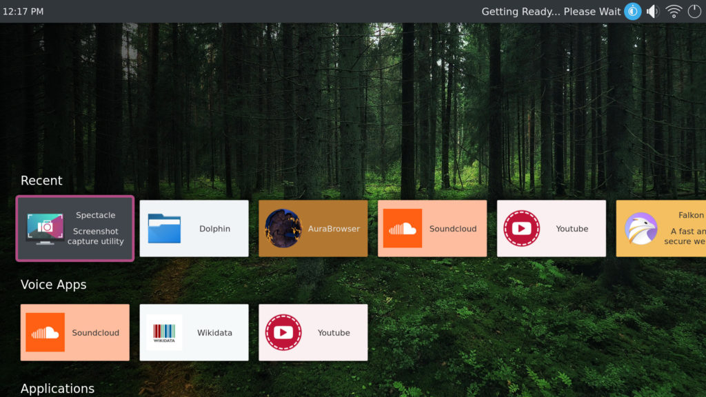
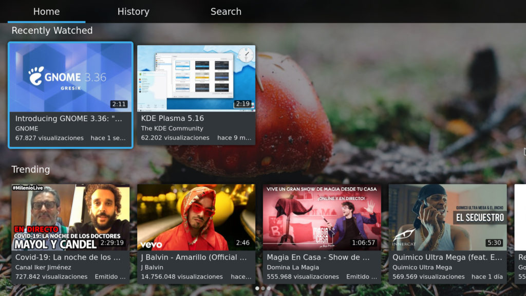
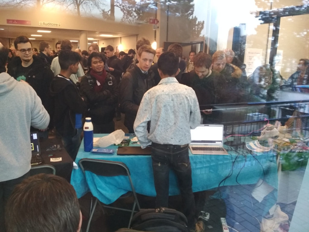
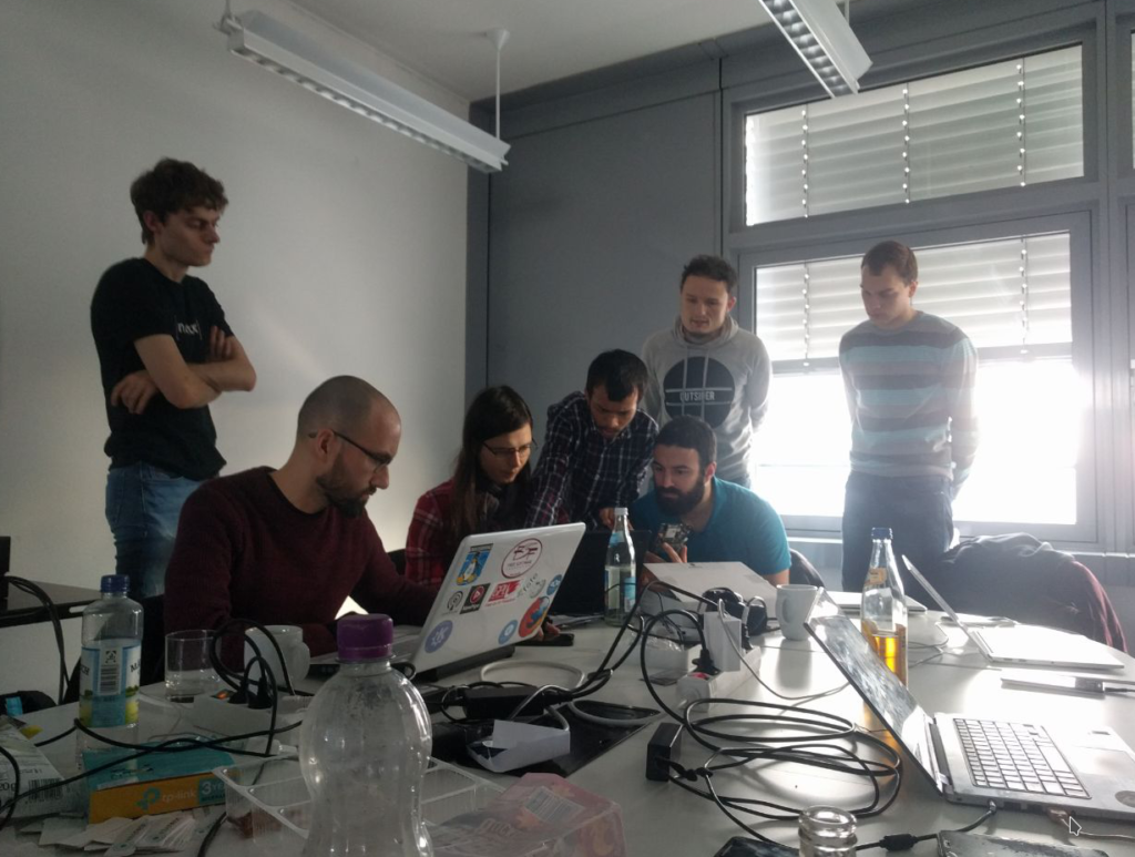
I was last week in Berlin at the Plasma Mobile sprint, graciously hosted by Endocode, almost exactly 9 years after the first Plasma Mobile sprint in which we first started to explore Plasma and other software by KDE on mobile phones, which at the time were just starting to become powerful enough to run a full Linux stack (Hi N900!)
Now the project got a wide breath of fresh air: the thing that impressed me the most was how many new faces came at the sprint and are now part of the project.
Compared to 9 years ago, we have a way saner and more robust ecosystem to play on. Instead of a single (and quite underpowered) phone, which was the N900, now we can hack on a wide variety of phones, thanks to ARM being slightly less painful to work with compared to back then (even tough still a long way to go to be considered an open hackable system from nay point of view) Some devices are starting to get upstream mainline kernel support, and for those (unfortunately, most) who don’t there is the Halium project to the rescue, which provides an abstraction layer between the Android kernel and the “proper Linux” userland, making possible to use its graphjics drivers to drive a Wayland session, access audio and connectivity and so on.
We have a Neon version which supports a reference device (the old Nexus-5x) which can be easily adapted to other devices, and PostmarketOS, which is a distribution which supports many different phones and several user interfaces, Plasma Mobile being one of the official ones. At the sprint there were also some people from the PostmarketOS project: one of the things i love most of open source is when different projects collaborate so closely.
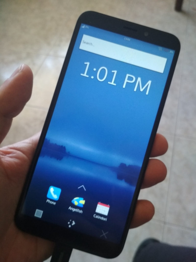
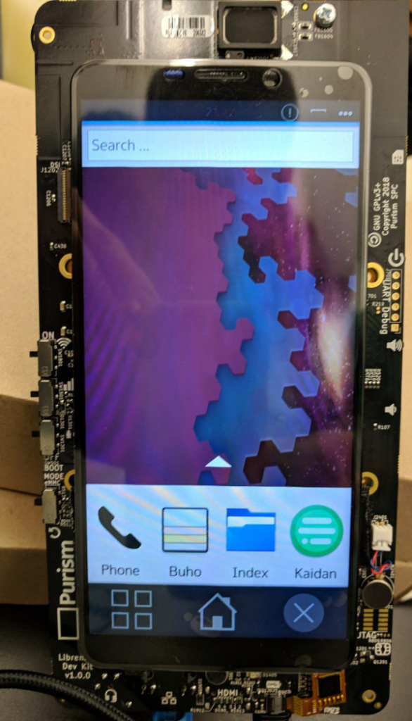
We had also some new toys to play with: people from Purism were also present, bringing development kits for their upcoming Librem5 phone, which will support mainline kernel and no need for closed Android drivers. Even tough a lot of work is stil lto do, Plasma Mobile already boots on the device.
As for Plasma Mobile software in itself, we did many bugfixes on the main shell/homescreen to have a better first impact, and a significant improvement came in KWin about high DPI scaling when running on an Halium system.
Also, many improvoements were done in the Kirigami framework, which is the main toolkit recommended to be used to build applications for Plasma Mobile: as developers of several applications that use Kirigami were present there, we could do very fast feedback and debug sessions.
The time for Akademy came this year as well, this year it was in the gorgeous Vienna, Austria.
This year marks my 10th Akademy in a row, starting from my first one in Belgium in 2008.
Talks have been awesome as usual, but what’s always awesome for me year by year is all the face to face conversation with so much diverse and smart people in out awesome KDE community.
Kirigami
For me the highlight was the BOF session on Kirigami, in which some nice plans, together the VDG are starting to form.
Kirigami in a QML based UI framework at the core of some KDE applications, which will become more and more central as more and more QML based applications are made.
So far is still a relatively unknown gem in the KE software and frameworks offering, however as technologically is starting to mature, we’ll start to advertise it more and simplify onboarding.
A big part of that will be about web presence and documentation:
A nice media-heavy introductory website which will showcase the features it can offer to your app, together expanded sections of the central Kirigami UX patterns in the new Human Interface Guidelines website.
A series of tutorials how to get started developing applications using the Kirigami toolkit
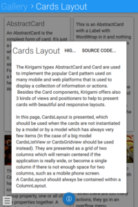
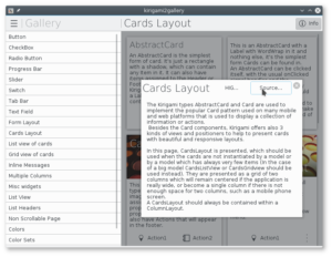
Repurpose the example “Kirigami Gallery” application: It will become a showcase of components and UI patterns the developer is recommended to use: each gallery page will also have documentation text together links to the corresponding HIG page and to the gallery page sourcecode itself, to be used as a source of inpiration and best practiches to be used while developing your application
Kirigami Gallery on the Cards pattern, mobile version
Kirigami Gallery on the Cards pattern, desktop version
If you think you can help on this web presence effort, you are welcome to join 🙂
Plasma
On the Plasma side, many plans of improvement have been discussed and are on their ways, such as better support for touch-based convertible laptops, a completely rewritten and overhauled notification system, and improved Virtual Desktops/Activities infrastructure and UI, on Wayland too.
But, more on all of this in the future 🙂
Vienna
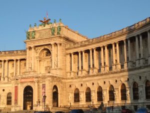
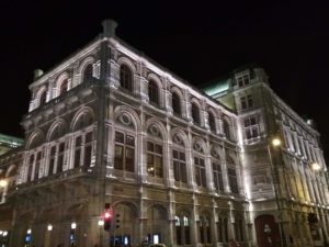
Vienna is a really charming and beautiful city, I would totally recommend going there at least once.
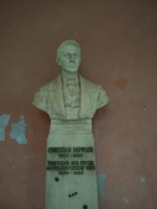
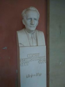
It’s home not only to great musician in the past:
Mozart
But also to Important scientists that contributed so much to the knowledge of humanity and.. contributed a littel bit making possible all the technology we know and love 🙂
A new release of Kirigami is about to come with the new version of KDE Frameworks about to be released, 5.38.
This is an important release, which bumps the import version to 2.2, because has a very important new feature: A brand new (but retrocompatible) color theming API, which allows different areas of the application to have different color domains, allowing for instance parts of the application to have a light color palette and parts of the application to have a dark one.
This model is modeled after KColorScheme which is very powerful (even tough sometimes underused): as KcolorScheme will be actually used when running on Plasma Desktop (just a runtime plugin, it won’t depend on it, so dependencies on Android or other platforms are not affected) it will allow us to integrate tightly with the other applications made by KDE.
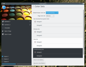
Here you can see the example Kirigami Gallery which has been set to use different color sets in different areas:
Kirigami Gallery with the Breeze widget style: areas with a different ColorSet, widget and icon colors following
Here, this is how choosing different color sets for different areas of the application looks on Android, using the Material style:
Theme.colorSet
The Theme object in Kirigami used to be a singleton (and still is, for full compatibility when the 2.0 or 2.1 version of the import is used), but is now instead an attached property: which is source-compatible (no rewrite needed in your apps, except bumping the import version to 2.2)
You can color differently an area of you application with the following code:
Item {
// tells the Theme no not inherit the color set from parent objects
Kirigami.Theme.inherit: false
// uses Complementary color set
Kirigami.Theme.colorSet: Kirigami.Theme.Complementary
Rectangle {
//this color will come from the Complementary set
color: Kirigami.Theme.backgroundColor
}
}
Another example of a (very minimal) full application which has the Global Drawer in the Complementary color set:
In the above screenshot, you can also see that the icons used there are colored accordingly to the same text color of the ColorSet of the area they are in. When loading in Plasma Desktop, we have the luxury of loading such icons with KIconLoader, which can process SVG-based icon sets with stylesheets, so we can actually have in the icons areas colored with particular named-colors, which correspond with the Theme’s named colors (like textColor, backgroundColor, highlightColor, negativeTextColor and so on) for instance is important that a record icon like the one shown in the screenshot has a red dot as this is the universal accepted iconography. The monochrome icons in the Breeze icon set are “almost” monochrome, with those few colored accents used very sparsely, just when really needed and give definitely a nice touch of polish to the visual identity.
On other platforms they are just treated as monochorome and the whole icon is colored.
Better integration with Plasma Desktop and QWidget style
A QtQuickControls2 style has been written which uses QStyle to paint controls and will be used by default in next Plasma releases (from 5.11 onwards), this is released as a framework as well in 5.39, called qqc2-desktop-style
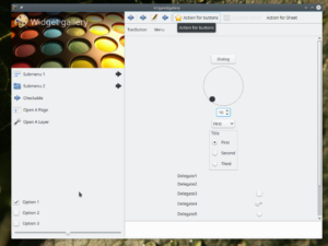
Here a screenshot of the Gallery using Oxygen widget style and icons:
Kirigami Gallery on desktop, shown with the Oxygen widget style
Different platforms plugins
The framework qqc2-desktop-style also contains a plugin that is dynamically loaded by Kirigami, which bridget the Kirigami Theme.* concept to KColorScheme, making Kirigami apps follow the same palette, as well as using KIconloader to load icons, being capable to apply color stylesheets to Breeze icons.
On other platforms, simpler plugins will be used to not drag dependencies and integrate better on whatever platform they are (like Material on Android)
What about fancy icons on my QWidget app?
Since several KF5 releases, Breeze icons in QWidget-based apps can follow the system palette, so when using a dark color scheme, icons will become white and so on. However: what about using a light color scheme in some areas and a dark one in some other areas?
Since 5.39 KIconLoader has gained a new method, setCustomPalette(), in which you can override the colors for a particular KIconLoader (the app will then need to use different KIconloader instances intended for different areas of the app). Pay attention that in that case you will have to monitor the QApplication palette change and eventually update that kiconloader palette by hand.
This year the Randa KDE meeting it’s all about Accessibility: a big effort has been concentrated around two very intertwined things: keyboard navigation and screen reader support.
(The fundraising campaign is still going on)
As a first taste, in Plasma 5.11 KRunner will be completely accessible (unfortunately until now screen readers didn’t work at all with it), which is important as is a completely keyboard-focused UI to do things, therefore potentially more user friendly towards vision impaired people.
Orca will be able to read out loud what query has been entered and the currently focused entry, that is what will happen if the user presses the Enter key.
Here it is a screencast of KRunner running with Orca navigating trough the list of result entries.
One of the key points of Plasma is while giving a simple default desktop experience, not limiting the user to that single, pre-packed one size fits all UI.
Its strength is to be flexible to greatly different user needs, “Simple by default, powerful when needed”.
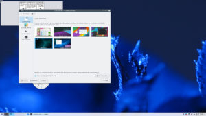
Several years ago, the Visual Design Group had the idea of making easy to build and share desktop layouts to make easy to test wildly different user interfaces, see this old post by Thomas on the topic.
Since then, work on it has been going on, mostly on the infrastructure needed to make it a reality, and in Plasma 5.8 the first pieces are there, tough still far from the complete experience we want to offer.
The support for Look and Feel packages is there since a while (5.3 or so) that’s what one of those package can do:
Provide a default layout for when Plasma starts for the first time, it was used for distributions to personalise their UI, but now is easier for users as well.
Provide some default look options, like what color scheme to use, what icon theme etc
(advanced) provide the actual implementation of some UI, such as KRunner, the Alt+Tab window switcher dialog, the lock screen
So far the default Plasma layout provided by the Look and Feel theme was used only when starting up for the first time, on a clean user home (therefore very useful for distributions) but sice Plasma 5.8, in the Workspace theme -> Look & Feel section of system settings there is an option to load the new layout when switching the look and feel theme. Not as default as is a destructive action that will remove your current Desktop setup.
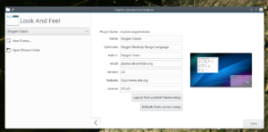
The other component is a tiny little application shipped in the “Plasma Sdk” package that’s called lookandfeelexplorer.
With this applciation you can:
Create a new Look and Feel theme
Edit the metadata and thumbnail of a locally created/installed theme
Create a default javascript desktop layout based upon your current Plasma setup
Create a defaults file based upon your current setup as well, such as color scheme and icon theme
The last two are the central part of sharing your idea of “the perfect desktop” with others, linked with the integration between the Look & Feel systemsetting module and the KDE store, also new in Plasma 5.8.
It’s still a preliminary feature, as ideally in the future if your shared Look & Feel theme depends for instance from a particular icon theme or a particular 3rd party plasmoid, the store integration will download those dependencies as well.
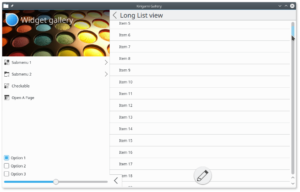
In the screenshot below, the desktop/Breeze-looking scrollbar it’s actually a control coming from QtQuickControls2.
Since one of the goals of Kirigami is to support also desktop applications, while working on Kirigami 2 (that is mostly porting it to be based on top of QtQuickControls2) I had the need for it to continue to integrate with desktop applications as well.
Unfortunately, desktops are not the primary target for QtQuickcontrls2, and while in Qt 5.9 some much needed desktop-related features, such as mouseover effects are getting back in, being as unrecognizable as possible with QWidget-based applications is definitely not in the roadmap.
Luckily, theming QQC2 is easy, so I’ve started a QtQuickControls2 style that integrates with desktop QStyle-based widgets (actually, based upon the QtQuickControls1 QStyle painter machinery).
If we are serious in using QtQuickControls2 in applications shipped together Plasma, we also must make sure they integrate well with the Plasma desktop’s Breeze look and feel.
I started by theming the scrollbar because I felt it was one of the hardest controls to do.
in QtQuickControls2 the scrollbars are supposed to be an attached property of flickables..
This is pretty simple for the mobile use case, turns out it’s a nightmare to create scrollbars that behave like we are used to in the desktop (unless you’re on mac, which insists to look more and more like iOS), which need to be
always visible
have optional little arrow buttons for increment/decrenent
be besides the flickable, not overlapping the contents, because again, they’re always visible
use the global desktop theme
I’ve been able to do all of the following, tough it’s necessary to reintroduce the QtQuickcontrols1 component called ScrollView (which imo was a mistake to remove in QtQuickControls2) which can correctly lay out and size the Flickable relative to its ScrollBar.
Hopefully, you’ll be soon able to build an application with QtQuickcontrols2 and Kirigami2 that feels right at home in a Plasma desktop.
What about Plasma-themed QQC2 controls for plasmoids? that will come too, of course!
Breeze icons are very simple SVG files, especially the ones used for actions that are mostly monochromatic are very simple, and that’s part of their appeal.
Since some time, Plasma themes that are SVG files as well have the capability of being colored with system themes.
So, why not doing this for every icon as well?
One problem with monochromatic icons is that they can lose contrast in particular situation: when the application uses another color scheme or in places such as in menu items uder the mouse, that get a blue background, giving a not too visible dark gray on dark blue.
That’s one of those “last mile” polishing issues that may be small, but have quite a big impact on the perceived quality of the finished product.
Starting with Plasma 5.7 Icons will behave the same way as Plasma themes: they can have an internal stylesheet which colors will be replaced at runtime with the colors from the system theme.
Here, Dolphin with the colors theme “Wonton Soup” and all the breeze icons following the text color of the theme:
Some applications, like Gwenview can use a completely custom color scheme, in the case of GwenView, it switches to a dark color scheme when fullscreen, regardless of the normal system color theme:
Icons that are in a “selected” state such as the menu item under the mouse or the current dolphin sidebar item change their color, just like the text does too:
Here with some custom colors for the highlight areas:
How to create a compatible icon?
First of all, Big kudos to Andreas for updating the whole breeze theme to the standard described below 😀
This is a quite minimal SVG file that supports colors from the system theme (Plasma Svg themes follow the same convention):
The colors defined in Text, Background, Highlight etc will be replaced with the corresponding colors from the system theme (look at the Systemsettings module to configure colors to see what colors they actually are)
This also defines a very minimal palette of “semantic” colors: you have the foreground and background colors for purely monochromatic shapes, and other colors for small accents that make the icon slightly more expressive than purely monochromatic such as Highlight, positive, negative (an “x” icon to close will be usually of “negative” color)
The other important part is the actual definition of the shape:
The rectangle has class=”ColorScheme-Text” that will make the stylesheet match to the class definition of ColorScheme-Text, that defines a color.
In order to actually apply that color, you can see the attribute style=”fill:currentColor”. It’s important no other colors are defined in the style attribute.
Over the second week of March I’ve been at the sprint at CERN.
It has been an amazing experience seeing those very big toys, where the cutting edge research is done (noted with satisfaction the presence of Plasma desktops in the CMS control room)
On my side, some interesting little things happened:
All new systemtray finished and merged
During the sprint I’ve merged a thing i was working since a while: the system tray of Plasma was one of the most complicated plasmoids out there due to the very peculiar things it does.
Its code was really showing its age (it surviced at least 3 portings across different technologies) and even tough the old Xembed-based systray icon protocol was dropped, its architecture was still decidedly all
It has now been completely rewritten, its code is now way simpler, using less layers of proxymodels and went from ~2000 locs of C++ to ~300
While completely new, the users shouldn’t even notice any UI change, the only noticeable change should be less bugs and working better 😉
Kirigami
During the sprint, a new repository was born.
What was Plasma Mobile components is now residing in a separate git repository: https://quickgit.kde.org/?p=kirigami.git Kirigami (The names comes from a Japanese paper folding craft similar to Origami, but unlike Origami cutting the paper is allowed) is a set of QtQuick components at the moment targeted for mobile use (in the future desktop as well) targeting both Plasma Mobile and Android. It’s not a whole set of components, all the “Primitive” ones like buttons and textboxes are a job for QtQuickControls (soon QtQuickContrls2) but it’s a set of high level components to make as easy as possible making applications that look gorgeous on mobile devices that follow the Visual Design Group UI guidelines.
The target of those components is anybody that wants to do an application using QtQuick as its main UI, especially if targeting a mobile platform, without adding many dependencies. They work both in Plasma Mobile and Android.
It will eventually become a Tier-1 KDE Framework.
Subsurface
While I was refining the components, it turns out a piece of desktop software just has its first release of its Android port, it is already using a tech preview of the Kirigami components: it’s Subsurface a dive log software started some years ago by Linus Torvalds (in GTK+) and recently ported over Qt (here a talk by one of its main developers Dirk Hohndel about the porting process https://www.youtube.com/watch?v=ON0A1dsQOV0)
It’s awesome having already an early adopter (which has been a pleasure to work with) for the components and also means we are getting a ton of feedback on it.