Tag Archives: mobile

A mobile Plasma Sprint

Software

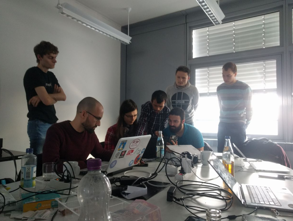
I was last week in Berlin at the Plasma Mobile sprint, graciously hosted by Endocode, almost exactly 9 years after the first Plasma Mobile sprint in which we first started to explore Plasma and other software by KDE on mobile phones, which at the time were just starting to become powerful enough to run a full Linux stack (Hi N900!)

Now the project got a wide breath of fresh air: the thing that impressed me the most was how many new faces came at the sprint and are now part of the project.

Compared to 9 years ago, we have a way saner and more robust ecosystem to play on. Instead of a single (and quite underpowered) phone, which was the N900, now we can hack on a wide variety of phones, thanks to ARM being slightly less painful to work with compared to back then (even tough still a long way to go to be considered an open hackable system from nay point of view) Some devices are starting to get upstream mainline kernel support, and for those (unfortunately, most) who don’t there is the Halium project to the rescue, which provides an abstraction layer between the Android kernel and the “proper Linux” userland, making possible to use its graphjics drivers to drive a Wayland session, access audio and connectivity and so on.

We have a Neon version which supports a reference device (the old Nexus-5x) which can be easily adapted to other devices, and PostmarketOS, which is a distribution which supports many different phones and several user interfaces, Plasma Mobile being one of the official ones. At the sprint there were also some people from the PostmarketOS project: one of the things i love most of open source is when different projects collaborate so closely.

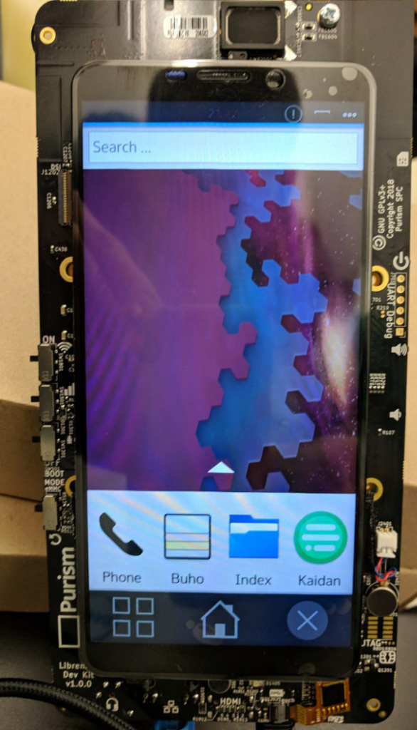
We had also some new toys to play with: people from Purism were also present, bringing development kits for their upcoming Librem5 phone, which will support mainline kernel and no need for closed Android drivers. Even tough a lot of work is stil lto do, Plasma Mobile already boots on the device.

Plasma Mobile running on a Librem 5 devkit.

As for Plasma Mobile software in itself, we did many bugfixes on the main shell/homescreen to have a better first impact, and a significant improvement came in KWin about high DPI scaling when running on an Halium system.

Also, many improvoements were done in the Kirigami framework, which is the main toolkit recommended to be used to build applications for Plasma Mobile: as developers of several applications that use Kirigami were present there, we could do very fast feedback and debug sessions.

Active, images and devices

BlaBla

As I wrote before, we are trying to make PA4 as stable as possible, and as well as it was noted by some people, this involves also having images for a wide variety of devices.

What I’m doing, is kindof even another step: making the image creation as easy as possible, so that is possible for people to contribute easily in the creatoin process of those images, (especially images for previously unsupported devices).

In Mer, that is the base of Plasma Active the OS images are created from an instruction file called kickstart. you can find a source repository that creates kickstart files for plasma active here:

git clone git://anongit.kde.org/plasma-active-kickstart.git

Then, what you have to do is installing a Mer SDK, following the instructions here. This is very easy, is more or less uncompressing a tarball and running a shell script inside it, and should work on any distribution.

Then, from inside the SDK chroot environment, go where you downloaded the git repo (your home is accessible from there) and do:

mer-kickstarter -e . -c latest-devel/plasma-active-latest-devel.yaml -o plasma-active-latest-ks/

it will create a kickstart for each of the supported devices in the plasma-active-latest-ks/ subdirectory, then:

cd plasma-active-latest-ks/
sudo mic create livecd plasma-active-i586.ks -o . --pkgmgr=yum --arch=i686 --logfile=plasma-active-build.log

And an iso file with the same name as the kickstart file will be created. Different devices may need different image format, such as “raw” instead of “livecd”

Right now just a few devices are supported there, what I want to achieve is to support there all the device types Active has been successfully ran on.

One thing I must say, the code in that repo is derived from the Nemo project (another Qt based project built on top of Mer) so also a better sharing of bits and pieces for device adaptations with Nemo would be awesome as well.

Help make Plasma Active 4 shine

BlaBla

PA4

Plasma Active 3 was released on 15th October 2012, and since then, work on the next version has not stopped for a minute, now the work on Plasma Active 4 is well on the way.

Another important release at the horizon is the KDE Plasma Desktop shell 4.10, due in February.

We believe our desktop and mobile products are closely interrelated, both from a technology point of view and from a continuity of the user experience, therefore Plasma Active 4 will be based upon the KDE 4.10 release. This will mean that PA4 will automatically gain some of the features of 4.10, at least from the technology platform point of view, but means also another important thing: ease of setup.

PA4

We are planning to release it around the end of March, and since some hardware is approaching as well, this release is more important than ever.

Plasma Active 4 will have a number of important new features over PA3, there are countless small improvements, and few features that will be really visible, including:

  • Faster and more usable web browser
  • Improved usability of the on-screen keyboard
  • Numerous improvements in the File browser application: faster, more usable and scalable to very big amounts of data
  • Device-wide ownCloud integration
  • “Developer mode” on the device, to more easily work with it
  • More user friendly ui for setting alarms
  • Better notification
  • New applications
  • Community support for new devices

PA4

But I want to know more!

This is where you can make the difference: it’s very important that the new release will have an user experience as smooth as possible. The work for new features is coming to an end (even tough you are still in time to present a work plan if you want to work on a particular one). But is starting an even more important period: testing, stabilization, bugfix.

There are many ways to help in making the release shine: it may be just installing an image and testing, it may mean getting random people to test and register the issue they had with it, it may be participating in the discussions on IRC or the mailing list, it may be setting up a build environment, and start hacking.

PA4

Starting hacking on the components of Plasma Active is easier than ever, because as i said, PA4 will be based on KDE 4.10, that means everything specific of Plasma Active can be built on top of the development packages of KDE 4.10 from your distribution of choice, while having the active workspace and active applications running from git from your machine in matter of a minute.

From a packaging point of view, is ridiculously easy as well, as all you have to do is to install the Mer sdk, that is completely self contained, can be dropped on top of any distribution and doesn’t really “touch” your system

If you are interested, drop in in IRC, on the #active channel of Freenode, or join the malinglist active@kde.org

Active three

Software

Today we have a new release of Plasma Active: quite some time passed since the last release last year.

OGG version

Applications

Plasma Active 3 has several new applications out of the box, to reinforce the philosophy of “useful by default”.

  • Add Ons: an add ons store, where both the client and the server side are free software: right now are available a collection of wallpapers and all the thousands of ebooks from Gutemberg. Different kinds of content like more books and apps will come shortly.
  • Advanced file management: in mobile devices often the files are walled behind the single applications or cloud services: while is fine to have also that possibility, you should be more in control of your files. Plasma Active by default comes with an advanced file manager that lets you manage your files with timelines, tags and other advanced semantic features (thanks, Nepomuk ๐Ÿ˜‰
  • Alarms: not much to say here, it was a must for a mobile device ๐Ÿ˜‰
  • News reader: a convenient touch interface to browse your favourite rss feeds.

Incremental improvements

Compared to the Plasma Active Two release running on the same device, there is a significant improvement in stability, boot time, apps startup time and rendering performance.

Base OS

A quite visible one is that the official release is now based on a different OS: welcome to Mer.

Mer continues the effort of MeeGo, but in an more open, community-oriented way. It’s a lightweight Linux based OS with a high accent in offering the possibility to build customized final distributions, with adaptation for specific hardwares or specific end user software.

Many still remember what pain it was to set up correctly the old scratchbox based build environment for maemo, (or pain common for many embedded development environment for what matters) In Mer setting up a development environment is matter of probably 10 minutes or so.

The high customizability of the base OS of Plasma Active also means that is ideal to build highly customized verticals for the enterprise environment.

Notifications, let the redesign begin

Software

So, it seems it’s that time of the year again… the plasmoid used in KDE Plasma Desktop to display notifications and the progress of transfer jobs started to really show its age, due to some bad limitations in the old QGraphicsview code to handle complex layouts, so it appeared quite buggy and not so smooth to use. Yes, I’m aware that sometimes it started to dance resizing itself several times in a row, and there wasn’t much to be done on that regard… Until now ๐Ÿ˜€

The fact that there is some research/development being made to build a new backend for notifications that will support many new features, more “modern” to be actually useful with the applications that are so heavily “communication” oriented(both desktop clients and web stuff), that became essential part of out workflow.

The story begins more than a year ago: we needed a way to display notifications on Plasma Active, and obviously the desktop applet used back then wasn’t enough.

Since we would have to rewrite it in QML anyways, we started it, at the beginning as a thing used only in Plasma Active.

Here below is the status that will be shipped together Plasma Active 3, in about 2 weeks (more on that later ๐Ÿ˜‰

WebM version

Then, as it became more and more feature complete, it was obvious that it could have replaced the one used in the desktop quite easily.

But wait, we have different input methods so we need two completely different things otherwise one won’t be usable on the other platform, right?

Wrong ๐Ÿ˜‰ what we need is a different UI, and not even dramatically different: we need it adapted for a different input method and yet still familiar, the actual code difference needs to be very little.

In QML plasmoids, we can specify some files that will be used only in some platforms, so the system will automatically pick the most suited one. Also the basic component used (buttons, scrollbars etc) while having exactly the same API on all platforms, they can have a radically different behavior (or even, a completely different implementation).

Here is the plasmoid that is going to be merged and shipped with our next iteration of the desktop:

OGG version

While it looks very similar, there are some important differences:

  • Different theme/look (that was easy;)
  • The desktop version has scrollbars, the touch version works by flicking and has scroll indicators that automatically appear/disappear
  • The touch version has way bigger hit targets
  • The desktop version has mouse over effects, the touch version doesn’t
  • The text in the notifications can be selected with the mouse in the desktop version, and there is a right mouse button menu that allows to select/copy to clipboard
  • Instead, with an horizontal drag on a notification on the touch version, it will be moved, and if “thrown” outside the window, it will be deleted.

Difference in code? a couple 100-something lines QML files that are chosen either one or the other, that’s it.

The desktop version has more or less the same functionality as the old version shipped with 4.9, the changes are mostly about making the ui a bit simpler.

Also, this new notifications plasmoid is all about the user interface. It has been designed to be as easy as possible to change (or add a new one) the underlying notification system, so it will fit pretty well in the new system that is being researched right now.

Artificial boundaries

BlaBla

This is the 4th and last part of a single post (1, 2, 3)

For all the things in our life, we constructed boundaries that sometimes are completely artificial with not much actual sense in the reality of things, presenting more and more false dilemmas

This series of posts is of course about user interfaces, and this last post is about two common beliefs about applications and UIs that I think are false distinctions (and particularly care of)

Workspace? Application?

The boundary between the workspace and the applications is somewhat artificial, as is the boundary between one application or the other. Is there a common function that most applications share?

If so whether it appears in the application window, in the workspace or as part of another application is just a matter of what are usability findings for that action in particular (see Share Like Connect in Plasma Active).

How much two applications have to be considered separated if they share most of their components? or are just two tools of the same procedure? the knife and the spoon of the dish application?

In the end how much corresponds the separation I see in windows? is what i see as different tasks in the taskbar actually a different task? We should think more about different semantic task rather than different process/window that is an implementation detail.

Everything is just part of the same tool, the same system.

But is system == the machine? No!

Desktop/phone/tablet/TV…

Even distinction between devices and type of devices is artificial: my work spreads trough multiple machines, some more capable than others.

I won’t be able to do the most complex data creation operations on a phone, but I can view that work and create something, so on a mobile device I don’t want a completely alien set of tools, and i want to be able to access the very same resources.

  • I want everything as much synchronized as possible
  • I don’t want to set up the very same mail accounts on every device
  • If I have a movie on my desktop I want it to be available on my tablet
  • And if I press “play” on my tablet I want to see it on my TV
  • And i want zero effort to do that, not having to play around with settings and shared folders for hours.

I also want as much as possible of the very same visual language shared between all my devices. There are differences in input methods and screen sizes (in few years differences between pixel densities will be nullified), but most of the aestetics, a part of the behavior and most of the applications should be shared between all the devices, even if with more faces.

I don’t want to hear anymore KDE mobile effort versus the desktop: they are the same system. They are an unity, a spectrum that scales smoothly without really distinct interruptions.

Devices used to be very different from one to another, but in the next years differences will be less and less, in 1-2 years probably 100% of the sold computers, desktop or not will have a touch screen, we will see as big X86 tablets as very small ARM laptops. the input method and the mobile-ness won’t be a boolean anymore, they will be a real, from the big desktop(that is definitely not going away) to the small phone there will be a million of in-between thinghies.

And this is a false dichotomy dying right now, a distinction that existed for technical reasons (small mobile processors not having enough power) is fading away, we better adapt or die as well.

We are seeing different approaches in software to be ready to this paradigm shift in hardware; both Windows 8 and OSX are trying to “mix” desktop and mobile paradigms. Here the problem (especially visible in Windows 8) is that the transition from different devices is too abrupt, you end up with an ui designed for a different kind of input method from what you are using (thik about Metro start screen on a 24″ monitor).

So:

  • One size does not fit all.
  • There aren’t anymore well defined boundaries for different devices.
  • The UI should be like lego, every little piece should be interchangeable to do a million different combinations: small tablet, large one, laptop with touchscreen, small laptop with a mouse, tablet dockable to a mouse/keyboard station, whatever we don’t imagine yet…

To do a synopsis of this last post of the series, a phone and a desktop are the same system.

There are the Bob’s and the John’s systems, not the tablet system and the laptop system, the only difference between two systems is belonging to different people, being tailored around different lives.

To conclude, by the way here is the complete version of the mockup that srarted this long brain dump:

Fictional Desktop?

Overdesign

BlaBla

This is the part 3 of 4.

As the popular saying goes, there is always an easy solution to every human problem: neat, plausible, easy to understand and wrong.

It’s now widely accepted that the graphical and behavioral presentation of an interface should be have some conformity to what we evolved to expect (as i talked about in the previous post: transitions, rounded shapes possibly textured, direct manipulation of objects are just some aspects of it), however this brought a very easy answer that introduces a whole new range of problems: skeuomorphism.

A skeuomorph design tries to mimic as much as possible real objects that are an analog version of the tool implemented by the interface, a typical example is an address book application that looks like a leather address book or an ebook catalog application that looks like an actual library.

Address book

This is the design direction Apple taken since a while, and now from mobile is starting to percolate in the desktop as well (and being Apple is influencing a whole lot of developers now).

This approach has several problems:

  • It kills consistency: the boundary between different applications becomes extremely evident, too evident, condemning to remain forever in the application based paradigm, while “application” is a technical detail, is not much really something that should be very evident in the user facing semantics. Every application has a completely different graphical language, even tough it was designed to ease the transfer of learning from the “real” world it ultimately hinders the transfer between learned part of the system.
  • Imposes artificial limits: by copying a real object you copy also its limitations. To stay in the example of the book browser that looks like a library, the mapping to the real object suddenly drops (and thus it starts to look unfamiliar, magical) when you perform functions like sorting or searching books. You can’t certainly make magically disappear from the library all books that aren’t from a certain author, with a snap of the fingers. This makes quite hard to create innovations, like in this case a more powerful intuitive way to browse books that leverages indexing and metadata extraction.
  • It’s uncanny: the application will mimic the real object, but not perfectly: it will always feel fake, there always will be something out of place (even if just because of the features it offers that are impossible in the real world just as a simple search), creating a cognitive dissonance: yes I am looking to something that looks like a leather address book, but I can’t use exactly like that, i have to use a completely different set of skills.
  • It’s expensive: last but not least, it’s extremely expensive and labor intensive to redo from scratch every single pixel of every application: not everybody that are not Apple can afford to deliver a complex product with quality good enough to be presentable. If the cost of this enormous amount of work was justified by a big benefit could be worth it, but as we seen causes more problems than what it solves.

Finding the balance

The debate between an hyper-realistic, application based design, and a more classical UI approach is very polarizing lately, with good arguments from both sides.

Problem is the detractors of skeuomorph UIs, as gets natural in every polarizing debate, advocate from stuff that looks like it comes out from some 80’s science fiction movie, with Windows 8 Metro or Android 4 Holo as examples (especially in the Android case, the similarity with Tron is quite again, uncanny)

As I said, I think Skeuomorphism is the easy and wrong answer to the need of interfaces that feels more natural (where natural doesn’t mean there isn’t need to learn it), easily learnable to make the machine being a desktop or a phone an extension of your arm rather than a weird machine that you have to dialog in a strange arcane dead language with.

There should be a natural looking language, natural looking (or even reality copying) materials to build the UI elements, with a correct lighting, but yet not trying to copy real objects in the end, what you have to construct is a new machine that looks realistic but yet doesn’t copy a library or an address book.

You want something that looks and behaves more “analog” than “digital” (even if is something quite hard to quantify) for the same reason the piano replaced the harpsichord very quickly.

The UI must “flow”: as square edges and shapes with spikes should be avoided, the movement of everything should be as smooth as well, nothing that just appears or disappears, everything that is obvious where it comes from.

Remote controls should be avoided, everytime you have to use a UI to configure another UI, rather than directly manipulating it, you are doing something wrong.

In one sentence, design a visual language that is new, consistent, rigurous, looks natural and stick to it.
A button that looks like a button, with the correct lighting, drop shadows to tell the brain what is the most important and secondary things are ok, replicating a fully functional rotary phone is not.
Also, small breaks from the visual grammar can sometimes enhance the value of a particular feature, but only if used extremely rarely.

Next and last, boundaries between applications and workspace, boundaries between devices (or, why they don’t exists)

Design and psychology of user interfaces

BlaBla

This is the part 2 of 4.

Some times an application, or its user interface, seem to exist more for themselves rather than around the purpose of being a tool to accomplish a task: it’s very important that always stays the first goal of the existence of any functionality the software offers, being an application, a particular screen of that application, or a piece of the shell.

  • The star of the user interface is the content, this has to always remain the center, what distracts from the content is something that is often not necessary and can be avoided.
  • You interact with objects represented on the screen with a particular input system, may be a mouse, a trackpad or the touch screen. Interaction should be direct: in the real world you interact with an object not with a remote control that remote controls the object. Objects represented on the screen are often quite abstract, from objects to “pure information”, so is not always easy avoiding levels of indirection, but they should be limited (one of the reasons you will see handles in Plasma and not things like text boxes that ask how many pixels you want your panel high).
  • Our mind is trained to recognize patterns, that’s why consistency in UI is extremely important: this is something that comes from our evolution: for our survival we have to memorize and then recognize anything new that we encounter, may be a menace or an opportunity. Once you learn what a snake is, when you see a very different type of snake you just run;). Same thing as learning to use a tool, and transferring this knowledge to the use of different and perhaps more advanced tools, and this is what interest us here. (see transfer of learning)
  • Organic user interfaces: same reason as the above point, our mind expect things that we have seen the past some million years: some things are hardwired in our brains: we expect that when something appears it comes moving from somewhere. Something appearing out of the blue without having being noticed it was coming it’s seen as a potential menace, if you just find yourself with a big spider in front of you all the sudden without having it seen coning from somewhere, is possibly even more terrifying.
    As important as UI element coming in from somewhere is “natural” shapes: even just using rounded corners when possible instead of perfect edges may do quite a lot of difference. There are two probable reasons here: a shape with sharp edges focuses the attention on the outside of the shape, where the edges are pointing, while a shape with rounded corners focuses the attention inside the shape. Moreover, in nature things with sharp edges again are a menace.
  • Finally, a good interface should be invisible. What? Again, the sole purpose of the interface is being a tool designed to do a particular task. Everything that is “more” that the strict use case of the particular UI hinders its learnability and efficience. Often most of an application UI can be seen as “Content”, “Document” that still is a UI artefact, but is a quite direct representation of what you are viewing or working on, with chrome as everything else, that is often necessary, maybe a necessary evil, but evil still.

Those are all concepts that gained quite a lot of traction over the last few years, and UI quality all around, from Windows to KDE to web apps improved a lot, most applications and environments we see around followed a very clear design procedure, but… there is a but ๐Ÿ˜‰

There is also an ugly side about it.. in the next post.

A UX manifesto, universe and everything

Graphics

The next 4 posts were intended to be just one, then it evolved to be quite huge, so it got splitted in 4 posts that will be posted over the next days.

All started when i was working on a mockup for a theme. I am still unsure what do do about it, making a plasma theme (probable), a qstyle, or just a prototype in QML about what would be my ideal(tm) desktop UI.

This is a small glimpse of it, due the mandatory Back to the future quote: “You’ll have to forgive the crudeness of this model, I didn’t have time to paint it or build it to scale”

possible Plasma theme preview

Then this thinghie made me think about the current state of aestetics on all current platforms being KDE or GNOME, OSX, iOS, Android, Windows8, Unity… where they are going, what they try to achieve, if they are achieving it.

Quite a lot for a quick Inkscape mockup about a theme that is admittedly not that original, but maybe that’s actually the point.

It has some important characteristics, that will be quite important in the next posts.

  • It looks quite realistic, I paid attention to the lighting effects of the buttons.
  • It tries to have the least possible visual noise, borders between things are as few as possible, and big empty areas are used to make the various items “breath”.
  • Directions of the drop shadows, while looking as correct as possible, always try to represent a visual hierarchy: the thing that has an higher z-order is always more important. This not only between windows but also in the same window.
  • A theme like that is intended as an unified visual language for everything: consistency is more important than how realistic a particular application looks (hint: an address book application does not have to look like a real address book)

Since some years in KDE there are some projects that share a common goal, such as the Plasma Workspace and related projects, like KWin and Oxygen and Plasma Active; as I’ll talk about, distinctions between those, what they should be their goals and boundaries, are mostly an artificial limit that doesn’t actually exist.

This end goal is to make our software more useful, more easy, more pleasant to use. Computers (any kind of, from a desktop to your watch) should be an helpful tool that help the user to achieve a particular goal, for which the computer has facilities designed to accomplish.

In the next post I’ll talk about some of the central points in the UI design, both as in behavior and cosmetics of the Plasma desktop over the past years and Plasma Active over the last one.

Maliit and Plasma Active

Software

Until now Plasma active had an on screen keyboard that served us well, but due to its implementation had some limits that couldn’t be easily overcome.

However there is a Qt based virtual keyboard project that is very promising: Maliit

It’s the one that was used in the Nokia N9, and already made a good progress since the version used there.

To have a good user experience on Plasma Active it should be well integrated, both as in look and behavior with the rest of the environment. Luckily Maliit is transitioning itself as well to the use of QML to write the user interface, making very easy to switch to a platform specific UI while all the logic stays untouched (I must say I’m quite impressed by this input method framework).

This is the result of just some hours of work towards a keyboard interface that uses Plasma UI components, and hopefully it will be in the next Plasma Active release.

OGG version