Category Archives: Graphics

Plasma2: all about elegance

BlaBlaGraphicsSoftware

Ok, I lied: it’s about elegance, performance, simple and great API, better user experience, more cross-device compatibility, in the end about improvement on all fronts.

And a very important thing is to gove an user interface more beautiful, tidier, more elegant.
One example is what Sebas talked about yesterday.
That new calendar is kindof a blueprint of how the UI of the Plasma workspace is being reworked: no huge and breaking changes, but fixing small layout problems, paying attention to the visual balance of the elements, and way better typography.
One thing that was pointed out is that its contrast or readability it was still dependent on what kind of wallpaper or windows you have behind it.

That’s what we came up with:
dadel2
(Note, the panel is from Plasma1, the systemtray and clock area will look much better πŸ˜‰

Here what it’s changed: contrary to what it seems, the window is *not* more opaque than the screenshots of yesterday, but it’s a modification of the blur effect in KWin.

What it does, it reproduces the effect of seeing something trough a frosted glass: what do you see is a combination of what’s behind the glass, the color of the glass, and the reflection of light reflected by the glass.
This last part is what has been added: it adds a bit of light to the color, but unlike a semi-transparent white window in front, it conserves all the information about colors.
So while being almost white, therefore very contrasted with the text, but still looking happy and colorful, instead of more dull and opaque if the theme was white, 95% opaque.

Time to refresh some air

Graphics

In the last entries I posted some screenshots of some upcoming features in the Plasma Workspace in 4.10, and they shown also a glimpse of another thing: a new default theme, on which I was working on since a while together with Nuno.

The new default theme landed today in git and it will be in the Plasma Workspace 4.10 release (disclaimer: the wallpaper is an old included one, the new default will be presented in a while ;)):

desktop

It’s the typical case of a radical redesign, in which everything changed, in order to seem that nothing has changed, just a general feeling of feeling more “right”.

The key design principle is to make the whole appearance “lighter”. Most graphical elements that didn’t have an actual “functional” meaning are now removed, as well as gradients (a pattern that says “3D”, usually reserved for indicating interactivity) on all elements that are not clickable.

Plasmoids looks completely flat now, the taskbar has now an element around only the active task, and the shadows of the items are different as well. On a related note, now all the popups will use KWin to draw their shadow, just like the panel. This means better layout and better integration with other windows.

widget gallery
widget gallery

A UX manifesto, universe and everything

Graphics

The next 4 posts were intended to be just one, then it evolved to be quite huge, so it got splitted in 4 posts that will be posted over the next days.

All started when i was working on a mockup for a theme. I am still unsure what do do about it, making a plasma theme (probable), a qstyle, or just a prototype in QML about what would be my ideal(tm) desktop UI.

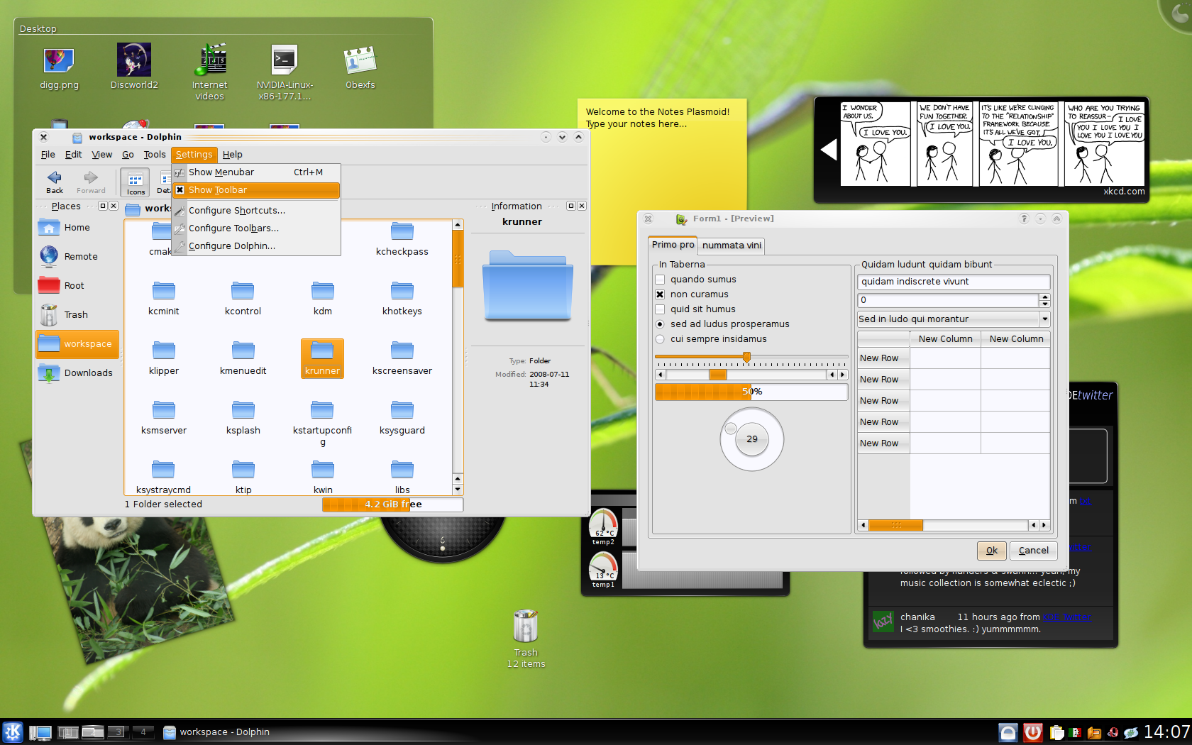
This is a small glimpse of it, due the mandatory Back to the future quote: “You’ll have to forgive the crudeness of this model, I didn’t have time to paint it or build it to scale”

possible Plasma theme preview

Then this thinghie made me think about the current state of aestetics on all current platforms being KDE or GNOME, OSX, iOS, Android, Windows8, Unity… where they are going, what they try to achieve, if they are achieving it.

Quite a lot for a quick Inkscape mockup about a theme that is admittedly not that original, but maybe that’s actually the point.

It has some important characteristics, that will be quite important in the next posts.

  • It looks quite realistic, I paid attention to the lighting effects of the buttons.
  • It tries to have the least possible visual noise, borders between things are as few as possible, and big empty areas are used to make the various items “breath”.
  • Directions of the drop shadows, while looking as correct as possible, always try to represent a visual hierarchy: the thing that has an higher z-order is always more important. This not only between windows but also in the same window.
  • A theme like that is intended as an unified visual language for everything: consistency is more important than how realistic a particular application looks (hint: an address book application does not have to look like a real address book)

Since some years in KDE there are some projects that share a common goal, such as the Plasma Workspace and related projects, like KWin and Oxygen and Plasma Active; as I’ll talk about, distinctions between those, what they should be their goals and boundaries, are mostly an artificial limit that doesn’t actually exist.

This end goal is to make our software more useful, more easy, more pleasant to use. Computers (any kind of, from a desktop to your watch) should be an helpful tool that help the user to achieve a particular goal, for which the computer has facilities designed to accomplish.

In the next post I’ll talk about some of the central points in the UI design, both as in behavior and cosmetics of the Plasma desktop over the past years and Plasma Active over the last one.

Easier Plasma themes creation

Graphics

One pretty long task of plasma themes is to manually rename all the SVG sub elements with the proper names. Let’s say we want to theme a button, we will need a SVG file with the following elements: normal-top, normal-topleft, normal-left, normal-bottomleft, normal-bottom, normal-bottomright, normal-right, normal-topright and normal-center.

This is for the button in normal status, then you need the same thing with active-, pressed- and focus- prefixes

This makes Plasma themes quite powerful (and always looking pixel perfect) but it’s quite fainful to rename over a hundred of elements by hand

Since usually the themes are designed in inkscape and it has a pretty neat system to write plugins in python, i’ve decided to write a little extension that eases the ain a lot: if you select 9 elements it will rename them with the usual topleft, left, top etc names, with an optional prefix asked by a dialog. If you select 4 items, it will instead rename them as hint-top-margin, hint-left-margin etc.

The extension is located at this address, to use it you have to copy those 2 files in the ~/.inkscape/extensions folder.

Unfortunately it requires a recent snapshot of inkscape 0.47, since the python scripts used have some bugs.

As usual a video is worth 1024 words πŸ™‚

Ogg version

AIR: it’s official

Graphics

AIR

This is not a shocking news since the Air Plasma theme was developed all in the open, so there are literally months that screenshots of it are around the interwebs, but since today it’s official: the Air theme is the default plasma theme πŸ™‚

It has been moved today into kdebase alongside Oxygen and made the default (Oxigen is of course still available)

Nearly all elements of this theme are redone from scratch, the idea of the look is of couse by Nuno Pinheiro, it’s amazing how he can make something that looks great out of nothing, I was just the mere executor of the elements (the fun activity of the “rename party” that who has done plasma themes knows :P)

The look of the theme is done to look really light an unobtrusive, let’s say that the target demographic of it should be wider: unfortunately Oxygen seemed to polarize people between love and hate, too bad, because i ireally love it eheh πŸ™‚

There is a thing in this theme that is new in KDE 4.3 (besides the usual element additions here and there) tose circles that apear over the applets: they are really transparent, just a filigrane, and their position is random (well, actually highly predictabe pseudo-random, but that is what we need here), and that becomes useful to quicly tell apart one widget from the other (since the position of the overlay in an applet is the same across different sessions, until the widget gets removed). This can be useful also in the idea of common branding (with subtle differences across distributions, instead of total difference)

Update of Polyester 2

Graphics

Published an updated version of the polyester widget style for Qt4/KDE4. Actually it was a pretty long time i didn’t touch that, but was too lazy to release the last state somewhere πŸ™‚

Now i’m pretty happy with it, it seems to work pretty well, and is good, because i really don’t want to spend much time on it, it has a really high amount of hacks in it and i get bored quickly of things πŸ™‚ however, how does it look? here it is:

Polyester 2

There will still be some updates for the time being, to correct most annoying bugs etc, btw πŸ™‚

4.1 times more Prettyness

Graphics

Ladies and gentlemen, let me introduce you the brand new shiny Plasma theme that will be used for KDE 4.1:

Plasma theme for KDE 4.1

Here you can see the new applet and krunner backgrounds, the new panel, our brand-new carbon fiber clock and some items that once upon a time weren’t themed at all, like the pager and the taskbar.

This is the wonderful work of Nuno, i did some work in the code in the last month to make the theme support even more extensive, to have all your nice plasma widgets with more SVG prettiness, so let’s start thing by thing πŸ™‚

  • The pager: the mini-desktops now have 3 different backgrounds, and when the mouse goes over the widget the mini desktops fades in and out with a neat animation
  • The panel: when composite is disabled his borders must be nice even if we don’t have antialiasing and when its width is the 100% of the screen it’s really a different beast, so a different svg it’s used, one different for each edge of the screen the panel can be
  • Dialogs and krunner: they have the same styleas the applets, but when composite is disabled we don’t have antialiasing for border, so it’s drawn in a nice retro-style
  • Taskbar: it now supports SVG backgrounds for several task states, there was some performance issues but we hope we will be able to enable the neat animations on mouse over also here πŸ™‚
  • System tray: yeah even that now has a SVG background to make it look coherent with the other panel plasmoids like the taskbar (and the pager, if the size is enough)
  • The analog clock: KDE4 is all about analog clocks, right? πŸ˜› so how could we neglect it? Absolutely not, so it now has cool drop shadows under each hand, that are always projected in the right position when the hands rotate
  • The folder view: due to its very nature it must have a more translucent background, to be easier on the eyes. Do you want to use that background on your applet? just call setBackgroundHints(TranslucentBackground) et voil

A simple way to test Plasma themes

Graphics

Some time ago when testing the code that draws the svg themes in Plasma (like applet backgrounds, panels and tooltips) i wrote a very simple plasmoid that its sole purpose was to test that code, its very uninspiring name was SvgPanelTest, because surprise surprise it was a test for the class named SvgPanel:P
It turns out this applet can be actually useful also for theme designers that wants to test the themes they’re doing without killing plasma all the times.

Since now there is a contest to make Plasma even more gorgeous, i’ve decided to publish it in an easily buildable source package, and i hope that it could somewhat help you (yes, YOU :P) to make a beautiful theme that will make vista and osx to look as they are coming straight from the 80’s (well even if it’s a very little help :D)

You can download it here (also a kde-look page here) or from KDE’s svn in /playground/plasma/applets/svgpaneltest

Some notes:

To build it a KDE4 developing environment is needed (see the techbase article)
at least KDE 4.0.2 is required, but a recent svn snapshot is preferred.

A plasma restart could be needed to see it listed among the plasmoids, or you can also start it with the command
plasmoidviewer svgpaneltest
or, with a very recent svn snapshot (from some minutes ago actually :P)
plasmoidviewer svgpaneltest /path/to/your/theme.svg

Crisp Plasma dialogs borders

Graphics

Since yesterday The border of plasma dialogs like the clock popups have got rounded borders also when the composite is disabled, just like tooltips before,ok not a big deal.
But what is changed is that before tooltips shape was an hardcoded rounded rectangle with a fixed shape and an also hardcoded white border and that kinda sucked…

A second problem connected to that was when compositing was active the windows only faked a non rectangular shape, but they still were stupid rectangles, so for instance you couldn’t click on a totally transparent area to make the popup go away.

Now the window shape is computed from the alpha channel of the background svg, it means now the windows have a shape similar to the one you would expect seeing the fancy transparent svg.

And it causes another problem if not well-managed, because if you use a fancy svg with cool antialiased borders, without composite you will get something awful like that (here zoomed 2x):

ugly borders

See that two black pixels on each edge? and if the radius is bigger the problem gets worse.
This because the semi-transparent pixels will become fully opaque. Fortunately the way Plasma::Theme works comes to rescue, because when compositing is not active it will load a different set of svgs when available (they are all the files in the “opaque” folder in the theme path), so for instance with tooltips when compositing is disabled it will load the following svg (here with an huge zoom):

good borders

Here you can see that the outer borders are made of big blocks that will be rendered with a size of exactly one pixel and will make the illusion of a perfectly round line, while the inner border is still round and antialiased.
So if you will make a sexy plasma theme don’t forget to provide an “opaque” version of the relevant svgs, that at the moment are widgets/tooltip.svg and dialogs/widget.svg (probably in the future there will be also krunner.svg).
these svgs must not have semi-transparent areas and they must have a pixelated border, There are some nice tutorials around on how to make a convincing pixel-based path, like this one.

What? very 90’s or eve 80’s you say? Eh, true, this is where the desktop without compositing comes from πŸ˜€