


Work in Plasma Next is proceeding frantic as usual.
We are around a week from the release of the first Alpha (mark your calendard from a week from now), and the feature count is getting close the current release of KDE Plasma Desktop, in order to get the transition as smooth as possible.
Of course we aren’t trying to just do a carbon copy port, but to give some nice new features and improvements, such as a dramatically better behavior of the system tray (no more weird popups-from popups!), waay better support for high DPI screens and a nice new rewamped notifications system and UI.
The big thing tough is the new capabilities of the frameworks: KDE Frameworks 5 and the new Plasma Framework, with a desktop shell all based on QML2: so many things that in the past we couldn’t do, now will be possible.
And now as usual, a sneak peek of something that will not be in the alpha release yet.
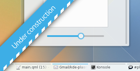
The KDE Visual Design Group is doing a terrific job across very different areas of Plasma Next, the little area I’m collaborating with is the Plasma theme itself (a lot more nice stuff in many different areas will arrive from them in the future). I must say I’m impressed by their work.
But what if I have a screen with a ludicrous amount of DPI?
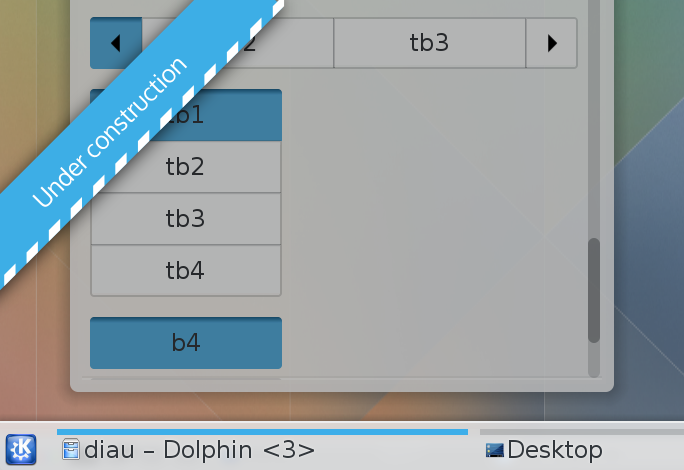
All of this is heavy under construction, so is still subject to a *lot* of changes until the final version 😉
So all the work to improve blur and the transpariences have became pretty useless because new theme won’t be taking advantage of them? Also, will the Qt theme be updated accordingly to match design ideas with this plasma theme?
>So all the work to improve blur and the transpariences have became pretty useless because new theme won’t be taking advantage of them?
As i said, it’s work in progress, final version will definitely be more translucent
>Also, will the Qt theme be updated accordingly to match design ideas with this plasma theme?
A complete visual refresh to the Qt style will arrive as well.
However, change will be gradual, so visual refreshes will arrive piece by piece, as revisions come by
Marco? I’ve always read “Marta” in the blog title, thought the little house was an “A”.
Please don’t feel obliged to make things translucent for the sake of it. Yes, a lot of work has gone into a nice efficient blur effect, but don’t let the perceived need to use extensively detract from everything. If one thing has been learnt from KDE 4.x and design generally, it’s that less is more.
P.S. the preview looks like a huge progressive step in KDE design, btw
Nooo, I can haz transulcency!
it makes icons pop and doesn’t look cheap when icons and stripes collade.
http://www.ella-zhu.com
Will the new plasma theme be suitable for plasma active next as well?
>Will the new plasma theme be suitable for plasma active next as well?
Yeah, definitely.
probably as in Air, there will be small tweaks in the active version, but not a complete departure
Maybe just put the stripe on top of the text(the two itens to the left) or just let the icon overlay the stripe(the two itens to right).
https://drive.google.com/file/d/0B3QTKJTYHD3jRUJDTTUyaUphQVE/edit?usp=sharing
Second try
https://drive.google.com/file/d/0B3QTKJTYHD3jNUtpa2s1dmt0UE0/edit?usp=sharing
I like that the space above icon is without stripe. Makes icons pop and doesn’t look cheap when icons and stripes collade.
Better, no stripes at all on inactive programs. Best: no stripes at all, period! I would prefer a cleaner way of distinguishing the active program. (Don’t ask me to define ‘cleaner’.)
This is all looking great. Very excited about the visual refresh
I’ts cool if having a lot of ABSURDLY TINY content on screen is a good thing for you, but I want to keep my eyes healthy, thanks.
To the author of the post: the new design looks awesome! 😀
Do you know how false the claim is that you need high PPI only to render objects larger?
The fact is, if you want to keep your eyes healty, you do NOT do that with larger objects. You do that by moving your display further away from your face.
Now look your computer display. Do you see it? Meter its distance from your body. Just raise your hand and touch your display. Can you touch it?
If yes, then you are way too close, move the display further.
If not, then check that there is at least 20-30cm space between your hand and the display.
Do you have that extra 20-30cm space between your hand and the display? GOOD!
Now you can be sure that your eyes strain stay much lower.
And do you want to know the detail?
Now as well your eyes need to change its focus when you move and look around because the distance change and you need to blink more to keep eyes wet.
Your bonus is, with longer distance a 105PPI display is way more sharper and detailed than if it would be distance where you can touch the display or even worse, distance where it is closer on typical laptop range.
But sorry if you are just unlucky one and you use laptop as main computer. If you do have only laptop, use a external monitor attached to it and get a good natural keyboard, because you don’t want to use any laptop keyboards and touchpads because they are very bad to your hands. And in fact, your laptop most often sets you to terrible sitting position.
And do you use computer on coach and bed? Just don’t. Do you sit on normal chair or those fancy office chairs? Just don’t, they will kill your back. Get a saddle chair if you value your body or start use standing table.
Because you are so worried about your eyes, then you definitely are concerned from your body ergonomics and you don’t use normal chairs and tables but ones what really makes your body to withstand long term working.
I value my eyes very very much. Thats why I keep display further away and I had to get higher PPI so that elements are smaller instead having a larger elements what are just bad to your eyes.
And if you really believe that higher PPI thing, do not read news papers, books or anything else because the DPI value in those is much smaller than PPI value in a normal market display. As the fact is, the DPI/PPI value isn’t the problem, the distance and size is. You want longer distance and smaller (optimal) size so your eyes needs to work and adapt continually from infinity to close. But don’t worry, no matter how much you train your eyes, you probably belong to 90% of the people whom eye sights just weakens once you hit 40+.
http://isthisretina.com/
Just so you can calculate your own display PPI value. Like with a older 24″ 1920×1200 resolution display, I was required to have 91cm distance to get a optimal sharpness.
Now with 2560×1440 and 27″ I could get display to 81cm distance but I keep where it was. That is just 10cm distance but it is a lot because now I have little wider view and my eyes needs to move left and right more, what makes me more relaxed because horizontal eye movement activates brain left and right parts more efficiently and it helps to focus to task and clears the thinking. (That is reason why psychologists use eye and hearing trick by simulating sides separately)
Think about you are using a typical laptop with a most common resolution 1366×768 and 15.6″ display.
You would need to use that display over 86cm distance as well. But your elements are larger and you really don’t have benefit from display being so small at longer distance as your working flow is ruined when you need to swap and move windows all the time and scroll a lot vertically and your eyes don’t move. And you really can’t write with the laptop from that distance.
I’m sure someone will construct some kind of widget for you to turn off the PPI adjusts if you don’t like them.
> Oh please don’t do what Apple has done that you can’t actually ENJOY from high PPI display!
on high ppi/dpi by default all will be zoomed, to have every control, every text etc in the same physical size as in a low ppi screen. (since it’s a font size ok to be readable from 50cm-1m of distance by people with an “average” eyesight, therefore is a good default)
However, if you prefer to have tiny components to “fit more stuff” you can always adjust the auto-detected ppi and “zoom out” everything, that remains a couple of clicks away, really 😉
I hope there will at least be an option to add arrows back to the scrollbar.
I hope too. Even that I don’t use and I keep my hided in QtCurve. But if you look the office workers, who are just so custom to click those arrows to move view few pixels, it will be huge problem to them.
Overall, I really like the clean, new look of these designs, especially the slider. Adding extra thick, grey bars to denote windows *not* being used though just seems to add extra visual clutter in the form of unneeded lines (one of the most common forms of design clutter in KDE’s otherwise excellent design imo). I’d suggest using shading and a glow instead of thick colored lines to draw attention to which window is currently active. If compositing isn’t enabled then you could have the shading, just without the glow. Anyway, here’s my mockup (it would look better if there wasn’t a shadow behind the glow, but hey, it’s a quick mockup):
https://mediacru.sh//BJB2CwMAR2Md.png
Yours looks much better. Clean and simple.
Exactly my thoughts! Nice first mock up. Consider treating the taskbar like the tab bar of a browser and steal design cues from there. Look at how firefox’s upcoming australis design does it. Just like this mock up but without the distracting glow.
Nice… I love this look !!
To the people that is posting their own mockups and ideas, there is a forum to discuus all the design details:
http://forum.kde.org/viewforum.php?f=285
I like the new style very much: simple, minimalistic, flat, clean and light on the eyes (exept for the stripes in the windowbar … I don’t know, what to think of it yet, but it tastes of additional visual clutter?).
How about to push the Oxygen style in the same direction: flatter, less depth, less strong gradients?
And for the windowbar, how about to get did of the text (name of the application) completely and just let the icon speak for itself? So you don’t have to care for an equal length ofthe window buttons anymore and especially for the faded window name, which I personally don’t find the most lucky solution. Could look more clean and elegant.
The window name could blend in on mouse over nevertheless.
OS X and Win7/8 already show, that it works and doesn’t confuse users 😉
Wow, excellent work, thank you!
Do you know if there are any plans for a visual revamp, specially the default icon theme, KDM, KSplash, etc.?
> Do you know if there are any plans for a visual revamp, specially the default icon theme, KDM, KSplash, etc.?
yes, there will be a visual rewamp of everything, however, it will be gradual, piece by piece,
Just to say thank you for making kde looks awesome. thumbs up
What I would love to see would be allowing plasma themes to have their own configuration options, such as translucency and colour (depending on the theme); Nothing horribly complicated, but just some basic options.
I’m unsure how the shakedown would work since the themes are in SVG format (embedded script?) but I do feel the need to completly fork a theme for slightly more transparency is a bit of a limitation. Even some sort of flat text file defining colours in the themes and what can be done to those colours might be an idea, such as…
#EEEEEE “backgrounds” transparency(.0-1, .9), hue(0-255, 0), saturation(0-255, 0), luminosity(180-245, 238)
#6193CF “trim” hue(0-255, 212), saturation(0-255, 135)
#ORIGHEX “label” valuetype(min-max, default), valuetype(min-max, default)
So something like this would allow people to complretly change the white backgrounds to a subtle colour, and modifly the blue to be any colour/saturation. It would also specify defaults on top of the origional HEX value (if supplied) so theme authors could use easier placeholder colours during editing (like red) and easily adjust defaults though the theme file. Inside of plasma, users might be presented with a simple set of sliders, each corrosponding to a value. With bounds set in the config file, you could also make the user unable to produce an unusable theme.
Not immediately, but eventually should become possible to colorize themes since we are slowly migrating from hardcoded colors in the svgs to css-based ones