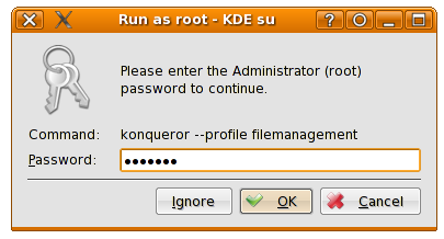
Since I’ve always given too much importance to the superficial appearance, I was very uncomfortable with the default KDE password lineEdit look (that hides the typed characters with asterisks) in contrast to the one of Windows XP or Gnome, where the passord characters are hidden by a bold dot, being vertically centered it’s much more appealing.
Yesterday on Damino’s blog I discovered that this could be achieved straightforward with few lines of code in the style, it seems that it was first used in the QWindowsXpStyle bundled with QT. So I can only give a big thank you to him 🙂
Now I feel like the urge to rip it off into polyester :-), so there is a sneak peak of the upcoming version: