Tag Archives: linux

Again on the unsystemtray

BlaBla

I see last entry sparkled a bit of discussion, so a recap is needed on what are the goals of our redesign for the ground up of the systemtray, form the low level protocol to the visualization.

The systemtray was almost always intended as a “notification area” (this always was its official name) and most implementation until now failed at it. The Windows systray failed because every commercial application wanted to put its “brand” on it, the X11 systemtray failed even in a worse way, because there was zero communication between the applications and the systemtray and there was no semantics at all in the items.

So the visual representation had to be pretty limited, it could just put there all the icons that registered themselves and nothing else.

The “notification” nature was failed by the fact that is was just an huge disorganized list of everything and the kitchen sink, so the option to manually hide some of them got in. This was again a failing of the notification concept, a manually hidden notification item can’t notify anything right?

But hiding icons would not be a bad thing if you can ensure that the ones that are actually notifying something are indeed visible, so -manually- hide/show icons can’t work.

That’s one of the reasons we wrote a whole new protocol for those items, called StatusNotifier (and -not- sytemTraySomething), this is already being implemented from third parties, for instance the next Ubuntu release will make extensive use of it. In the new protocol, an item is in a passive state unless it decides it really needs to be active (i.e. has some useful status information, like the battery charge) or is notifying something really important (like, the battery is running out).

Any information that doesn’t belong to the latter two cases, simply should not be there, as well doesn’t belong there its usage as a tiny taskbar, that will go completely away in the future (probably to go on another widget or in the taskbar itsef).

As a result, the visualization (that is what’s is improperly called systemtray) now can use much more data than before and can give to the user a representation that makes semantically sense, like showing only “real” notifications in the notification area.

Now the hidden items are a menu, because since an hidden item means it has no notification value, it just have an “interaction” one. so you probably need to access it just to trigger a function, like accessing one of its menu items (that will become a submenu of the main menu) and not anymore.

This design is a radical departure from the previous one (I would go as far as saying that is not a systemtray anymore, or at least that should be the target), so in the current Plasma widget there will be no room for the old behaviour anymore (so no configuration option to make it behave like a totally different widget, that should indeed be shipped as a different widget). However, the modular nature of Plasma, makes it really easy to replace the widget with a different one, maybe derived from the 4.4 branch (that by the way will stay buildable for the whole 4.x lifetime), so if there will be enough demand, rest assured a different widget for your needs will be available somewhere.

Small systemtray change

Software

And now a new micro feature for KDE SC 4.5 🙂

Since today you’ll note that the expand button on the systemtray got rotated: weird isn’t it?

closed 4.5 systray

That is because it doesn’t expand anymore the systray to show hidden icons, instead when you click it, this is what happens:

opened 4.5 systray

There is a popup menu with all the hidden items in it, perfectly interagible and with a text label near to them: the rationale of this change is simple:

  • Hidden icons are rarely seen, it could be hard to recogniza them when you need one, so the label is very helpful
  • Often you expand the panel only to access a function of an hidden icon, then you don’t need te expanded systray anymore
  • Expanding the systray the unhide button actually moves, so it’s not immediate to close it again
  • When the systray is open, there is no way to distinguish icons that are norally visible and hidden

This has been done pretty early in the 4.5 cycle, so it’s still open for change, feedback and the due bugfixes 🙂

A vertical Plasma

Software

Two little extra videos linked to the previous post, this is always plasma-netbook and plasma-mobile running on the JAX10 with Moblin, this time with the screen rotated to vertical.

It is a bit of an hack since the device doesn’t have an accelerometer and the touchscreen needs to be recalibrate every time the screen rotates, but is neat as a proof of concept, because neither Plasma Netbook or Plasma Mobile were never designed thinking about vertical screens, but in both cases, always keeping in mind we are at early prototype stage, they work quite well.

Something to be noted, fullscreen plasmoids tends to look a bit better on a vertical screen rather than an horizontal one, and our on screen keyboard works already quite well, even tough it’ll need to show less keys when in a tiny screen

OGG version


OGG version

A mobile Tokamak

Software

Suse officesSo another Tokamak went by, it is always sad to leave from this amazing group of people, but there are also two good things on that: 1) you know you will see them soon. 2) you know a really impressing amount of work has been done.

One of the big focus points of this meeting was how we tackle the new mobile devices, from a Plasma and more general KDE perspective.

It was a bit strange for me, because it didn’t involve as much coding as usual, but a lot of work on getting the KDE build working well on a particular mobile device.

We had three Compal JAX10 devices loaned from Intel with installed an image of the Moblin environment, version 2.1. While both software and hardware wise they are still a bit far from a “commercial” release, but that’s exactly what makes them interesting.

Everybody hackingThis is a device with capabilities pretty near to a netbook, however it has a totally different set of limitations and requirements.

Here we don’t have a normal keyboard, but just a little slideout one, and we have to remember that some of the devices of this class won’t have a keyboard at all. Of course there is no mouse/touchpad as well, this means all cursor input is done via touch screen.

With a touch screen some interesting things happen: precision becomes really poor, so we need bigger targets. Moving the cursor and pressing the “mouse button” happens at the same time, so you can just click: anything that relies on mouse hover becomes immediately useless. Screen edges, the most reachable area with a mouse, becomes the less convenient one to use

Anyways, it was an interesting experiment: how far we can get, in a single week, starting from the bare libplasma to do an user interface for a device like that?

In the end we ended up not with one interface but with two: I adapted the Plasma Netbook interface to some of the quirks typical of a touch screen (a lot work still has to be done) and I obtained something that works quite well as a general launcher for touchscreen based tablets, that still can use an (adapted of course) version of desktop applications mixed with the “newspaper” concept (where “turning pages” will become a really natural concept) and Plasma Widgets that will run as a full screen application.

Here is a short video of the Search and Launch usage (a rough prototype had already been shown some days before Tokamak, now it’s starting to work really well): it shows the horizontal scrolling of the results when the little touchscreen is landscape and the drag and drop of items around: really important there since the little actions on mouse over don’t work there: also for deleting them a particular drop target with a little trashcan appears. Another important point is that now on a touchscreen a drag (being of the results view, of an icon around) begins with an enormous treshold compared to a desktop/netbook: in this way it adapts to the really low precision that a finger has on a touchscreen.

OGG version

And the last concept brings us to the design of the other user interface: on a really small mobile device, such a phone, it will become simply impossible to use the regular full applications (logic and ui will have to be decoupled). Many Plasma widgets have a quite small UI, so as far as real screen estate is concerned they can work suprisingly well on small screens, they also make extensive use of touchscreen friendly concepts, like flickable scrolling views and drag and drop (even some basic multitouch support, like pinch zooming, if ony X could :p)

Some widgets, like the Opendesktop plasmoid work really well already, with just some fixes to be done here and there.

Another advantage using the Plasma widget library is that being based on QGraphicsview, they are on top the same framework of Maemo 5 and Maemo 6 ui, allowing coherence and interoperability.

On devices like a phone, we will probably also need a different primary user interface, since the size will be even smaller, not only in terms of resolution but most important, in terms of real size (the JAX10 and the N900 are both 800×480, but the N900 has more dpi, so a smaller screen)

Another reason we can want a different ui for a real phone are the main use cases, for instance here i want to be able to reach the actual phone dialer with as less gestures as possible, and the target use case is even more “casual” for function that are not related to telephony itself.

We had some design sessions about the use cases, interaction paradigm and code design of it, then Nuno produced some really beautiful graphics and mockups. Artur and Alexis sat down and implemented a proper full featured plasma shell over that mockup and got it working in an impressive short amount of time. As I said, I couldn’t code much on that (but I plan to fix it in the next days;) because my job was mostly getting everything working on the JAX devices, so long sessions of building, patching, rebuilding testing, fixing and rebuilding again. Artur has a really interesting post on it too, as well as Alexis.

At the end of the week we produced a video that once released (will take some time to edit) will explain what we did and our plans in detail.

As a preview, here are two short videos that show what we got at the moment.

OGG version

OGG version

Tokamak, days 3, 4 and 5

BlaBla

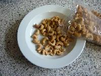
Cashews!
Days at Tokamak are running out very quickly: last days we had a very frenetic activity: for me it was spent mostly around adapting aspects of the Netbook Search and Launch interface for touchscreens. It’s impressive how good it looks already with so little changes of code

.

Alongside of that, we are designing a different interface for another different kind of devices: smaller mobile devices, as small as smartphones (hello n900 🙂 or various ways on internet tables.

We have here some N900 and 3 little tablet devices lended by Intel (Compal Jax10 with a Moblin image installed on it actually). I must say the Moblin SDK is quite easy to use, I’m pretty happy with it.

It’s really important for us to actually get going on mobile devices, because with our platform as insanely flexible as it is, we can deliver a really coherent user experience across the board, starting from the desktop, going down to the netbook, to little tablets and cellphones.

Almost entirely different UI, but with an impressive amount of code shared between totally different form factors. That’s the beauty of having a clear separation between the logic and the ui, having a rich framework that helps to keep the ui layer as thin as possible.

We’ll also going to expand theming capabilities by offering the possibility for Plasma themes to offer custom animations…

What does it mean? It will be able to customize the user experience a lot, not only with different desktop themes, but also across different devices, where the interaction patterns and different resource constraints.

It will use of course Javascript, for usual requirements of multiplatform deployment without rebuild and more robustness/security/ease of writing.

In the short term what it means? Expect tasty screencasts in the next few days and new cool shiny toys to play and develop with in the next KDE SC releases.

A remote notification

Software

In KDE SC 4.4, thanks to a very successful Summer of code project, is now possible to share your running widgets to the local area network. This opens a whole lot of new possibilities, but as every brand new thing, it still did not come to full potential, but is something that developers will have to play with to start to have really interesting applications.

In 4.4, is possible to remote control your media player by publishing the nowplaying applet. Is probably the most obvious application but it’s just a start.

Since I’m refactoring the notifications and jobs for 4.5, it came obvious that it would have been a pretty good use case.

Imagine you started a pretty important file transfer on your main pc and you want wo know when is done, but now you just want to go watch tv on the couch, you can just bring to the other room your netbook or your mobile device, so your options are:

Going polling the other room every 3 seconds (naaah:), use a somewhat overkill tool like vnc, or just share the notifications applet on your main computer 🙂

This video shows both notifications (KMail complaining about misconfigured mail acounts) ahd a short ftp upload job: on the remote pc is exported both the progress and the notification when the job is done (to answer ti the more obvious question, nothing is shared unless you tell to). Had to switch quickly between the two screens, so looks a bit Blair Witch eheh

OGG version

This is not available under KDE SC 4.4, because the notifications system had to be refactored a bit to support that (and there were also some important bugfix that will be in 4.4.1)

As an advices for who does the Javascript jam, provided that you use the last bugfix version, is: use dataengines as much as possible, then you will be able to do really interesting things combined with this feature.

On a different note, tomorrow I’m leaving for Tokamak 4. this will be a really interesting week where I’m sure something cool will come out of, I’ll keep you updated 😉

Drag, drop, search and launch

Software

KDE SC 4.4 is just out of the door (by the way, what an achievement, woha :D) and as our tradition we are already cramming features on trunk, that will be KDE SC 4.5.

In plasma land you will probably see more things in the tone of polishment and refinement of stuff already there rather than completely new stuff. But since the fourth Tokamak is approaching, expect something really really tasty coming out of it 😀

But now there’s a little appetizer: in 4.4 in the Search and Launch interface of the netbook shell is possible to add favourites and remove them by clicking on the little “-” icon

While that’s good and will still be available, now is possible to add favourites where you want with drag and drop from the results view and move them by just dragging around.

The drag operation will start with a pretty low sensibility, making possible to still scrolling the view by dragging.

For instance since the results view scrolls vertically, if you drag vertically the view will just move, but if you drag horizontally over an icon, after a while a drag operation will start.

This feels pretty natural and make it actually usable on touchscreen and mobile devices, as it’s shown on this video:

OGG version

For the curious, that mobile device is a standard off the shelf thing, available from quite some time. That’s all I’ll say for now, during Tokamak wou’ll hear many more details about this and many other things 😉

So yes, I’m definitely…

The future of notifications

Software

Warning: this post belongs to the category of the evil teaser ones, that announces features for the release after the next near one 😀

KDE SC 4.4 has some improvements to the notification system, as I shown there, but still some problems remains:

The popup can still be very big, covering a big part of the screen, stealing input area or just being too big for smaller screens.

Also, being notifications and jobs shown in the same window, it automatically shows again and again the same information, being the individual job progress when a new notification arrives r vice versa.

So, things are changed a bit in trunk (so what will be 4.5) let’s look at a video worth more than 1024 words:

OGG version

This is of course still subject to change a lot before 4.5 release, but it’s on the right track.

When a new notification arrives, it is shown by a popup on its own, without jobs progress. This popup only shows a notification at a time partially covering all the others (maximum 4 total) in order to save space. to see a covered notification is enough to pass the mouse over its title.

The big popup accessible by clicking the “i” button is still quite big indeed but is only shown when the user asks explicitly for it. it shows the usual individual job progress and the old notifications browser introduced in 4.4, where is possible to filter by application. Is a convenient place to search what happened to the PC when you were away for instance.

Similarly, when there are jobs running, the big popup is not shown, but only a really tiny global progress bar, that can even covered by the windows, so won’t be blocking any mouse input to precious areas of the screen.

Another nice thing is that if you compare it with widgets like The microblog plasmoid or the opendesktop ones you see that a very common design pattern is emerging for similar things, making the experience pretty consistent.

notifications and microblog

Netbook, Pages and what they’re for

Software

As presented on this blog a bit ago the central and more important view for Plasma Netbook Shell is this so called “Newspaper” activity: applets are positioned in an arbitrary number of columns (default two), one on top of the other, scrolling when there isn’t enough space, giving you actually an “almost infinite” vertical real estate

At the beginning this was decide just for a screen size issue, but with time this has been revealed to be a damn good metaphor that could have been expanded, so let’s see what the direction is.

As said pretty much over the place, the “netbook” is not a little laptop is a totally new class of device, that is kinda inept to do what the computer has been used for ages, create content.

The shift we are seeing now, is a shift on using the computer to create content only in certain moments (i.e. work ;p) and most of the time just “consuming” content or creating only really lightweight type of content (hello microblogging).

A different beast, a different use

This is what has been called (and somewhat mistaken for) the shift towards the web based content, but is not just limited to that, the web is just the pipe to convey this content and often the web browser is a kind of a suboptimal tool to access some kinds of that content, but this is another story.

The netbook is the perfect device for a quick check of that content when you are on the move, or not want or have the possibility to use a bigger but sometime inconvenient computer.

Now, there is something that needs full focus of the attention of the user ad of the machine, like reading a big article on a website or watching a movie, and there is something that instead most of the times needs a quick “peek” at it to see if there is something changed, and -maybe- only in this case I’ll give full attention on that task, like:

microblogging: what my friends are saying? or just update your status with a line or two of text.

Facebook or sites like that: often just used as microblogging, if i need some more advanced features of the website i will give full attention to it

Weather: often all is needed is just a quick answer: will it rain tomorrow?

Email: at start just want to see the titles of the few last emails, only if there is something that looks important i will give the attention to emails right now.

There are other examples, like appointments, to-do lists and similar things.

The concept of giving “full attention” is indicated in plasma by that little “full screen” icon i talked about here, this is available both in the usual plasma desktop and in the scrolling page layout of the netbook. this button will launch an application, like akregator for the news widget and gwenview for the picture frame or just open the a web browser to the proper URL in the case of services like remember the milk or the weather.

Pages and activities

The concept of the newspaper is perfect for that, it contains widgets that will give this quick “peek” on the possible information sources one could be interested on the internet, giving a quick idea, as soon as the device is turned on on what could be interesting/important and what definitely won’t be.

This video gives a typical work flow of the netbook Plasma interfaces: it shows how is easy to add and remove “pages” and organize widgets in them, keeping the concept of “activity” that was introduced in the plasma desktop, so one could have a page that informs on what’s going on in several social networking sites, or showing some news from rss sources and so on, having another page activity that is more work oriented perhaps showing appointments and work related emails (widgets for emails and appointments still won’t be available in KDE SC 4.4, but they are in the works)

OGG version

Web client widgets

Here you can see some widgets that can attach to web services: the microblogging client, the 3 opendesktop plasmoids, and the Remember the milk client

network widgets

The first thing one can notice is how they look very similar, they’re pretty good at their task and some guidelines on how to do a widget like that can be extrapolated:

  • You may want to follow this look and behavior when the service you want to connect offers a list of “stuff” that can always be interesting to give to the user, such as microblogs, news items, friend list, email messages, whatever.
  • This list should be presented as occupying the total or nearly total area of the plasmoid (maximizing the content, minimizing the “chrome”)
  • don’t make assumptions on how big the widget will be, test it from a very small size (always think to run your widget in a cellphone and ask yourself if it would look usable in there), to very big
  • when there isn’t enough space, make it scroll the content, some UI elements (like the input field of the microblog applet) are in fact less important than the content, so shouldn’t be always visible stealing from the content, you may want them to scroll away as well
  • make it work in the panel, so in 90% of the cases you may want show the content in a popup
  • Scrollbars nested in other scrollbars are not really good, so when embedded in the newspaper the widget should get longer to not have a scrollbar (well if it won’t become -exaggeratedly- long)

Some of those points, like scrolling, automate resize and panel-friendliness will be got almost for free using standard Plasma components, like Plasma::ScrollWidget and Plasma::PopupApplet

In the future I hope (is this a new year resolution? i don’t know :P) more and more of this kind of widgets will surface, with the procedure to create them more and more easy and automated when possible (and I also hope to see them written in the simple javascript bindings). This kind of widgets will also be the key to start to colonize new type of devices, from cellphone like tiny things to 10 foot interfaces like mediacenters

Ah, by the way, hopefully

I'm going to Camp KDE 2010!

Where I will give a talk about all this stuff 😀

Plasma and KWin

Software

Those are not radically new features, but rather a refinement of what it was available in KDE Plasma Desktop 4.3

When the mouse cursor is over a task, the corresponding window gets highlighted (dimming all the others), this works for groups too, highlighting the goup’s windows. This was already available in 4.3, but it’s works in a way more reliable way now.

What’s new is that now moving the mouse cursor over the taskbar tooltips triggers the highlight effect too, useful to quickly pick a window from a group, since the thumbnails are now clickable too, activating the proper window.

Another new and very useful feature (even if a bit “hidden”), is seen around the middle of the video: if you click on a task group with Ctrl pressed, it doesn’t open the usual popup menu, but it triggers the present windows effect, giving you a fullscreen chooser of the group windows

Tasks should have text or not? The text in the taskbar is a really important disambiguation, so should always be shown when possible. but in some cases it’s just messy because there is not enough room. so now with vertical tiny taskbars or when there are really many tasks the text is authomatically disabled and enabled as soon as possible.

OGG version