Tag Archives: linux

KWin and tiling

Software

Personally I haven’t ever been a big user of tiling windowmanagers such as i3, awesome and what not, is not much the workflow style I want 24/7 out of my desktop, but there is definitely something something to say about that kind of multitasking when it makes sense, when is important to see the status of multiple windows at once for some particular task.

Plasma’s KWin has since a long time a basic support for tiles via the quick tiling support, by either dragging a window at edges or corners, or via keyboard shortcuts. This feature is very good, but very basic, and while there are 3rd party tiling extensions such as Bismuth which is a very nice thing, but window geometry managing outside the core always can bring you only so far.

Over the last month I have been working to expand a bit the basic tiling capabilities, both the quick tiling with the current behavior and a more advanced UI and mechanism which lets the user to have a custom tiling layout. Here it is a very short screencast about it.

tiling manager effect

Tiling is done by a full screen editor done as a fullscreen effect where is possible to add /remove/resize tiles. When moving a window if the Shift modifier is pressed, the window will be dropped in the nearest tile. Resizing the tile in the editor will resize all the windows connected, and on the converse, resizing tiled windows will resize the tiles as well. (also the traditional split screen quick tile will gain this feature, so if you have 2 windows tiled to get half of the screen each, resizing one will resize both)

Another use case we thought about for this tiling feature is to address people which have those fancy new ultra wide monitors.
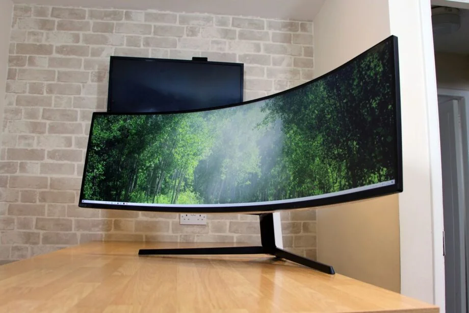
Random stock photo from the interwebs of an ultra wide screen

There are very few applications which have an UI that actually make sense maximized on such proportions (i could imagine perhaps KDEnlive, Krita and very few other productivity apps). Most applications just look wrong, but with custom tiling areas, those can become sub “maximization” zones.

It is not intended to be a full fledged replacement for I3 or Bismuth, but rather an hopefully robust mechanism in the core with a pretty minimal and unobtrusive default ui, then the mechanism will have scripting bindings which should allow for 3rd party extensions to use it and implement interesting variations of the tiling WM out of it.

For now the feature is quite basic, a notable thing missing which i still hope to get in time for 5.27 is having separate tiling layouts per virtual desktop and activity (for now they’re per-phisical screen), but hopefully the full thing should land on a Plasma 5.27 release near you.

Whops I didn’t mean to delete that

Software

This is a little sneak peek of a new feature that will arrive in Plasma 5.2 (OK, to be pedantic since frameworks has a separate schedule, you will be able to get it already next frameworks release a bit before Plasma’s)
Ever ended up deleting a desktop widget, panel widget or even an entire panel just to wish you hadn’t?
One solution may be littering everything with confirmation dialogs, but this quickly becomes annoying, besides the user becoming quickly trained to click “yes” without ever thinking about (I fallen too many times at this kind of dialogs).
So, what can be a better solution? Undo!

When the user deletes something, a notification pops up, notifying that an important thing has been deleted: it offers an action to undo the deletion.
If you click “undo” the widget or panel will instantly come back, if you manually close the notification, it will be irrevocably deleted.

On Plasma5: present and future

BlaBlaSoftware

This is the second part of my ramblings about the Plasma 5 release, just after it come out.
plasma-5-banner
This is a very important moment, after a massive amount of work.

What are the most important things that can make a free software project successful or not?
To me are principally two: user experience and developer experience.

User experience

The first release of Plasma 5 will start to make use of the work of a newly formed group in the KDE community: the Visual Design Group.
I’m very impressed how they managed to get a firm grip of many issues that are always been a problem in KDE software.
They are not only doing nice pictures, but rather starting to give real guidance to the design direction of the future Plasma and applications by KDE.
On the 5.0 release, the most visible thing will be the Breeze theme, that while still far to the final vision, it starts to show the clean and functional style (funny trivia: I remember discussing on the VDG forum about pure flat design versus using 3D effects for “interactive” controls, to give depth and intuitiveness for interactive areas… months before Material was presented. Those guys are definitely onto something.)

But it of course doesn’t stop to a theme and some icons:
what is more deep and a long term plan is to review the look, refinement and usability of pretty much.. everything.
Good design means also every single application has a clean and functional layout, and its “interaction flow” is logic, intuitive and derived from user needs rather than the technical details of the application.
An example of those things still to come is the new layout of System Settings that will come in little piece by piece, one by one in the future releases (The 5.0 release already has a new categorization, each release will move it a step more towards the final design).

Freedom, in all aspects

A big challenge in the design of Plasma 5 is that while providing a very simple and appealing experience out of the box, our central value is to put our priority in serving the different exigences of different kinds of users, because, as for devices, one size does not fit all.

The Plasma workspace is now even more flexible, on different devices it will sport completely different default user interfaces, because different use cases and different input methods require a different way to interact and a different way to present information (as lately even Microsoft discovered, in the very hard way).

And not only that, on your desktop or laptop, you can “build” a workspace experience as you please, optimized to your preferences.
We will never force you to a panel in a particular side of the screen, or to one task manager mode (taskbar vs dock) or to a particular desktop layout.
We well know that this makes the design process more difficult, but often the “easy” solutions are not necessarily the “correct” ones.
We give you a desktop that can adapt to you, rather than giving you a desktop you have to adapt to.

Developer experience

In later years, with the bigger emphasis on the user experience, the experience for developers started to take the back seat.
But we are a free software project, and its success is measured not only in users, but also in how many people would want to engage in an active way, and how comfortable are developers to work on the projects.
Being built on a foundation as strong as Qt, the software by KDE can also offer amazing tools for developers.
The recently released KDE Frameworks 5 is an important step in this direction: the KDE libraries are not anymore a big monolith but a set of very small, useful and independent libraries.

The base of the Plasma Shell is a framework as well: the Plasma framework, composed principally by two things:

  • The Plasma library: is the good old libplasma.. but it’s way slimmer and more focused than the KDE4 version: It doesn’t offer graphical widgets anymore, and doesn’t make any assumption on what graphic engine will be used (One could even build a shell completely based upon QWidgets with it, just because :p).
    It continue to provide easy access to packages, dataengines, asynchronous services and the save and restore functionalities of the layout, known as the Corona.
    The library solves problems that are out of scope for QML: from a surface with interactive graphical elements in it, it brings it to a “full featured desktop shell”.
  • The second part is instead a set of runtime components, of QML bindings that offer QML access to the Plasma facilities such as dataengines and svg themes and a set of graphical components to use in QML plasmoids and applications, such as buttons and text fields, that are converging, and will converge more and more with the upstream QtControls project.
  • In future releases there will be a comeback of the kpart to easily include qml-based informational dashboards into applications, and a runtime to launch plasmoids as simple independent mini applications.

Looking at the future

So, what are we planning for the future?

The stable, default core Desktop project will become more and more stable and polished, but the development focus will touch other use cases as well.
The Plasma Active port to Frameworks 5 is ongoing, as well the Plasma Mediacenter port, so the “different shell for different devices” story will be complete.
Of course our focus is not only about KDE on different devices, but also making KDE work tightly integrated with other kind of devices, thanks to projects such as KDE Connect. Interestingly, The Plasma Workspace 4.x series is today the environment with the tighter integration with smartphones (only with the next releases of their operating systems Apple is catching up, with a quite similar feature set).
You can expect this integration work being even more complete in future releases of Plasma 5.

Finally, the artwork presented in 5.0 is only a preview of what is still to come from the Visual Design Group: more icons, more complete widget set, more and more applications will receive a makeover look-wise and most importantly usability-wise.

On Plasma 5

BlaBlaSoftware

We are very, very near the release of the new Plasma release by KDE (more on the nomenclature later).
This is the first entry of a short series of blogs that take a look about the past and the future of Plasma, what we learned from the 4.x series, what changed, what we can take away and to expect for the future.

First, we were (and we still are) very happy about the status of the Plasma desktop as seen in KDE 4.x, but this doesn’t stop to wonder what can be improved.
The Plasma Desktop started to migrate towards QML since quite some time, but it was clear that the real focus in Qt 5.x would have been QML2.
That’s awesome, because QML2 solves many limitation in performance that QML1 and the QGraphicsView framework had in Qt 4.x.
But that was also a problem, since Plasma1 was tightly coupled with QGraphicsView, this meant: a lot of work ahead.
What we wanted, was the plasma platform itself completely independent from any graphical system itself.
From a big monolith-that-provides-everything, libplasma would have become a way smaller library (roughly 1/3 of the code of the plasma library in 4,x), providing a *model* for the layout, and utils as painting utils and the usual data access, but the representation of this model, would have been completely up to the shell (more on that next entry).

I remember starting a branch of libplasma back in summer 2011 at the Berlin desktop summit (that was also when the Frameworks development seriously started to seriously gain steam). The thing lived as mostly a proof of concept for a while.
Fast forward at the end of 2012 and we had a minimal shell that started correctly and could correctly restore a layout of applets, in a minimal desktop (no panel yet!).
The work proceeded and the features got back one by one.
In the meantime many new people joined the effort (Some thanks to Blue Systems, some volunteer) significantly speeding up the process.
Fast forward to the beginning of 2014 and it was possible again to use it as a basic main desktop (eat your own dogfood).
Just to give a little idea of the amount of work, there are around ~5100 Plasma5-related commits only on the plasma-frameworks repository, if we count all the workspace parts, it would be a way bigger figure.
It has been a long road, with some (quite) rough moments in the middle for sure, but looking back I’m pretty proud of what we achieved, of what i did, and what every single member of the team did to get here.
But this, this is

Just the beginning

This is the first release of a new chapter of Plasma, in which a new release method will be used to celebrate the diverity of the KDE community.
We used to have a 6 months “big release” of all things KDE, called in the beginning just “KDE”, then “KDE SC”, but this release is not that anymore, because KDE grown a lot in the past years, is not just that anymore, and “a single release of everything” scales only so much.

So, let’s take a step back and see what is KDE: it is a community that can offer you a range of very different things:

  • Want a primary user interface for your Desktop, Laptop, Tablet, Media Center? There is Plasma, tailored explicitly for the particular device is running on. Desktop and laptops have an interface optimized for mouse,keyboard and trackpad input, Plasma Active and Plasma Mediacenter are instead tailored on the constraints those different kind of device pose instead.
  • Do you need a particular application for a particular task? The KDE community offers a wide range of applications, from media players, communication tools, games, to a kickass office suite, to one of the best painting applications on the market (not best on Linux, not best among Open Source ones, the best, period) and countless others.
    They are free software, they are multi platform and supported by a vibrant community of developers.
  • Are you a Qt developer that is working on a new application, and need more functionality? KDE Frameworks offers a wide variety of libraries and frameworks to chose from that can dramatically decrease the amount of work needed to do a big, polished application.
  • And in the latter case, if you want, of course your project is more then welcome to join in the KDE family, as other formerly external projects already did, like KDEnlive or GCompris

This release of The Plasma Desktop Workspace can be used for day to day use already, even tough it’s based on very new technology, so some youth problems are expected as well. Also, while the integration between KDE4 and Plasma5 applications is good, you may want to wait more applications ported to Frameworks 5 before jumply completely full on a pure Plasma 5 environment.

The cycle

So, when a new version will arrive? how do you check if new applications come?
The development cycle will be much faster now: you can expect a new release of the KDE frameworks (so the libraries, *not* the applications) every month, while Plasma5 will be each 3 months instead for now.
Anyways, new goodies should hit your distro of choice way faster than it used to be in the past.

Next time, I’ll write about what to expect in this release and the next ones about the user experience, the developer experience, and random musings on the future.

Systemtray, Plasma Next and GTK

BlaBlaSoftware

You may have heard that KDE Plasma Next won’t support anymore the old X11,Xembed-based systemtray icons.
(More information here)

Years ago, we developed a nicer, model/view based alternative in which is the shell that actually draws the systemtray icon, allowing better integration with the workspace, it’s a specification that is now shared between KDE and Ubuntu Unity.
All KDE applications use it already, Qt4/Qt5-only application will use it depending on a small patch (and soon Qt5 will do out of the box)

But also GTK has some options: until today I was aware only about the Ubuntu’s appindicator library, but I have just been contacted by the author of another neat library, that can be found here on GitHub.
It’s a very small, few dependencies GObject-based library that allows a GTK3 application to export and control a statusnotifier-based systemtray icon. I just tested it on KDE4 and Plasma Next and seems to work quite well.
So if you have a GTK application that is using a systemtray icon, and you would like the icon to be integrated in the next version of Plasma as well, now you have an option more (and of course, the author will be happy of any patch/bugreport/bugfix).

Plasma2: all about elegance

BlaBlaGraphicsSoftware

Ok, I lied: it’s about elegance, performance, simple and great API, better user experience, more cross-device compatibility, in the end about improvement on all fronts.

And a very important thing is to gove an user interface more beautiful, tidier, more elegant.
One example is what Sebas talked about yesterday.
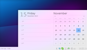
That new calendar is kindof a blueprint of how the UI of the Plasma workspace is being reworked: no huge and breaking changes, but fixing small layout problems, paying attention to the visual balance of the elements, and way better typography.
One thing that was pointed out is that its contrast or readability it was still dependent on what kind of wallpaper or windows you have behind it.

That’s what we came up with:
dadel2
(Note, the panel is from Plasma1, the systemtray and clock area will look much better 😉

Here what it’s changed: contrary to what it seems, the window is *not* more opaque than the screenshots of yesterday, but it’s a modification of the blur effect in KWin.

What it does, it reproduces the effect of seeing something trough a frosted glass: what do you see is a combination of what’s behind the glass, the color of the glass, and the reflection of light reflected by the glass.
This last part is what has been added: it adds a bit of light to the color, but unlike a semi-transparent white window in front, it conserves all the information about colors.
So while being almost white, therefore very contrasted with the text, but still looking happy and colorful, instead of more dull and opaque if the theme was white, 95% opaque.

Plasma++ at Randa

BlaBla

Pretty busy days here at Randa. On the Plasma front some important decisions have been taken and a lot of work is now being done in this direction.

There is now a big traction in rewriting our current plasmoids in QML, such as the notifications I talked about some days ago, and many more that are coming.

The plan for the future is to have 100% QML-based workspaces, with as little changes as possible feature-wise compared to the current one, just with a smoother feeling 😉

This is only the first part of the road, and this is arriving already today, with each release of the Desktop workspace more complete, while Active is already 100% QML from day one.

What will happen next? Together with Qt5, there will also be the release of the next major revision of QML, that expands the language and changes the technology behind. Among the other things, everything will be on an opengl scene and the JavaScript bits will be managed by V8.

This comes at a price: only pieces of the user interface that are written in QML can be loaded in an environment based off QML2. hat means the old code based on QGraphicsView (and part of the old C++ API) has to go.

This wasn’t an easy decision, but it will make things dramatically easier in the future.

  • On QML2, we’ll have a lot more performance, guaranteeing a way smoother experience (with QML2 you can get 60fps in 1080p on an humble raspberry pi after all)
  • More stable, because most user facing code (especially most 3rd party) becomes scripted
  • Easier to write plasmoids: lowers the barrier for contributions and lowers the barrier in experimenting new innovative approaches for the UX
  • Also the internal library will be way easier to approach for new developers, because it will be way smaller and simpler
  • It will also be simpler to take and use the Plasma library for new things, like in application’s dashboards, or just using its QML components.

This is a long term plan: The work on the new Plasma library version started now, and we expect a working shell based on the new framewok and Qt5 in about 18 months or so.

I’ve just got a first preliminary version of libplasma building without QGraphicsView dependencies, and the binary is about two thirds of the size it had before, so this is an encouraging start 😉

It’s again an exciting time when we can design a new architecture, have crazy ideas, trying them out, and any input or help is very appreciated.

You can see the progress of the tasks that are added as the work proceeds here, and talk or claim some tasks for yourself at the usual channels of communication, plasma-devel@kde.org or the #plasma freenode IRC channel.

Plasma QML documentation

Software

Just a brief heads up. As you know, from now on the recomended way to write plasmoids will be using QML only, and using the new components api for common widgets such as buttons, sliders etc.

What’s cool about this API is that is as compatible as possible with Symbian and Harmattan(N9/N950), so porting to and from those platforms just became a tad easier (That’s especially important in the perspective of Plasma Active).

The documentation of those components just landed on api.kde.org, and can be seen here.

Other useful resources for QML plasmoids:

A big thanks to everybody that helped writing the documentation, to Antonis that helped with the script for the generator and Allen that helped with the setup of the infrastructure to api.kde.org 🙂

Brand new Widgets explorer

Software

The rewamp of the KDE Plasma Desktop is continuing: in the 4.8 release it got a completely new QML based device notifier (already quite improved for 4.9), now a new redesign has landed in master, scheduled for the 4.9 release of KDE Plasma Desktop.

The Plasma widget explorer and activity manager have been rewritten from scratch in QML, giving it s much smoother look and feel, new animations for free and what I love most, a way simpler code base.

By replacing the activity manager and widget explorer with the new implementation, over 4000 lines of C++ were removed (traded with around 1000 of much more readable and maintainable QML): this makes it easier to maintain, easier to spot possible problems, easier to modify and experiment new ideas.

With the rewrite of the various components of Plasma Desktop in QML I expect to slash away most of its C++ code base, making the entry level for contributors significantly lower (and being able to finally close long standing bugs 😉

How does it look now?

QML widgets explorer

And the Activity manager: designed to look as coherent as possible with the widgets explorer:

QML activity manager

Here showing the inline ui to configure and delete an activity

The overall design is almost the same, but the layout has been redesigned to overcome a problem of the old implementation: it looked quite crowded and dirty, because elements were too cramped together, not very well aligned and sizes were quite eterogeneous. Now we paid a lot of attention about the sizes and positioning of the elements, as shown below, everything is positioned along a quite precise grid, that makes the view look less crowded that it actually is.

QML widgets explorer alignment

I a good trend can be established here, for each release of the KDE Plasma Desktop having some element not only rewritten, but its UI becoming significantly more elegant with few but important improvements in the look or in the behaviour.

Share, Like and Connect

Software

An important part of the Plasma Active Contour user interface is the connection between the objects that i can view with my tablet, like images, webpages, and documents with the current activity, to help to organize your work and fun.

I already wrote here about the activity screen: the main Contour workspace will show everything that is related to the activity and is the natural evolution of the Plasma Desktop activities (that will evolve in this direction as well as the integration with applications becomes deeper;)

The screencast below shows the usage in practiche of the concept I’m going to explain in the next paragraphs: Share Like Connect (SLC).

It also shows towards the end the progress of the Active image viewer application, a touch friendly image viewer that deeply integrates with the Contour UI in terms of Look&feel and technology, since uses Nepomuk as metadata storage backend and supports SLC

OGG version

So we have an interesting UI problem: easily buildthis relationship between objects and activities with just one click (or so;) without having to navigate trough an over complicated user interface.

So, we have a simply search interface right into the workspace, it works well for many use cases and is really simple, but what if I’m browsing a website and want to add exactly that website in my activity? (or a photo I’m viewing, or a document I’m working on Calligra…)

Copy the url of the website, go to the workspace and paste it somewhere? a bit overkill, isn’t it?

Have some UI in the web browser that lets me add the current site to the activity? Definitely better, but we would end up with a different implementation, and a slightly different UI for each application.. can we avoid that?

We also noticed how similar this problem was to another one: is very common that while I’m viewing something i want to share it with someone in some way: I could want to upload on flickr a photo that I’ve just taken, or I may want to send via email to someone a PDF that I’m reading right now.

On the desktop the current workflow is to leave your current application, go to the web broser or email client, search the file again and upload/send it.

On mobile platforms things looks a bit more convenient: many applications have built in the possibility to share the currently open file to some services, but each application has its own implementation, often having a slightly different ui to do the same thing, or support to different web services, maybe because the developers of the application wanted to push their own services (a random example starting with G comes to mind 😉

So, get back to the problem of connecting the current open “thing” to the current activity (avoiding “file” by purpose, since could be something that is not a file at all, like an URL) is similar to wanting to share this same thing with someone, or rate it, or add a tag, tweet it, like on Facebook…

Since we already log what is the currently open object (for how long, how often etc..) to be able to log history and construct recommendations, the external workspace knows this information.

We can provide actions in a global menu in the top panel to perform those tasks, divided under 3 menus: Share (upload on web services, send by email), Like, (rating, bookmarks, “like” on web services), Connect (connect to the current activity, to an event in the calendar, etc).

Each action is implemented by a plugin, and plugins can be written in both C++ and Javascript, making it possible to download them on the fly from the Web

A first version of this global menu will be available with the first release of Plasma Active, and will eventually make its way to Plasma Desktop as well.