I’ve uploaded a little bugfix release of Tasty Menu.
it fixes three minor glitches and most important it has a Russian translation by Yurkovsky Andrey, thanks dude 🙂
Tasty Menu 0.7.1


I’ve uploaded a little bugfix release of Tasty Menu.
it fixes three minor glitches and most important it has a Russian translation by Yurkovsky Andrey, thanks dude 🙂
Just released Tasty Menu 0.7, this time there are also some minor cosmetic changes, I hope this time will compile out of the box at the first try 😛
Grab it if you dare 🙂
Little changelog as usual:
-configurable button text label
-configurable menu button pixmap
-item descriptions can be turned off
-optional “save session” entry under the user button
-configurable popup text
-the button no longer appears on mouse over, instead the background becomes lighter on mouse over and darker on mouse press
-when the user clicks on an empty area the last item is no longer activated
-Italian translation
I’m working around some improvements of Tasty menu for the 0.7 version, along with some bugfixes you can expect a little bit more configurable look and feel, so you could obtain something like this (just for fun :P):

Yeah, there is still no true theme support, and probably there won’t be, because one of the most important points of Tasty menu always was being consistent with the rest of the environment, i always found skinned apps a little bit out of place, but it’s a matter of taste 🙂
Yes, it’s still alive, recently I just had ZERO time to take care of it, and I’m not going to have more anytime soon 🙂
Btw, the today’s new version has just some bugfix of most annoying things and a micro new feature.
Grab it when it’s still hot 🙂
The mandatory changelog:
-fixed menu placement when it’s on the right side of the screen
-now both the recent applications list and the most used list works
-some cosmetic improvements in configuration dialog
-don’t reopen the current submenu when the user clicks again on an already open category
-now clicking on categories of right column expandes/collapses them
-“always collapsed categories” option available also if “show tree expanders” is off
-fixed compilation issues with autoconf >= 2.60
The work for KDE4 HIG is on te way and let’s see if KDE4 it’s gonna be the most useable environment out there.
Some days ago I’ve read on el’s blog about her work on the guidelines around the configuration dialogs. At the moment the work is around tweaking prototypes made on Qt designer, as you can see in this example, this is a quite complex dialog and the main difference between this type of dialog and the current kde ones is that the layout is centered, the labels are right aligned and the main widgets are exactly aligned and have the same width, giving the dialog a lot less cluttered aspect and seems simpler, even if it has the same number of widgets than a traditional dialog.
The main problem of doing a layout like this is convincing Qt designer to align the widgets as you have in mind and not being too smart…
For the few times I had to use Qt designer, I’ve come with a love/hate relationship with it. Love because it’s one of the most powerful tools for creating a GUIs around here, for example, I still remember with horror how impossible it was to create a decent looking layout with Delphi (an ancient version when I was still trying to use it, looong ago :D). Hate because sometimes it really tries being way too smarter than the user, and especially when using the grid layout it puts the widgets in the most improbable places, and the impulse of beginning to edit the ui file with a text editor becomes so strong :-P.
In this article I will point out some veeery empirical guidelines on how to design a form without getting mad. It will be based mainly on the this dialog used in el’s blog entry, both because i’t a quite complex example and because I’m not expert in usability, so all the tips will be on how to make it in the easier way than in the most useable way and oh, also because of lazyness 🙂
Qt has that neat feature of the grid layout and is the type you probably want to use for almost every dialog more complicate than a simple pile of widgets, but unfortunately is one of the most difficult to work with, being essentially a table and if you have worked a little bit with html or word processors you know that they tend to be wery tricky to work with :-).
So let’s see how a grid layout is done in the Designer’s ui XML files (that has a very straightforward translation in the generated c++) let’s start with this very stupid dialog:

And the source code of the interesting part is:
  <layout class="QGridLayout" >
   <property name="margin" >
    <number>9</number>
   </property>
   <property name="spacing" >
    <number>6</number>
   </property>
   <item row="1" column="1" >
    <widget class="QPushButton" name="pushButton_4" >
     <property name="text" >
      <string>PushButton</string>
     </property>
    </widget>
   </item>
   <item row="1" column="0" >
    <widget class="QPushButton" name="pushButton_3" >
     <property name="text" >
      <string>PushButton</string>
     </property>
    </widget>
   </item>
   <item row="0" column="1" >
    <widget class="QPushButton" name="pushButton_2" >
     <property name="text" >
      <string>PushButton</string>
     </property>
    </widget>
   </item>
   <item row="0" column="0" >
    <widget class="QPushButton" name="pushButton" >
     <property name="text" >
      <string>PushButton</string>
     </property>
    </widget>
   </item>
  </layout>
As you can see every item of the layout has the row/column coordinates that determines how the table is done; a quite different method from for example HTML.
But there is one part that is very similar to HTML and that is responsible for most problems. The following dialog has only three buttons, but the right one is in the middle.

The source code is:
 <layout class="QGridLayout" >
   <property name="margin" >
    <number>9</number>
   </property>
   <property name="spacing" >
    <number>6</number>
   </property>
   <item rowspan="2" row="0" column="1" >
    <widget class="QPushButton" name="pushButton_2" >
     <property name="text" >
      <string>PushButton</string>
     </property>
    </widget>
   </item>
   <item row="0" column="0" >
    <widget class="QPushButton" name="pushButton" >
     <property name="text" >
      <string>PushButton</string>
     </property>
    </widget>
   </item>
   <item row="1" column="0" >
    <widget class="QPushButton" name="pushButton_3" >
     <property name="text" >
      <string>PushButton</string>
     </property>
    </widget>
   </item>
  </layout>
the property rowspan=”2″ tells the right cell to expand in two rows.
In the same way the property colspan expand the cell of the given columns.
This is a very powerful property that lets you draw very complex layouts, but usually you can’t force Designer to use it where you want, it always guess from the layout you have drawn, so you always must very precise; for example in this particularly bad drawn form  in theory you could expect a result like that
  but if you click on the grid layout button you get that monstruosoty:
  that correspond to this table:
  As you can see there are three empty cells (the bottom two resulted from the wrong vertical alignment of the right spacer) and a text label with rowspan=2 where it shouldn’t be.
This is a simple example, but in more complex dialogs this phenomenon could be very subtle and hard to spot.
Let’s start with the bare dialog of the above example and we will progressively populate it with more widgets.
First of all, when you place the widgets, you must be very precise, in order to avoid the above problem. You should give to the dialog the very same aspect that you plan for the final one; usually the Qt tutorials emphasize that you don’t have to be very precise and will be designer that line up the layout, but thrust me, you have 🙂
In this example, the left and right spacers must be exactly aligned with the label and the textbox, in order to avoid unneeded empty cells and the labels should be aligned well with the corresponfig text boxes.
Hint: for the most delicate parts (here the two spacers and the textbox) you can make an horizontal layout and then break it, only for obtaining the components placed well.
When you ‘re done you will obtain the structure of the following table:

I always find a great help thinking about what structure of table, and what rowspan/colspan are needed in order to achieve a particular result (I know: HTML wreaks mind :D).
You may have guessed that the hard part of this article is making all the layout always centered and keeping the ideal line between the text labels and the line edits (or other kinds of widgets) continuous. So what happens when we introduce some titles that are aligned to the left that makes impossible to still use only two spacers, like this image?

You have to consider the layout broken in different logic “blocks” separed by the item that is not centered (in our case that bold labels), and then use one and only one spacer for every separate “block”.
In this step we end up with this dialog:

Nothing particular here, in order to avoid to render the main table too complex and avoiding ugly surprises, I suggest to grup the groups of widgets with an horizontal layout.
If there are widgets without label could be helpful to put a vertical spacer instead of the text label just to make sure that designer understand that cell should be void; it’s not necessary, but if you modify the layout designer could screw things up.
Sometimes you have two or more lines containing more widgets that are almost identical and should be aligned in a grid, otherwise they would look very bad. In this case you will end up with a multiline block that will have a rowspan of 2 (or how many lines you will need) with the text labels (as many as the rowspan) aligned on the left of the group.
If you want a layout like this  I would say that a grid too big should be avoided (as usual, this is not a tip about usability, but only about what is simpler to do). The ugly thing is that you have no way to align items in a grid if there is a title in the middle that breaks the layout.
The only way is to align them into the main grid, but you can use this trick only one time, because another grid of different items would break down everything.
And there it is the final result, with the sources 🙂 
Or at least I wish I could say that 😛
By the way, now it should be a little bit more stable.
The obligatory changelog:
-command to clear the recently installed applications list
-Application categories cand be made collapsable and appear collapsed by default
-left mouse button menu on menuitems that lets to add/remove bookmarks and edit the proper submenu with kmenuedit
-the add bookmark icons should work better
-Fixed a bug that prevented svg-only icon themes to display correctly
-Added a very basic Strigi integration
-When resizing the menu in window mode the size of the three columns are updated correcly
-Fixed a crash when a no longer existent app is in more used / recently used list
-Fixed another probable cause of crash
And the even more obligatory download link 🙂
Updated today with a bunch of enhancements:
0.5:
-(Hopefully) fixed some other crashes
-the big tooltip is enabled only when also the other kicker’s big tooltip are enabled too
-the menu can be made a normal window (the upper right arrow toolbutton)
-the highlighted item in the middle column is always the currently open category
-busy mouse cursor when searching
-corrected a bug that prevented to use the left column after a search in ceratin cases
-added a “Configure global shortcuts…” command in the LMB menu
-user button and “switch user” buttons merged in one button
-added a “Run program…” button
-open submenus on timeout also when the mouse button is not pressed, so now when the mouse button is down the delay is 250ms when is not pressed 1 sec
-clear button on the right: it is dramatically nicer looking now 🙂
Download it when is still hot 🙂
Yes, Tasty Menu crashes more than Windows 95 🙂
In this release I hope to have fixed many of the crashes that occured, but of course I fear many bugs still remains.
So the two major highlights are a less frustrating and more stable experience ™ and the notification of recently installed applications that I was talking about here in the last post.
As usual, you can download it here.
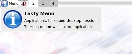
The common complaint about every desktop (with every=(Gnome||KDE)) is that it’s difficult to spot where the recent installed applications, maybe now it’s finally over: Tasty Menu will notificate into its tooltip how many application have been installed and the menu will highlight the categories where the icons of the new aplications are. It’s still not perfect, unstable and heavy, but it’s starting working.
So when someboy else complains about this, he will be punished with 5 uninterrupted hours of Magical Trevor 🙂
Again another release of Tasty Menu.
It is slowly getting shape, my TODO list is shrinking more and more.
Summarizing a rough changelog:
0.3:
-Keyboard navigation
-Right-most list doesn’t open groups on mouse over
-More evident focus on lists
-Added a left mouse button menu
-Menu size configurable
-A more clear highlight of the currently opened submenu
-Simple integration with Kerry Beagle
-Added a big tooltip like other kicker applets (no it isn’t the cool tooltip of kicker, because at the moment it isn’t usable by 3rd party applets unless big and ugly code duplication)
-It’s possible to override the global shortcut Alt+F1 to make it open Tasty Menu instead of KMenu (default disabled)
-Uses KconfigXT
-The menu button text label can be disabled
Of course you can download it from here