A new release of Kirigami is about to come with the new version of KDE Frameworks about to be released, 5.38.
This is an important release, which bumps the import version to 2.2, because has a very important new feature: A brand new (but retrocompatible) color theming API, which allows different areas of the application to have different color domains, allowing for instance parts of the application to have a light color palette and parts of the application to have a dark one.
This model is modeled after KColorScheme which is very powerful (even tough sometimes underused): as KcolorScheme will be actually used when running on Plasma Desktop (just a runtime plugin, it won’t depend on it, so dependencies on Android or other platforms are not affected) it will allow us to integrate tightly with the other applications made by KDE.
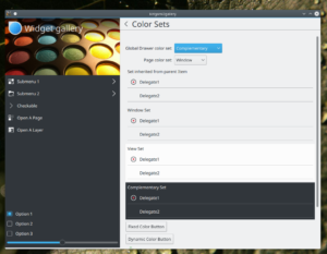
Here you can see the example Kirigami Gallery which has been set to use different color sets in different areas:

Kirigami Gallery with the Breeze widget style: areas with a different ColorSet, widget and icon colors following
Here, this is how choosing different color sets for different areas of the application looks on Android, using the Material style:
Theme.colorSet
The Theme object in Kirigami used to be a singleton (and still is, for full compatibility when the 2.0 or 2.1 version of the import is used), but is now instead an attached property: which is source-compatible (no rewrite needed in your apps, except bumping the import version to 2.2)
You can color differently an area of you application with the following code:
 Item {
    // tells the Theme no not inherit the color set from parent objects
    Kirigami.Theme.inherit: false
    // uses Complementary color set
    Kirigami.Theme.colorSet: Kirigami.Theme.Complementary
    Rectangle {
        //this color will come from the Complementary set
        color: Kirigami.Theme.backgroundColor
    }
 }
Another example of a (very minimal) full application which has the Global Drawer in the Complementary color set:
import QtQuick 2.6
import org.kde.kirigami 2.2 as Kirigami

Kirigami.ApplicationWindow {
    id: root

    globalDrawer: Kirigami.GlobalDrawer {
        Kirigami.Theme.inherit: false
        Kirigami.Theme.colorSet: Kirigami.Theme.Complementary
        title: "Hello App"
        titleIcon: "applications-graphics"

        actions: [
            Kirigami.Action {
                text: "action 1"
            },
            Kirigami.Action {
                text: "action 1"
            }
        ]
    }
    contextDrawer: Kirigami.ContextDrawer {
        id: contextDrawer
    }

    pageStack.initialPage: mainPageComponent

    Component {
        id: mainPageComponent
        Kirigami.ScrollablePage {
            title: "Hello"
            Rectangle {
                anchors.fill: parent
            }
        }
    }

}
Colored monochrome icons
In the above screenshot, you can also see that the icons used there are colored accordingly to the same text color of the ColorSet of the area they are in. When loading in Plasma Desktop, we have the luxury of loading such icons with KIconLoader, which can process SVG-based icon sets with stylesheets, so we can actually have in the icons areas colored with particular named-colors, which correspond with the Theme’s named colors (like textColor, backgroundColor, highlightColor, negativeTextColor and so on) for instance is important that a record icon like the one shown in the screenshot has a red dot as this is the universal accepted iconography. The monochrome icons in the Breeze icon set are “almost” monochrome, with those few colored accents used very sparsely, just when really needed and give definitely a nice touch of polish to the visual identity.
On other platforms they are just treated as monochorome and the whole icon is colored.
Better integration with Plasma Desktop and QWidget style
A QtQuickControls2 style has been written which uses QStyle to paint controls and will be used by default in next Plasma releases (from 5.11 onwards), this is released as a framework as well in 5.39, called qqc2-desktop-style
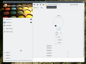
Here a screenshot of the Gallery using Oxygen widget style and icons:
Different platforms plugins
The framework qqc2-desktop-style also contains a plugin that is dynamically loaded by Kirigami, which bridget the Kirigami Theme.* concept to KColorScheme, making Kirigami apps follow the same palette, as well as using KIconloader to load icons, being capable to apply color stylesheets to Breeze icons.
On other platforms, simpler plugins will be used to not drag dependencies and integrate better on whatever platform they are (like Material on Android)
What about fancy icons on my QWidget app?
Since several KF5 releases, Breeze icons in QWidget-based apps can follow the system palette, so when using a dark color scheme, icons will become white and so on. However: what about using a light color scheme in some areas and a dark one in some other areas?
Since 5.39 KIconLoader has gained a new method, setCustomPalette(), in which you can override the colors for a particular KIconLoader (the app will then need to use different KIconloader instances intended for different areas of the app). Pay attention that in that case you will have to monitor the QApplication palette change and eventually update that kiconloader palette by hand.


Should probably read 5.39…
I am using kirigami for a personal project and it rocks.
Thank you!
qqc2-desktop-style looks AMAZING. My biggest concern with Kirigami and QtQuickControls2 adoption was it ignoring having native look n’ feel and now it’s gone. Thank you!!!
Is possible to use Material style for apps on Plasma Desktop ??
> Is possible to use Material style for apps on Plasma Desktop ??
It is a QtQuickControls2 theme, so it is possible, but only for apps written with that, not for old apps written with QWidgets or QtQuickContrls1
Pingback: #Kirigami and color palettes http://notmart.org/blog/2017/10/kiriga… | Dr. Roy Schestowitz (罗伊)
Pingback: Links 6/10/2017: Systemd 235, Cockpit 152, More Kirigami | Techrights