


Did some work on the code of that little tiny things that lets you move and configure the Plasma applets, the poor ol’applet handles that really needed some visual love(tm) and some speedups, so the result is the following:
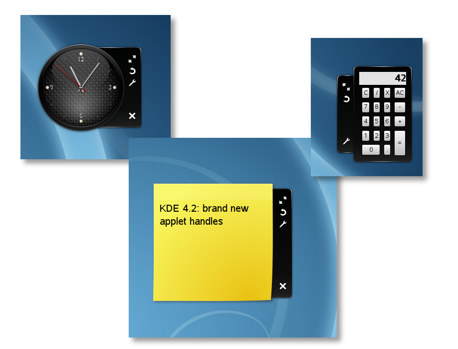
It’s started from a Nuno mockup he did quite some time ago, and while the graphics will probably be a lot more refined than they are now (i.e. become closer to the mockup), i think code wise we are definitely here 🙂
First of all the old icons were so-so, partly because we didn’t have the exactly right metaphore partly because they eren’t designed for that kind of background, so now they are Plasma-theme specific, the default is a set of very simple monocrome shapes but more recognizable. In the future these little thingies will be used all across Plasma, so more power to theme creators, yay 🙂
Now the handle also uses a svg background from the plasma theme, it behaves differently (so always in the right way i hope:) for different types and sizes of applets and has a new cute sliding animation that makes the thing to feel more “attached” to the applet itself.
And now in youtube-o-vision:
But you prefer Ogg-o-vision, don’tyou? 🙂
dude you rule soooooo much
This looks great, thank you 🙂
Nearly related (but not so much), I was wondering if a “help” buttons could be added to the plasma handle (something like setHasHelpInterface(true)…)
Even if plasmoids are often quite simple, it could be useful to be able to give some tips to the user (“do you know you can middle click blabla… ?” or a better description for the applet). Of course the help button could be added to the configuration interface but I don’t know if this is a good idea)…
For the help file itself, it could be a simple html file with some KDE-CSS and be launched in a webkit “help plasmoid” ? (or it could be a regular kde help file)
Looks nice. Is there a reason that the handle for the clock is first not attached, then when you resize it it attaches?
Oooh, shiny! These are so much nicer than the old handles… applet handles have been one of my few gripes with Plasma since the light-grey ones, and these finally don’t bug me.
@leos
Probably because the height of the handle is taller then the height of the clock, but it’s just barely noticable in the video. Once the clock’s height is taller than the handle, the handle attaches to the widget.
This is so fucking awesome! Great job! Really slick, monochrome kicks ass!
I don’t have touchscreen so I don’t find applet handles usable at all. Actually, they are pain to use. Notice how one manipulates a regular window:
move – alt+LMB
resize – alt+RMB
For people with keyboard (majority) this is much faster then: move mouse over a plasmoid, wait for handle to appear, find right icon, move mouse, click on the icon, move the mouse again. Please implement that.
really cool, thanks mart!
The panel and the plasmoids are looking great, but the windows themselves are still really horrible. They are dull, grey boxes with tiny text and acres of grey wasted space. They are, even now, almost impossbile to tell apart without compositing on. A dialogue box atop a window is almost lost. This isn’t just a moan – this is a real accessibility problem.
I hope this can be worked on before 4.2. I’m starting to fear that it will not be.
Well, I disagree. I always come crawling back to the oxygen style. always always always. It simply takes my breath away. And yes; I am VERY familiar with theming and such, and trust me; I tried all the different types available. Nothing beats oxygen
Nice work! it would be even nicer if the button order was similar to that of real windows. That is: close button at top, resize at bottom.
Just tried it after compiling trunk, it is indeed lovely!
Just a small bug (I don’t know if it was present before or not): when there isn’t a “configure” button (i.e. the applet don’t have a configure dialog), the close button gets the configure icon. 😉
(See calculator in you screenshot)
I planned to try fixing this myself, but then reminded myself that I need to study, study, eat and study some more => no hacking today.
yeah, was a bit of a whoops 🙂
now it’s fixed
That’s absolutely excellent! Prettier and more intuitive, that’s what I call real design!
Just a little thought, though: is there any plan to change the calculator? Because, IMHO, this one is even uglier than the infamous macOSX calculator widget and it really sticks out like a sore thumb, especially next to that gorgeous clock.
Maybe something like this one ( http://macthemes2.net/forum/viewtopic.php?id=16780382 ) would look better ? Well, that’s not exactly your job anyway, so keep the good work on Plasma and thanks a lot for everything you do 😉
Hi, well done nut i have 2 questions:
1)why the handles are so big?
2)why the handles appear every time a plasmoid have mouse over? i dont understand the sense, i dont have to manipulate a plasmoid every time i use it
tnx bye