


Breeze icons are very simple SVG files, especially the ones used for actions that are mostly monochromatic are very simple, and that’s part of their appeal.
Since some time, Plasma themes that are SVG files as well have the capability of being colored with system themes.
So, why not doing this for every icon as well?
One problem with monochromatic icons is that they can lose contrast in particular situation: when the application uses another color scheme or in places such as in menu items uder the mouse, that get a blue background, giving a not too visible dark gray on dark blue.
That’s one of those “last mile” polishing issues that may be small, but have quite a big impact on the perceived quality of the finished product.
Starting with Plasma 5.7 Icons will behave the same way as Plasma themes: they can have an internal stylesheet which colors will be replaced at runtime with the colors from the system theme.
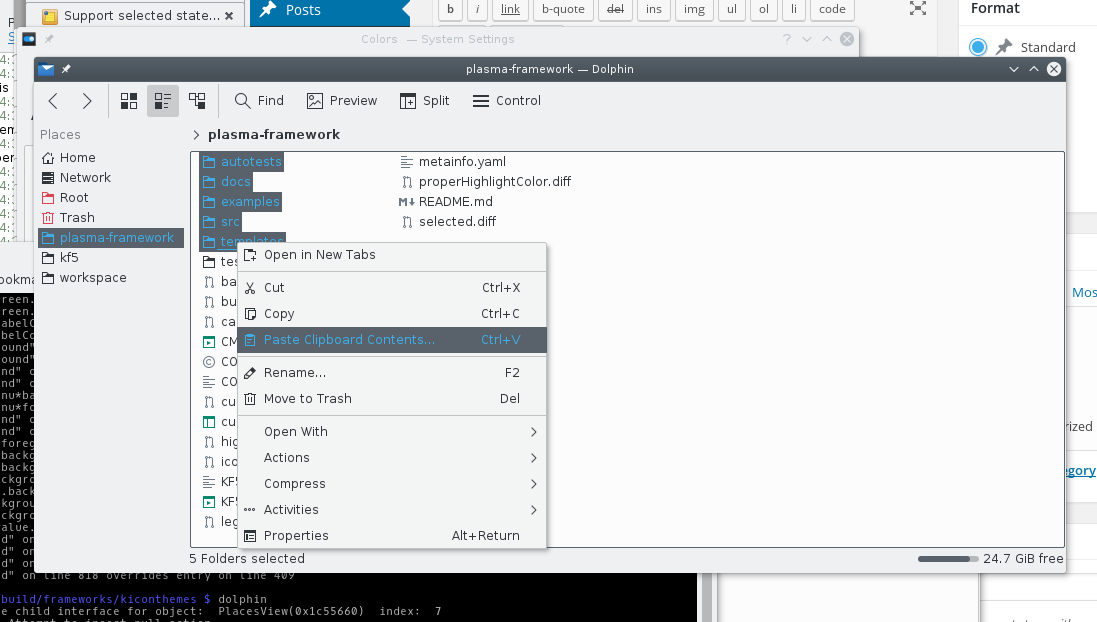
Here, Dolphin with the colors theme “Wonton Soup” and all the breeze icons following the text color of the theme:
Some applications, like Gwenview can use a completely custom color scheme, in the case of GwenView, it switches to a dark color scheme when fullscreen, regardless of the normal system color theme:
Icons that are in a “selected” state such as the menu item under the mouse or the current dolphin sidebar item change their color, just like the text does too:
Here with some custom colors for the highlight areas:
How to create a compatible icon?
First of all, Big kudos to Andreas for updating the whole breeze theme to the standard described below 😀
This is a quite minimal SVG file that supports colors from the system theme (Plasma Svg themes follow the same convention):
<?xml version="1.0" encoding="UTF-8" standalone="no"?>
<!-- Created with Inkscape (http://www.inkscape.org/) -->

<svg
   xmlns:dc="http://purl.org/dc/elements/1.1/"
   xmlns:cc="http://creativecommons.org/ns#"
   xmlns:rdf="http://www.w3.org/1999/02/22-rdf-syntax-ns#"
   xmlns:svg="http://www.w3.org/2000/svg"
   xmlns="http://www.w3.org/2000/svg"
   xmlns:sodipodi="http://sodipodi.sourceforge.net/DTD/sodipodi-0.dtd"
   xmlns:inkscape="http://www.inkscape.org/namespaces/inkscape"
   width="22"
   height="22"
   id="svg3049"
   version="1.1"
   inkscape:version="0.91 r13725"
   sodipodi:docname="coloredsvgicon.svg">
  <defs
     id="defs3051">
    <style
       type="text/css"
       id="current-color-scheme">
      .ColorScheme-Text {
        color:#4d4d4d;
      }
      .ColorScheme-Background {
        color:#eff0f1;
      }
      .ColorScheme-Highlight {
        color:#3daee9;
      }
      .ColorScheme-HighlightedText {
        color:#eff0f1;
      }
      .ColorScheme-PositiveText {
        color:#27ae60;
      }
      .ColorScheme-NeutralText {
        color:#f67400;
      }
      .ColorScheme-NegativeText {
        color:#da4453;
      }
      </style>
  </defs>
  <metadata
     id="metadata3054">
    <rdf:RDF>
      <cc:Work
         rdf:about="">
        <dc:format>image/svg+xml</dc:format>
        <dc:type
           rdf:resource="http://purl.org/dc/dcmitype/StillImage" />
        <dc:title />
      </cc:Work>
    </rdf:RDF>
  </metadata>
  <g
     inkscape:label="Capa 1"
     inkscape:groupmode="layer"
     id="layer1"
     transform="translate(-421.71429,-525.79074)">
    <rect
       y="525.79071"
       x="421.71429"
       height="22"
       width="22"
       id="rect4102"
       style="fill:currentColor;fill-opacity:1;stroke:none"
       class="ColorScheme-Text" />
  </g>
</svg>
Here there are two important parts.
The first is the definition of the actual CSS stylesheet:
<style
       type="text/css"
       id="current-color-scheme">
      .ColorScheme-Text {
        color:#4d4d4d;
      }
      .ColorScheme-Background {
        color:#eff0f1;
      }
      .ColorScheme-Highlight {
        color:#3daee9;
      }
      .ColorScheme-HighlightedText {
        color:#eff0f1;
      }
      .ColorScheme-PositiveText {
        color:#27ae60;
      }
      .ColorScheme-NeutralText {
        color:#f67400;
      }
      .ColorScheme-NegativeText {
        color:#da4453;
      }
      </style>
The colors defined in Text, Background, Highlight etc will be replaced with the corresponding colors from the system theme (look at the Systemsettings module to configure colors to see what colors they actually are)
This also defines a very minimal palette of “semantic” colors: you have the foreground and background colors for purely monochromatic shapes, and other colors for small accents that make the icon slightly more expressive than purely monochromatic such as Highlight, positive, negative (an “x” icon to close will be usually of “negative” color)
The other important part is the actual definition of the shape:
<rect
       y="525.79071"
       x="421.71429"
       height="22"
       width="22"
       id="rect4102"
       style="fill:currentColor;fill-opacity:1;stroke:none"
       class="ColorScheme-Text" />
  </g>
The rectangle has class=”ColorScheme-Text” that will make the stylesheet match to the class definition of ColorScheme-Text, that defines a color.
In order to actually apply that color, you can see the attribute style=”fill:currentColor”. It’s important no other colors are defined in the style attribute.
I think it was something like 5 or 6 years ago when I implemented the possibility for a plasma-theme to use system colors in this way. It’s impressive to see the fruits of it know. I never thought of the possibilities to extend it to allow it for complete icon themes or render a selected state. Very nice work. Thanks!
> I think it was something like 5 or 6 years ago when I implemented the possibility for a plasma-theme to use system colors in this way.
Oh yeah, thanks again for the original implementation, has been proven very useful 😀
Thanks for your work on this. Will those with visual impairments still be able to use the old Oxygen icon sets with this feature (non-flat, full color)? Flat monochrome or low-contrast icons are really hard to see in terms of accessibility, I’d be curious to know if people with fully functional vision also have this issue.
> Will those with visual impairments still be able to use the old Oxygen icon sets with this feature (non-flat, full color)?
Any old icon theme (and png based icon theme) will just continue to work unchanged
Awesome! these kind of things are very welcome for us Plasma users. Thanks. 🙂
A litle Big change.
Yeah! I am so happy about that change, thanks for your work!
It makes things so much easier for apps that often use dark themes like Kdenlive, and much more polished too!
Wow, this looks fantastic. I can’t wait to try it in Plasma 5.7!
Icon coloring only seems to work when using a KDE session. If the application is started in a Gnome session, icon coloring does not work. Is there any chance to make it work or do you have an suggestion for a workaround ?
>Icon coloring only seems to work when using a KDE session
KIconLoader gets used to load icons only with the KDE platform integration, so in order to have it loaded the whole plaform theme has to be loaded, is just an enviroment variable.. but then you get also things that you probably don’t want in Gnome, such as the KDE file selection dialog and what not.
Also, depneds on the breeze style to be used as well, as the final painting is dependent from the QStyle
so, uh, how do KStatusNotifierItem, the AppIndicator spec and this feature play together?
is there a way to get this to work using e.g. the GTK AppIndicator API?