Tag Archives: theme

Plasma in all colors you like

GraphicsSoftware

The Plasma theme system had a feature (since many years, actually) in which SVG elements done in a certain way can be recolored with colors coming from a theme file.
The Breeze Plasma theme (and now all the monochrome Breeze icons too) was all done in this way, in part to prepare what I’m, presenting today:

If the colors in the SVG can follow a color scheme defined in the theme, they can follow also a system wide color theme no?
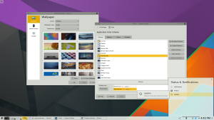
For Plasma 5.6, (as a feature that was requested really a lot) the default Breeze theme, while by looking familiar, it will change color following the applications scheme.

However, if you prefer to maintain a clear distinction between the workspace and the applications (And I’m definitely among them), there are still available the themes “Breeze Light” and “Breeze Dark”, just as before (Oxygen and Air also received some nice visual updates).

Let’s look at some screenshot:

So far so normal, typical Breeze theme we had so far.
dynamictheme1

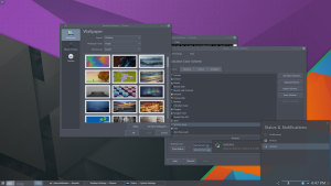
Let’s try with a different color set:
dynamictheme2

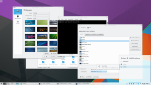
Or another one, this time darker.
dynamictheme3

Time to refresh some air

Graphics

In the last entries I posted some screenshots of some upcoming features in the Plasma Workspace in 4.10, and they shown also a glimpse of another thing: a new default theme, on which I was working on since a while together with Nuno.

The new default theme landed today in git and it will be in the Plasma Workspace 4.10 release (disclaimer: the wallpaper is an old included one, the new default will be presented in a while ;)):

desktop

It’s the typical case of a radical redesign, in which everything changed, in order to seem that nothing has changed, just a general feeling of feeling more “right”.

The key design principle is to make the whole appearance “lighter”. Most graphical elements that didn’t have an actual “functional” meaning are now removed, as well as gradients (a pattern that says “3D”, usually reserved for indicating interactivity) on all elements that are not clickable.

Plasmoids looks completely flat now, the taskbar has now an element around only the active task, and the shadows of the items are different as well. On a related note, now all the popups will use KWin to draw their shadow, just like the panel. This means better layout and better integration with other windows.

widget gallery
widget gallery