


Yes, Tasty Menu crashes more than Windows 95 🙂
In this release I hope to have fixed many of the crashes that occured, but of course I fear many bugs still remains.
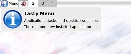
So the two major highlights are a less frustrating and more stable experience ™ and the notification of recently installed applications that I was talking about here in the last post.
As usual, you can download it here.
Tag Archives: tastymenu
New feature of Tasty Manu
The common complaint about every desktop (with every=(Gnome||KDE)) is that it’s difficult to spot where the recent installed applications, maybe now it’s finally over: Tasty Menu will notificate into its tooltip how many application have been installed and the menu will highlight the categories where the icons of the new aplications are. It’s still not perfect, unstable and heavy, but it’s starting working.
So when someboy else complains about this, he will be punished with 5 uninterrupted hours of Magical Trevor 🙂
Tasty Menu 0.3
Again another release of Tasty Menu.
It is slowly getting shape, my TODO list is shrinking more and more.
Summarizing a rough changelog:
0.3:
-Keyboard navigation
-Right-most list doesn’t open groups on mouse over
-More evident focus on lists
-Added a left mouse button menu
-Menu size configurable
-A more clear highlight of the currently opened submenu
-Simple integration with Kerry Beagle
-Added a big tooltip like other kicker applets (no it isn’t the cool tooltip of kicker, because at the moment it isn’t usable by 3rd party applets unless big and ugly code duplication)
-It’s possible to override the global shortcut Alt+F1 to make it open Tasty Menu instead of KMenu (default disabled)
-Uses KconfigXT
-The menu button text label can be disabled
Of course you can download it from here
Tasty Menu 0.2
Uploaded Tasty Menu 0.2: this version has a more usable and a little bit less unfinished aspect, the most prominents highlights are:
-Fixed some crashes at exit of kicker
-Now the behaviour it’s similar to the one of a normal popup menu so it’s now possible to launch an application with one single mouse click
-Configurable size of icons
-Listviews with a more compact look in order to waste less space
-Kicker button it’s a little bit less wide
-Kicker button icon grows with kicker
-Some informative tooltips
-Reverse Layout support restored again
-Beginning of an help page
Available here.
Tasty Menu: what do you wanna eat today?

Today I just released for the joy of everybody a first very dirty work in progress of my new pet Tasty Menu, if you dare, you cat download it here, but of course don’t complain if your kicker becomes a great ball of fire :-).
And now some introductory blah blah on it.
I found unconfortable the current KMenu due to the plethora of menu entries and started to think about how that menu should be…
looking around the various approaches I tried to take here and there the saner ideas of the various menus around there.
The Windows xp menu is hated by almost everyone I know, Yeah, I know it isn’t very objective, but it’s the impression I have. I think the reason is that the prominent icons on the left are the automatically generated most used apps list, that is out of the user’s control and the second reason the list of all programs is very hidden on a submenu.
The menu in the new Novell desktop is very similar, but I think it should be a little bit better, because if I understood correctly the default list on the most prominent place is a list of the favourite apps that is the user to decide.
the list of all the available apps it’s on a separate window, that renders the process of searching for an app much slower, but at some extents easier, because a big window makes the categorizing more clear and the icons looks a little bit less cluttered. A similar thing applies to OSX, where the apps are browsed through the file manager. Similar thing applies to Gimmie(http://beatnik.infogami.com/Gimmie) where the launcher of “objects” is a window. Speaking of Gimmie is very interesting how they have integrated also other infos (Documents, contacts and other stuffs) in the same app.
A strange thing about the default Gnome menus: at a first glance separing apps and other actions like logout seems cute, but they seems to fail in real world where new users seems confused by the two/three menus instead of one (I have also failed on it: the first time i tried Gnome 2.x I always opened the wrong menu in order to find the logout button :-P) I think it will definitely need more testing.
So I started hacking around this little applet in the hope of finding something valid, that i surely don’t pretend to be perfect, but at least to be a testbed where new concepts could be rougly drawn.
The left part of the menu is very similar to the Novell idea: you have a search box that is always selected when the menu is opened (the search result are displayed in the leftmost listview), followed by a combobox that decides what the following listview: favourite applications (default), most used applications, recently used applications and recent documents.
The right part contains the whole kmenu and takes the aspect from KBFX, the middle column contains the top level categorization (plus in the current kmenu arrangment there are also the control center, home folder and find files, but i think there should be present only categories). in the left-most listview there is the content of the category currently selected in the middle column. I think in this way even if it has the same number of items it _appears_ less huge than with a popup menu/submenu structure.
every items have two row, for the name and for the description, in order to make a more it more informative. On each selected item appears an action icon on the right, at the moment they are “add bookmark” on application icons and “remove bookmark” on favourite apps list.
The bottom buttons are the usual switch user, lock session and logout. In a first time I didn’t want to put them, I tought that these function should be delegate to another applet like that session applet , but as I said, it seems that the multiple menus concept it’s a thing that doesn’t work very well in practice.
The left-most btton contains the user name and icon, and clicking on it it opens the kcm used to edit the user’s profile. I know it seems silly, but I read on some usability report somewhere that in the tests with the XP start menu when asked to edit their profiles many users clicked on the user icon in the menu and were disappointed that nothing happened. Maybe I should integrate that button with the Switch user one.
At the moment there is still an huge room for improvement, it’s still not very stable and it still lacke some important features thet I still hadn’t figured out how to implement them, in particular:
-a global shortcut and keyboard navigation,
-tooltips to truncated menu entries and actions,
-the ability to launch an app with only one mouse click like the normal menu items,
-the ability to make it a normal window,
-drag ‘n drop support in the management of favourite apps,
-and of course making it more friendly with smaller screen resolutions, at the moment is really huge 🙂 (that is not necessary a bad thing)
What I’m working on
 Its name is Tasty Menu and is a KMenu replacement (oh,no! another one! yah, another one :P).
It’s aim it’s to be a testbed on usability issues rather than eyecandy.
How it will look like? See on the left.
The layout will have three colums (more width than height, shoul look ok also in lower resolutions).
The column on the left (the more accessible onr) will be for most used applications and for the results of the search field, the second column has the main categories and the column on the right contains the items of each category. It’s still too alpha for being released, but I feel it already more confortable than standard kmenu.
Stay tuned for more details and a first release!