Ok, I lied: it’s about elegance, performance, simple and great API, better user experience, more cross-device compatibility, in the end about improvement on all fronts.
And a very important thing is to gove an user interface more beautiful, tidier, more elegant.
One example is what Sebas talked about yesterday.
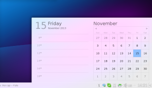
That new calendar is kindof a blueprint of how the UI of the Plasma workspace is being reworked: no huge and breaking changes, but fixing small layout problems, paying attention to the visual balance of the elements, and way better typography.
One thing that was pointed out is that its contrast or readability it was still dependent on what kind of wallpaper or windows you have behind it.
That’s what we came up with:

(Note, the panel is from Plasma1, the systemtray and clock area will look much better 😉
Here what it’s changed: contrary to what it seems, the window is *not* more opaque than the screenshots of yesterday, but it’s a modification of the blur effect in KWin.
What it does, it reproduces the effect of seeing something trough a frosted glass: what do you see is a combination of what’s behind the glass, the color of the glass, and the reflection of light reflected by the glass.
This last part is what has been added: it adds a bit of light to the color, but unlike a semi-transparent white window in front, it conserves all the information about colors.
So while being almost white, therefore very contrasted with the text, but still looking happy and colorful, instead of more dull and opaque if the theme was white, 95% opaque.


