Tag Archives: kde4

Dissecting a tray

Software

This is another pretty long post on the new system tray. Since the last post things have cleared up a bit (and i hope the api it’s a liiiittle bit more stable too) so i think times are ready for a slightly more technical description of all the machinery there is in place.

So, what are the parts of the system tray spec and more important how to use it and port existing applications?

First of all, the protocol is totally based upon dbus, so examining what are the registered services let’s see what are the (three) actors involved (yes, eventually some day those org.kde.* will become org.freedesktop.* :D):

org.kde.NotificationItem

every application that wants to use the systray has to expose this service, that will be called org.kde.NotificationItem-pid-index, where pid is the application pid and index is an unique thing that ensures no duplicate names, so an application can even register more item it it wants.

This thing is what defines everything that a system tray icon was and a bit of information more: it exposes the icon, a tool tip, the category of the item (status of a generic application, communication related, system service or hardware info) and the status: is it idle? is important that is visible? or is it really important to require user intervention?

It offers also some actions to interact with: activate, secondary activate, context menu and scroll. Notice how it doesn’t talk about left or right buttons, because right now we are providing a thing that looks like a system tray, to have a smooth transition, but we are not anymore forced to use that, we can have for instance some of the items embedded in the taskbar or have different representations, maybe interacted with the keyboard or who knows…

org.kde.NotificationItemWatcher

A system tray can come and go, for instance in Plasma the applet can be added or remove or the plasma process can be restarted, moreover the application can run in an environment that doesn’t (still:) support the protocol, so it’s needed something that keeps track of registered items and registered hosts for items (there can be more), all the system tray instances will register themselves here and take from here the list of items registered (NotificationItem implementations must register here too)

When the org.kde.NotificationItemWatcher is not up and running or it does not have instances of org.kde.NotificationHost registered all the items must automatically fall back to the traditional xembed type of icons

org.kde.NotificationHost

This service is registered by the system tray itself, it doesn’t offer properties or functions, it’s just used by the system tray (or whatever thing that can display an org.kde.NotificationItem) to announce its existence to the watcher to make possible to be automatically unregistered when the systray is closed (even if it crashes)

There can be an arbitrary number of hosts registered, to make possible both more simple things like having a system tray for each monitor in a multi monitor setup or more interesting stuff, like offering a different representation for different items category, for instance:

  • Putting the hardware status items and system services in a traditional tray, and we will be sure only that low level stuff will be displayed here
  • Integrating the application status items with the taskbar, we could perhaps display the minimized tasks without text in this case, or collapsing them in a popup menu, or whatever a brilliant idea will come 🙂
  • Collapsing all communications related items in a single item into the panel, that would be a “messaging center”, where i don’t care if messages are arriving from kopete, kmail or konversation, i only want to know what people are saying to me…

Those are just abstract ideas for now, it’s not said that they will be implemented in this way or that this description is necessarily the best way to go, it’s just a little scenario to provoke some thinking on what is the best way to go and to not take as a given that the current way is indeed the current one, time will tell, what counts for now is that we are no more forced to display this stuff in a pre determined way.

Last but not least, where is the code?

System tray plasmoid and kded

The system tray plasmoid is basically the org.kde.NotificationHost part that does all the interaction with org.kde.NotificationItem and includes full support to the spec for KDE 4.3, it can also be configured to show only certain categories of items, giving a first implementation of the ideas i talked before (i.e. one systray for hardware info, one for application status etc.)

The plasmoid ships also a kded that implements the org.kde.NotificationItemWatcher part, if the daemon goes down, or all systray plasmoids go away, all the items becomes traditional system tray icons on the fly.

KNotificationItem library

This is the client library to be used in place of KSystemtrayIcon (with a very similar api) it takes care of all the dbus talking and is quite simple to use, it just offers some functions to set properties like icons and tooltips and some signals to notify about the various types of activation from the user.

This will go into extragear on the next few days, so applications can start to experiment with it, keeping in mind that is still experimental. After 4.3, it will head into kdelibs for KDE 4.4, at that date and time it will be completely api stable.

Make some space

Software

Sometimes little details gives a way greater feeling of power and customizability, without actually adding much and more importnant without adding tons of new buttons and configuration options.

Plasma panel can arrange widgets in an ordered linear layout, one after another, but what about if you have a panel where you want to distinguish between different groups of applets and want to put a space between them to make the look more clear?
Since a couple of days in the plasma configuration dialog a new single button appeared: “Add spacer”:

panel spacer

Clicking on it it adds that little widget at the end of the panel, it’s just a space and you can drag it around as with every other widget or resize it as you wish by dragging the borders of it (that in this screenshot are a little darker) just like any window or resizable stuff in general.

panel spacer

Of course a space is not something that you should see: it’s empty right?
So you close the panel edit mode and the empty space ecomes well, empty, until you open again the panel configuration mode.

panel spacer

Dashboards, activities and desktops

Software

That’s a tiny feature that apparently makes several people happy:
Now the plasma dashboard is a way to quick access your desktop widgets whente desktop is covered by windows, and i really like this feature as it works.

But since KDE 4.2 it’s possible too with a little bit of digging trigh the config files to set a different activity for the dashboard, that is a similar behaviour to what some other operating system i can exactly remember the name does (it has something to do with fruit and groceries iirc :p)

But this was sooo well hidden that people kept asking if some day that feature will be available, so here we go:

dashboard config

In KDE 4.3, just zoom out and you will see a new controls box that has the actions that don’t belong to single activities (yeah, no more silly add activity on each activity:) and two options: click on “use a separate dashboard” and then you’ll have an activity just for the dashboard (not visible in the zoom out view) so here you have different plasmoids on desktop and dashboard:

dashboard config

Oh, and there is also the other checkbox, “use a different activity for each desktop” this was availale in 4.2 as an hidden config option too, if you check it it’s what you get:

dashboard config

Gently touch your web zones

Software

Also not groudbreaking (and nearly one-liners) features are pretty to see and can be foundation for more neat things to come.

In Qt-webkit since Qt 4.5 is possible to read and set the position of the page in the scrollable view, (i.e. horizontal and vertical scrollbar values) that gives us the possibility to implement a nice web view that behaves like usual touch screens: scroll with the mouse, just touch the page and drag the thing around


OGG version

Introducing Notification Icons

Software

This is the period of the year when Plasma developers exits from under their rocks it seems, so there i am too, i wanted to blog about that since quite some time, but i am really too lazy lazy lazy to blog :p

As Aaron said, last months i’ve been quite busy with the implementation of the new systemtray specification. At Tokamak we gathered around a whiteboard and discussed what sucked about the current X systemtray, so… what if we could design it from scratch? well, let’s do it! this thinghie interested me so much that i jumped over it in a coding frenzy with i hope a sane amount of pauses to think about it and keep the design sane, scrapping stuff when the design direction seemed to take an ugly direction, process that is still ongoing, so all i will talk about here is still subject to changes, rennnames, replacements etc, nothing “production” still :p

Soooo, why we were really unhappy about the system tray we have now so much at the point to want to design a brand new thing? (and enlightenment people too, and this makes me happy since will permit us to have a really cross desktop design from day one)

There are several reasons, so let’s see one by one:

Painting, positioning and behaviour

Right now systemtray icons uses the Xembed protocol, that basically means they are windows owned by the client application process (very very roughly and pardon for the inaccuracy, kinda like the systray was their window manager). This means the painting of the icon is controlled exclusively by the client application, the systray itself has not much to say about that.

It means also, since systray icons have windows, i can’t have two system trays, (they would steal icons each other, since the window representing the icon s well, one) and, since plasma is canvas based, the implementation detail of whet xembed is will brutally come out as soon as you try to put another applet over the systray or try to rotate the applet or zoom the view where the applet is, as you can see here :p (yes, that could be kinda achieved with composite, but still a real hack)

OGG version

Moreover, nowdays our panel is a window that uses argb visuals, so it’s translucent when desktop effects are on (that means basically force 32 bits color depth on all windows representing icons). and that’s a thing that neither X or graphics drivers (or even qt, before 4.5) were ready for, the amount of bug reports about visual garbage into the system tray or icons that becomes invisible (nowdays still happens with intel cards and the problem doesn’t seem to be headed for a solution) were really many and quite discouraging.

Communication between system tray and icon

Or better, lack of thereof in the current spec. Now, the system tray limits itself to embed all the icons there are around (basically windows with _NET_SYSTEM_TRAY_S atom set) and after that, it knows exactly zero about them. Why it’s useful for those guys to talk to each other? Well, we all know the problem of cruft in the system tray, having 10-20 icons that steals half of the panel length or more is quite common, unfortunately…

Windows starting from XP made a timid attempt to solve the problem, by auto hiding system tray icons that din’t have activity for a given period of time (don’t know how since i don’t know how their protocol works) or alternatively manually hide icons you hate (ideally shouldn’t be necessary but the world is not, nice and fluffy with rocket launcher equipped ponies, misbehavers will always be here)

Now, in KDE (and any desktop that works on X by the way) we can hide icons but only manually, because the system tray has no idea what icons have activity, what are trying to notify something or things like that.

another interesting tought can come by looking at a typical crowded (and not even really crowded) system tray, icon by icon:

average systray

  • The package manager screaming that i need super-important security updates: it’s a system service that needs user intervention every now and then, so it uses the system tray to notify that to the user.
  • KMix: it’s an hardware control utility, it sits in the systray to give the user a quick way to control the volume without having to dig into the applications menu or systemsettings.
  • Keyboard layout: it’s a system service, also there to give a shortcut rather than notify something
  • Nepomuk: it’s a system service usually it’s not really useful to have it in the systray, but becomes neat as soon as it goes into the systray just when it’s indexing, to notify the user that is doing many disk operations, so giving to him a quick way to pause the indexing if he needs hard disk performance in that moment.
  • Klipper: it’s a system service, that lets the user manage the clipboard, perhaps it would even make sense to have it in the panel out of the system tray..
  • Kwallet: also a system service, access to the saved passwords, not a notifying function at all, it’s the typical icon that should be hidden until the user goes explicitly hunting for it.
  • Konversation: it’s the status of a normal application, but it can be seen also as a communication thing, since those kind of applications tend to notify a lot they can be seen as a separate category (i.e, somebody is trying to talk to you, as in this icon)
  • Amarok: it’s the status of an application, the icon itself says if amarok is paused or playing and the progress itself. quite used because once amarok plays it can be keeped as a background thing (i.e not in the taskbar and forget about it as long as it emits noise :))
  • Skype: as konversation, it’s a communication thing, and also there the icon blinks when somebody tries to contact you
  • Kopete: communication thing too

So what we have there: several categories:

  1. Application status, like amarok in this case
  2. System service: like nepomuk
  3. Hardware status: like kmix or a battery or things like that

Application status icons in the future can be integrated into the taskbar for instance (did i heard somebody whispering dock? he will be punished :p), and even the other two categories could be separated in two different system trays, it gives more freedom to implement something that could exit from an usability study, with less fears of saying “ehmm, no sorry that can’t be done actually…”

The icons can have several statuses, we can think about 3:

  1. passive: informational, but doesn’t require really user interaction, so it’s a thing that the system tray can decide to not show if not explicitly asked (in this example would be the package manager when doesn’t have updates, kwallet or nepomuk when idle).
  2. active: the service is doing something or is a control that could be needed any time (nepomuk indicizing, package manager checking for updates, kmix that could always be handy there, battery indicator…)
  3. Notifying: the icon requires an action from the user, for instance the package manager with new updates, or somebody that tries to contact you from kopete.

So we can now display the notifying ones in a different area of the systray, with a different background and we can hide the passive ones, and show them only when the user presses the unhide arrow.

so what we have now?

The main implementation skeleton is done, the specification it’s all based on dbus message passing, since it has to be a cross desktop thing. It’s divided in 3 parts: a kded service that keeps the list of the applications that wants to use the system tray (so the list won’t be lost due to a plasma restart) the protocol support in the systemtray applet (our systemtray could already support multiple protocols, since it was designed already with this possibility in mind since the refactor in KDE 4.2) and a client library in playground with a tiny test application used as a proof of concept, that can be seen in this video (yes, not a mind boggling spectacular thing, but still important), with also an interesting feature: when you stop the systemtray bookkeeping daemon, the icon magically falls back to the usual legacy system tray icon, so an application using this new protocol would still get systemtray icons when running
in a desktop environment that doesn’t support the new protocol.

OGG version

The client library and the dbus interface itself will pass trough a tough api review, so they can still change in a quite significant way (that’s why i didn’t go really in details in this post).

So don’t expect in KDE 4.3 all KDE applications to have been magically converted to this new protocol, but i hope all the plumbing will be there to permit application developers to start considering using this, and i’m really looking forward for other projects to cooperate to have a new unified shiny stuff 😀

Responding the streetlights-glowing call

Software

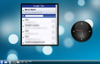
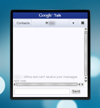
Ariya called on who is going to turn the web-based google talk client to a plasmoid, so here i am 🙂
Let’s try with the javascript api:

layout = new LinearLayout(plasmoid);
webView = new WebView();
webView.url = "http://talkgadget.google.com/talkgadget/m";
layout.addItem(webView);

And the result is:

google talk plasmoid

You can download it here (warning: trunk required).

Micro blog needed Macro love

Software

The Twitter Microblogging widget is a really useful tiny little utility, unfortunately until now it had severe appearance problems, especially when resizing the thing it did happen that contents could overflow from the applet boundaries.

This was partly due to some problems Qt 4.4 had with QGraphicsLayouts partly to our workarounds to those problems.

In Plasma we’re the childs with the slingshot that terribly enjoy to break stuff, the Qt components that Plasma uses, the QGraphicsView related stuff is a part significantly younger than the other parts of Qt, and we are putting it on a really tough stress test and this, even tough painful at start, it makes the framework mature at a really fast pace.

Now, i’m really impressed with the quantity of bugfixes present in Qt 4.5, so i decided to give the microblogging plasmoid another little quantity of love, and this is the result:

OGG version

So now the height of individual posts grows and shrinks depending on the text layout inside them and when the size of contents is bigger than the size of the widget it shows (or hides) scrollbars as needed (it’s also kinda touchscreen friendly since it can scroll by dragging the contents themselves). So now works more as it is expected to from day one, that wouldn’t be breaking news per-se, but it demonstrates that the stuff we were uber-early adopters it’s really coming together and show what its real potential was.

What’s more important is that not only the microblogging widget works better now, but it’s also easy to write a new widget like that, since the process produced two new widgets in libplasma (widgets not in the sense of plasmoids, yeah i know it’s confusing:): TextBrowser to be used every time you have to display formatted text simple enough to not require Webkit. The other one is ScrollWidget, where you simply slap another widget in it ant it will automatically decide when cut away a part of the contents and when to show the scrollbars or not.

The smallest media player in the world

BlaBla

As I was showing here now Plasma in trunk can also play video/audio files, so what will be there in KDE 4.3? Basically two components:

The first is a media player widget (or applet, or whatever…). It will be the basis for a future media center written totally with Plasma technologies (one of the exciting discussions we had at Tokamak2 🙂 as today it’s in playground and plays video files dropped in plasma, can open arbitrary audio/video files, has some usual control buttons and exposes the standard org.mpris D-bus interface used to control media applications, can be controlled for instance from the now playing widget, as shown here.

The most central component is in libplasma right now and instead is well, a media player widget :p
The difference is that it is a widget in the sense of reusable control to be used in the applets/widgets/plasmoids you write (so, wanna for instance make a youtube browser?:), it uses various components of Phonon, like Videowidget, MediaObject and AudioOutput and has a default set of control buttons that do a nice slide in/slide out on mouse over, and the reallt cool thing is that using it from the javascript bindings is ridicolously easy.
This is a complete plasmoid written in javascript in the minboggling amount of 6 lines of code:

layout = new LinearLayout(plasmoid);
video = new VideoWidget();
video.usedControls = DefaultControls;
layout.addItem(video);
video.url = startupArguments[0];
video.play();

All it does in sequence is: make a layout, make a video widget, enable a default set of buttons, add the widget in the layout, load the argument as the video if any (i.e, the file that was dag and dropped on the desktop), and finally, play.
This thing is in kdebase in the tests folder of the javascript based plasmoids.

Now, switching for a moment in hype-machine mode, think about putting together media content distribution, javascript, plasma, browsers and the not really happy state of these things in Linux right now, really far fetched for now and not for the immediate future, but good things can happen 😀

TokaTalks

BlaBla

Yesterday talks were wicked interesting, especially the Alexis talk about the new animation framework was really breathtaking.
Aaanyways, this is kinda a synopsis of what i talked about in my part during
the talk session yesterday at Tokamak, slides
here,
it’s quickly written in few minutes, so the english it’s a total horror,
but i feel it could be kinda interesting anyways 🙂

Themes

Pretty much everything you see in Plasma is based on SVG graphics,
this means that you have a really high degree of customizability
controlled by the Plasma theme. This also means that compared to
classical Qt themes the entry barrier is significantly lower, because
of course you have to be a good designer to make one, but not a
programmer, while to do a Qt theme you have to be both and this is a
really really rare thing.

Also, since themes are pure graphics without binary code they are
completely platform independent so they can be distributed trough the
GHNS framework.

Being vector graphics, we can display them without problem from
very little screen to huge monsters when we will have 600dpi screens
that won’t be a problem, specially for the theme elements based on
the FrameSvg concept.

From a programmer point of view using the theme graphics is quite
easy too, because the two main classes that manages Svg themes (Svg
and FrameSvg) are very abstracted, so you won’t have to bother that
the graphics is actually a Svg.

Plasma themes will be installed under your KDE installation prefix
under share/apps/desktopthemes. The filesystem structure inside the
theme has got two main subfolders: widgets, meant for element
drawn on canvas and dialogs, meant for elements that are
actually a top level window. There are two particular and optional
subfolders: the first is locolor, that will have the same two
widgets and dialogs subfolders meant to be used when the theme is
displayed on screens with less than 16 bit color depth.

The other folder is called opaque and has replacements for
the elements that are a top level widget when the desktop effects are
turned off, that’s because in this case we won’t be able to have a
semitransparent window, so we won’t be able to have luxuries like
antialiased borders or drop shadows, if you have a rounded border
there you should use the good old pixelart tecnique from the 80’s.

In order to load an Svg from the current theme is sufficient to
use the setImagePath() function of Plasma::Svg, where you don’t have
to worry neither of the path of the theme or the svg or svgz
extension, so something like “widgets/background” will suffice.

If you are writing a scripted applet you can also include the
graphics alongside the applet code and distribute everything in a
single package, from a javascript applet for instance it will be
sufficient to call the function plasmoid.findSvg(“foo”) and the
proper foo.svg file will be located for you.

That said however now i have to get a bit annoying with some
advices: you should be really really careful when you add custom
graphics in your applet, both when you install it alongside your c++
applet and also when you embed it in the package of your scripted
applet, because your additional graphics must work with as much
themes as possible, and this is an hell lot difficult. You should at
least try it with both a dark and a light theme, but in the end… if
you want to do that, think again 🙂

Boring implementation details

Usually in your applet won’t have to directly paint Svgs, because
if you just use the default plasma widgets you’ll have the svg
painting done for you, but if you have to draw some svg elements you
have to know two classes: Plasma::Svg and Plasma::FrameSvg.

The mighty machine that manages all the svg painting in Plasma is
the Plasma::svg class, that internally uses the QSvgRenderer class,
but optimizes it as much as possible: in the context of the whole
Plasma application for each svg file we get an unique shared svg
renderer and the rendering result is saved to disk thanks to a
KPixmapCache, that can avoid the creation of renderer to a satisfatry
degree: in the second plasma start won’t be created a single renderer
until you resize something, saving a bit of startup time and some
megs of ram.

The most important functions you are interested if you want to use
a Svg are its several paint functions (overloaded with QPoints or
QRects as parameters) the already mentioned setImagePath() resize()
and various functions to access the svg sub elements like
hasElement(), elementSize() and elementRect().

The other class used in plasma to render Svgs works at a slightly
higher level of abstraction and is Plasma::FrameSvg. Usually widgets
are mostly rectangular things, but even if Svg is scalable that
doesn’t mean the result will look pretty, take a look at the slides
example for instance, where a
default applet background is heavily vertically stretched, so the
horizontal borders become thicker that the vertical ones, and to make
things worse they usually aren’t even an integer number of pixels
making the result to look really blurred.

So, what is there in the default applet background? We can see
there are actually 9 pieces: the corners, the edges and the central
part (called with a great stretch of fantasy center, top, topleft,
topright, left,right,bottom, bottomright and bottomleft). When the
thing will get painted not all elements will be scaled, it’s
important that the corners won’t be never ever scaled, while the
horizontal edges will be scaled only horizontally and similarly the
vertical edges will be scaled only vertically, while the center
element will scale freely.

From a boring code standpoint FrameSvg inherit the Svg class, so
all the stuff that is available in Svg is available in FrameSvg too,
but with the difference that you want to resize the image with
resizeFrame() that uses the method i talked before and you’ll paint
the correctly resize Svg with paintFrame(), while paint() is still
useful to paint single elements in the Svg. Also a single Svg can
contain multiple series of 9 elements, with the names differentiated
by a proper prefix, that can be chosen with the setElementPrefix()
function.

Universe and everything

Software

KDE 4.2 has just been released, after many months of hard work by many people.

In this release the huge potentiality of the 4.0 platform is finally going to show up in the end user visible apps, so it’s where the good plans are starting to come together.

/me did just a tiny part, but nevertheless i like considering myself part of that wonderful community, they are wonderful people, congratulations to each one 😀

KDE 4.2