Category Archives: Software

Making plasmoids QML API better

Software

For the next iteration of Plasma, we are not only revising the user experience, but also making better the developer story.

This article is pretty long (sorry no pretty pictures this time ;), and is probably easy to just TR;DL it, but it will give some important guidelines if you will ever interested to write a plasmoid for Plasma Next, such as “how the hell can I make my plasmoid have a correct size in the panel.”

First of all I’ll start with a short personal note: I just started with a new position in Blue Systems, where I’ll work towards making the next iteration of the Plasma technologies, both as a framework and as a desktop ready for prime time, aiming to give the best experience possible on the all new Qt5, Frameworks5 based Plasma Desktop by KDE.

Plasmoid and attached properties

In QML1 plasmoids, you had a global object accessible from everywhere in the plasmoids called with much imagination, “plasmoid”
This is useful to access everything that is related with the ambient it’s loaded in, the scene and the containment, so you can read things like:

  • The formfactor: are we in the desktop? panel? is it horizontal or vertical?
  • The title/icon etc:data for the plasmoid: you can set a different title, which a containment can decide to show (such as in the new system tray) or the icon, that will be used when the plasmoid is iconified in a panel
  • Configuration: the whole mechanism for handling the configuration for plasmoids is abstracted in a neat object “plasmoid.configuration” that is usable as any JavaScript Object: configuration keys are accessible as members or as keys of an associative array. It’s possible to write or read on them, and the QML property binding mechanism will work, even when the configuration is modified by somebody else (such as the desktop scripting)
  • The compact and the full representations
  • And much more

Wait, what are “The compact and the full representations”? to find out, skip to the next paragraph 😉
In Plasma Next, besides the global plasmoid object, accessible from anywhere (any item and any qml file in the plasmoid), we have also an attached object, called “Plasmoid” (uppercase) that provides the full plasmoid api (is the same object, really) as QML attached properties of the root Item of your plasmoid, so you can have a very, very convenient way to read and write properties, and to do signal handlers.

import QtQuick 2.0
import org.kde.plasma.plasmoid 2.0 //needed to give the Plasmoid attached properties
import org.kde.plasma.core 2.0 as PlasmaCore

Item {
    id: root
    Plasmoid.title: "My custom plasmoid title"
    Plasmoid.onformFactorChanged: {
       if (plasmoid.formFactor == PlasmaCore.Types.Horizontal) {...
      // My custom JavaScript handler code to react to a formfactor change
    }
//rest of your plasmoid code
}

Compact and full representations

two important new properties of the Plasmoid object are compactRepresentation and fullRepresentation: plasmoid can collapse in an icon when they are resized to a too tiny size for their usual UI to make sense: in this case you usually get an icon that will show the full plasmoid in a popup when clicked.
The plasmoid will switch at a size that you can set with the properties

Plasmoid.switchWidth
Plasmoid.switchHeight

For those properties you should use preferably not pixels, but dpi independent measures, provided by the “Units” system, as explained here.

By default, you’ll have an icon (that’s one of the things the “icon” property of the plasmoid object is for) as the compact representation, and the whole root object is taken as the full representation.

But in some cases, an icon is not enough, you may want something more complex, like in the case of the clock.
To do that, you just have to define a cutom one.
Imagine you implemented your digital clock in a file called DigitalClock.qml:

import QtQuick 2.0
import org.kde.plasma.plasmoid 2.0
import org.kde.plasma.core 2.0 as PlasmaCore

Item {
    id: root
    Plasmoid.switchWidth: theme.mSize(theme.defaultFont).width * 10
    Plasmoid.switchHeight: theme.mSize(theme.defaultFont).height * 15
    Plasmoid.compactRepresentation: DigitalClock {}
//rest of your plasmoid code
}

One thing that is neat, being compactRepresentation a Component, it doesn’t actually get instantiated until you actually need it.. why wasting memory on the graphical representation of the icon if it will never be iconified for its whole lifetime?

at the same time, it’s realistic that a plasmoid can sit in your panel (or , in Plasma Next is also possible to collapse them when in the desktop) for hours before you have to open it, if at all: why it should take startup time to instantiate its contents? (and why they should always take memory if they are not used?)

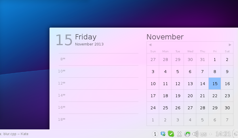
In Plasma Next, you can assign the full representation too, so to redo the previous example, if you want to show a calendar when you click on the clock:

import QtQuick 2.0
import org.kde.plasma.plasmoid 2.0
import org.kde.plasma.core 2.0 as PlasmaCore

Item {
    id: root
    Plasmoid.switchWidth: theme.mSize(theme.defaultFont).width * 10
    Plasmoid.switchHeight: theme.mSize(theme.defaultFont).height * 15
    Plasmoid.compactRepresentation: DigitalClock {}
    Plasmoid.fullRepresentation: Calendar {}

//rest of your plasmoid code, only data model related items, there won't be any graphics object here anymore
}

Plasmoid.fullRepresentation will probably usually contain the most complicated code since it may be abig and complex UI, but when it’s in the panel it won’t get created until the user opens it, so it won’t cut on precious startup time.

Therefore, in Plasma Next, the recomended way to write a QML plasmoid is:

  • Write a root Item as simple and lightweight as possible
  • Use the default icon as compact representation when possible (to have that just don’t define any compactRepresentation, it will take the default)
  • Put all of the UI under Plasmoid.fullRepresentation
  • Under the root object, put all the dataengines and the models that you need to access from both representation, but only and always non graphical pure data model stuff.

Making your plasmoid to behave well in a layout

Since Qt 5.1, QML2 has a new set of components: the Layouts.
Those are similar to the good ol’QWidget layouts, we have linear (row and column) and grid layouts. This makes construction of plasmoids and containments way easier.
What i want to talk about here, is the size hints that those layout provide.
As the Plasmoid object that I wrote about before, is now available another attached object called Layout, and is documented here.
You can define one inside of any Item, and when/if that item will find itself in for instance a RowLayout, the layout will respect the size hints defined as attached properties (minimumWidth, maximumWidth, fillHeight etc).

We are using the same attached properties for the plasmoids themselves.
If toy define the Layout sizehints properties inside either the compactRepresentation of the fullRepresentation of the plasmoid, they will be used for several things:

  • when the fullRepresentation is in a popup, the popup will never be smaller than the Layout.minimumWidth/Layout.minimumHeight of the fullRepresentation
  • If the plasmoid is collapsed in the panel, all hints of the compactRepresentation will be respected by the panel layout
  • Same thing for the fullRepresentation: for instance the taskbar is a plasmoid that always stays in fullRepresentation, which has the Layout.fillWidth property set to true: this way the taskbar will always take all the available space there is left in the panel.

Let’s add this to the usual clock example:

import QtQuick 2.0
import org.kde.plasma.plasmoid 2.0
import org.kde.plasma.core 2.0 as PlasmaCore

Item {
    id: root
    Plasmoid.switchWidth: theme.mSize(theme.defaultFont).width * 10
    Plasmoid.switchHeight: theme.mSize(theme.defaultFont).height * 15
    Plasmoid.compactRepresentation: DigitalClock {
        //make sure the collapsed clock is at least 5 "M" wide in panels
        Layout.minimumWidth: theme.mSize(theme.defaultFont).width * 5
    }
    Plasmoid.fullRepresentation: Calendar {
        //make sure the popup is at least 10x10 "M"
        Layout.minimumWidth: theme.mSize(theme.defaultFont).width * 10
        Layout.minimumHeight: theme.mSize(theme.defaultFont).height * 15
    }

//rest of your plasmoid code, only data model related items, there won't be any graphics object here anymore
}

KDE Plasma sprint

BlaBlaSoftware

Last week I went in Barcelona to the Plasma sprint with a bunch of old friends.
As usual it was a great experience, but let’s talk about results 🙂
The framework architecture is being finalized, compared to Plasma1 it will be way simpler. the Plasma framework will be a nice lean library (an order of magnitude smaller than Plasma1) accompained by a runtime component: a series of plugins provided as QML2 imports and the runtime environment, the Plasma shell, that will run Plasma Desktop, Plasma Active and Plasma Netbook (and any other you can imagine and write 😉 and even switch the shell at runtime. This is possible because the shell binary is pure logic, it doesn’t have any UI whatsoever.
The coding I did during the sprint was mostly on this area, especially a refactoring on how QML plasmoid are loaded by the shell and written, that should lead to faster startup and cleaner code.. but since is all stuff under the hood, no fancy screenshot tis time, sorry :p

The default Desktop experiece will be at first not too dissimilar to the one of Plasma1, a big focus will be on redesigning the singular components around simplicity and elegance (see here) rather than big changes in functionality altogether.
A set of visual guidelines is being developed, that will help any developer to make their plasmoid elegant and well integrated.
Changes can always come a bit at a time once the new technology is well road tested.

The importance of KDE hardware

BlaBlaSoftware

Those days I’m giving the final touches to what will be the image of the operating system that will be preinstalled on the Improv board.
Does it work? Yes:

Plasma Active on Improv

Blurry exibit #1: Plasma Active running on the Improv

KWin compositing

KWin is one of the few X11 window managers (and the only desktop-grade one) that can do composite on GLES devices (withut GLX)

Now, a little backstory: A while ago the Plasma team received a bug report about the popups in the Plasma panel. apparently they couldn’t receive any mouse event, and this happened on ARM and only on ARM.
This type of bugs are quite weird and difficult to catch, especially when they happen only on an architecture none of the developers is using as development machine.
And while it was possible already to test KDE on ARM devices (we got the bug report in the first place after all), it has never been easy (also helped by the fact most ARM deviecs are as close as you can get, especially the reasonably high end ones).
Not being easy means that it takes a long time to do… not many KDE developers have the time to go trough all the hassle to get a build environment working on an ARM device, and this means bug stays.
When working on the Mer image for the Improv of course i stumbled upon this bug as well.
But wait.. there we have OBS: testing patches on a single package it’s a matter of minutes, thanks to how much easy is to branch a package in an home project (Heads up to OBS developers for this).
In a couple of hours the problem was identified and fixed. In this case is an ARM specific ugly workaround, but luckily won’t be needed with Plasma2 (basically mapping from a QMouseEvent on a QGraphicsView to the QGraphicsSceneMouseEvents on the QGraphicsScene breaks on ARM when the item is at positions farther that (-QWIDGETSIZE_MAX*2, -QWIDGETSIZE_MAX*2), due to different sizes of data types compared to ia32/x8664).

Hardware like the Improv, that comes with KDE preinstalled with an easy way to test out development and patches may really contribute to increase the quality of KDE software on that devie class.

Dock

You need to test your software on another kind of device? Just pop the CPU card out of one and pop in into another, without having to setup the same stuff multiple times.

I dream in the future more and more “KDE first” devices, from mobile devices to laptops, to workstations, to set top boxes, both ARM and x86, from many different manifacturers.
They are good not only for who is making them. They are good for KDE software, for KDE developers and in the end for all of our users.

Plasma2: all about elegance

BlaBlaGraphicsSoftware

Ok, I lied: it’s about elegance, performance, simple and great API, better user experience, more cross-device compatibility, in the end about improvement on all fronts.

And a very important thing is to gove an user interface more beautiful, tidier, more elegant.
One example is what Sebas talked about yesterday.
That new calendar is kindof a blueprint of how the UI of the Plasma workspace is being reworked: no huge and breaking changes, but fixing small layout problems, paying attention to the visual balance of the elements, and way better typography.
One thing that was pointed out is that its contrast or readability it was still dependent on what kind of wallpaper or windows you have behind it.

That’s what we came up with:
dadel2
(Note, the panel is from Plasma1, the systemtray and clock area will look much better 😉

Here what it’s changed: contrary to what it seems, the window is *not* more opaque than the screenshots of yesterday, but it’s a modification of the blur effect in KWin.

What it does, it reproduces the effect of seeing something trough a frosted glass: what do you see is a combination of what’s behind the glass, the color of the glass, and the reflection of light reflected by the glass.
This last part is what has been added: it adds a bit of light to the color, but unlike a semi-transparent white window in front, it conserves all the information about colors.
So while being almost white, therefore very contrasted with the text, but still looking happy and colorful, instead of more dull and opaque if the theme was white, 95% opaque.

New QML components: Know thy dialogs

Software

Today part of “what to expect in 4.10 in QML components”: Dialog. The Dialog components have been introduced in plasma since sone time, and are documented in the usual page. The components that may be used to create a dialog are:

  • Dialog: unsurprising name: it creates a Plasma themed window with space for a title, a content and buttons. You have to create all of them, you’re on your own, but provides the window management and methods such as open(), close(), accepted() and rejected(). You usually don’t want to use this, unless you want some strange custom things in the titlebar area or in the buttons area.
  • CommonDialog: is a Dialog, but provides a titlebar and the buttons, you want to use this in the 90% of the cases when you want to display custom content in a dialog.
  • SelectionDialog: presents the user a list of items to chose from, useful to create menus when you want to modally ask “what of those items do you want?”
  • QueryDialog: probably the most useful: is a simple dialog with text and two buttons. Used for things like confirmation dialogs like “are you sure you want to delete this item?”. It displays a text and two buttons, that default as “Ok” and “Cancel”, but their text is customizable.

It’s a while this API exists, but in 4.10 there was an important change in its look and feel in 4.10: Now if it’s possible the dialogs looks “inline”. It will be done on the same window as the plasmoid (i.e. on the “desktop”) and if provided with a visualParent property, it will have a comic balloon tip pointing to it. As usual, an image is worth a thousand words:

Dialogs on desktop

But what about if there isn’t enough space? For instance the dialog may be displayed from a Panel, where is impossible to have an inline dialog. Fear not, in this case the dialog will become a separate window, still working everywhere:

Dialogs on panel

An “inline” behavior for dialogs is preferred because in this way questions are semantically and visually grouped with the object they belong to, and most important the desktop layer must not “interrupt” the user, it’s just background information.

The switch between an inline behavior and an external window is completely automatic, as usual, something that the plasmoid should never have to worry about.

New QML components: IconItem

Software

Last post was about a new QML component available in Plasma workspace 4.10 with an important design pattern that comes with it: Lazy loading everywhere when possible.

Next couple of posts will be about other new and old components and the UX concept behind them.

A very important thing in Plasma is to have extremely coherent elements all across the screen, both in graphics appearance and behavior. The fact that two things together in the screen are done by two different plasmoids is something that shouldn’t really matter to the user (it’s a bit of a fail the very moment they even notice, actually). I’ll go in a future blog entry on why seamlessy melting into the environment is absolutely preferable to coming out with “clever” ideas that stick out, even if it seems counter intuitive.

Today: IconItem. From 4.10 there is a new element available in org.kde.plasma.core It’s used whenever you need to represent an icon in a plasmoid (or an active application).

This describes semantically an icon: as everything in plasma you should only describe it, and not care at all how it looks (that’s the task of the component, of the themes, of the final platform and of the global settings). Also, as common in QML, it’s just a painter, doesn’t have any event management whatsoever (so you will do it in a MouseArea for instance if needed).

To use it you just have to do:

import QtQuick 1.1
import org.kde.plasma.core 0.1 as PlasmaCore

PlamaCore.IconItem {
    width: theme.iconSizes.dialog
    height: width
    source: "go-previous"
}

And that’s it. A PlasmaCore.IconItem can load:

  • It can load: freedesktop spec icon names (like “go-previous”, or konsole”). It is the preferred way
  • QIcon instances (useful when the data comes from C++, such as a QStandardItemModel)
  • QImage or QPixmap instances (again. useful pretty much only when the data arrives from a c++ part)

Some behavioral properties:

  • If the icon name has been provided, it will try to load the “best” icon it can find: it tries first a plasma themed monochrome SVG icon from the theme. If doesn’t find it, it then falls back to the classical oxygen icons.
  • For small sizes, (from 16×16 to 64×64) it renders the icon to the nearest “right” size for which there is actually a n image for it on the disk, without trying to stretch it: no more blurry-looking icons! This is also the behavior for all panel icons in 4.10, so your panel will look way sharper.
  • If you set the property enabled to false it will look grayed-out with the same effect as all the disabled icons around KDE applications.
  • If a mouseover highlight effect is needed, set the property active to true (also a property binding like active: mouseArea.containsMouse is fine). It will have the same highlight effect as all across KDE applications.
  • State changes, like enabled/disabled or active/normal or icon changes, will have a short fade animation, that is coherent with the highlight animation of the icons in the panel, like the launcher.

So you should use it always when you have to represent a simple icon in a plasmoid. It is always preferable to the QIconItem component in org.kde.qtextracomponents (the latter should be used only when you can’t really depend from plasma).

You should not use it when your icon is actually meant to be a standalone clickable button. in this case you should either Button or ToolButton from org.kde.plasma.components. For instance, if you icon is in a delegate of a ListView and is the main “decoration” for the delegate (not a small button on a side), IconItem is the way to go, regardless if the delegate itself is clickable or not.

Internally, both Button and ToolButton of org.kde.plasma.components use IconItem to load their (optional) icon, so you are ensured a consistent look and behavior.

Let’s finish with a screenshot of an example where this new IconItem component is used: the system tray.

KDE Plasma Workspace 4.10 will have a system tray completely rewritten in QML (a lot of kudos to Dmitry for this!) and looks like this:

new system tray

Don’t see any difference? yep, that’s the point 😉 It looks exactly the same without losing any feature, it just behaves better, its layout is more reliable and the code is an order of magnitude simpler.

Btw, in this post, as well the last post by Aaron, there is also a little taste of something else… different.

Lazy loading QML

Software

What is one of the most important things while writing a QML UI? the answer is pretty easy: KISS.

There are several reasons: the first is of course a reason that is pretty valid in any UI in general: the more an interface is simple, the less visual elements there are, the less redundancy, the more elegant and easy it looks (attention: it does not mean less features, it means just better design
in their representation)

And second, of course the more objects are on the screen, the more memory is taken for their representation, sometimes a non negligible quantity.

Another thing that is very important is to actually load your interface only for the things that you are actually showing right now on the screen, anything that is hidden, or can be shown just eventually, should be instantiated only just before actually showing, otherwise you are paying in startup time and memory for some objects that may even never be actually shown to the user.

A typical example is a tabbar with maybe 10 pages, if those pages aren’t performing an important background task (like loading an html page) why bother loading them?

I’ve just added a new very simple QML component in org.kde.plasma.extras: ConditionalLoader.

It works pretty much like a standard loader: you specify a source component and it instances it, but just when a certain condition is satisfied, so for instance:

 import QtQuick 1.1
 import org.kde.plasma.components 0.1 as PlasmaComponents
 import org.kde.plasma.extras 0.1 as PlasmaExtras

 Item {
     PlasmaComponents.TabBar {
        PlasmaComponents.TabButton {
             text: "foo"
             tab: fooTab
        }
        PlasmaComponents.TabButton {
             text: "bar"
             tab: barTab
        }
        PlasmaComponents.TabButton {
             text: "baz"
             tab: bazTab
        }
    }

    PlasmaComponents.TabGroup {
        id: tabGroup
        PlasmaExtras.ConditionalLoader {
            id: fooTab
            when: tabGroup.currentTab == fooTab
            //source can be a path name as well
            source: Qt.createComponent("Foo.qml")
        }
        PlasmaExtras.ConditionalLoader {
            id: barTab
            when: tabGroup.currentTab == barTab
            source: Qt.createComponent("Bar.qml")
        }
        PlasmaExtras.ConditionalLoader {
            id: bazTab
            when: tabGroup.currentTab == bazTab
            source: Qt.createComponent("Baz.qml")
        }
    }
 }

In this example (simplified, without anchors and whatnot) the content of the tabs is in separated files, and they will get loaded only when the tab will become the current.

It may be used also to do other stuff, like in PopupApplets to load some things only when the popup gets open for the first time, or in delegates of listviews to load extra ui parts when the user clicks on an item, or whatever many other uses.

Active three

Software

Today we have a new release of Plasma Active: quite some time passed since the last release last year.

OGG version

Applications

Plasma Active 3 has several new applications out of the box, to reinforce the philosophy of “useful by default”.

  • Add Ons: an add ons store, where both the client and the server side are free software: right now are available a collection of wallpapers and all the thousands of ebooks from Gutemberg. Different kinds of content like more books and apps will come shortly.
  • Advanced file management: in mobile devices often the files are walled behind the single applications or cloud services: while is fine to have also that possibility, you should be more in control of your files. Plasma Active by default comes with an advanced file manager that lets you manage your files with timelines, tags and other advanced semantic features (thanks, Nepomuk 😉
  • Alarms: not much to say here, it was a must for a mobile device 😉
  • News reader: a convenient touch interface to browse your favourite rss feeds.

Incremental improvements

Compared to the Plasma Active Two release running on the same device, there is a significant improvement in stability, boot time, apps startup time and rendering performance.

Base OS

A quite visible one is that the official release is now based on a different OS: welcome to Mer.

Mer continues the effort of MeeGo, but in an more open, community-oriented way. It’s a lightweight Linux based OS with a high accent in offering the possibility to build customized final distributions, with adaptation for specific hardwares or specific end user software.

Many still remember what pain it was to set up correctly the old scratchbox based build environment for maemo, (or pain common for many embedded development environment for what matters) In Mer setting up a development environment is matter of probably 10 minutes or so.

The high customizability of the base OS of Plasma Active also means that is ideal to build highly customized verticals for the enterprise environment.

Notifications, let the redesign begin

Software

So, it seems it’s that time of the year again… the plasmoid used in KDE Plasma Desktop to display notifications and the progress of transfer jobs started to really show its age, due to some bad limitations in the old QGraphicsview code to handle complex layouts, so it appeared quite buggy and not so smooth to use. Yes, I’m aware that sometimes it started to dance resizing itself several times in a row, and there wasn’t much to be done on that regard… Until now 😀

The fact that there is some research/development being made to build a new backend for notifications that will support many new features, more “modern” to be actually useful with the applications that are so heavily “communication” oriented(both desktop clients and web stuff), that became essential part of out workflow.

The story begins more than a year ago: we needed a way to display notifications on Plasma Active, and obviously the desktop applet used back then wasn’t enough.

Since we would have to rewrite it in QML anyways, we started it, at the beginning as a thing used only in Plasma Active.

Here below is the status that will be shipped together Plasma Active 3, in about 2 weeks (more on that later 😉

WebM version

Then, as it became more and more feature complete, it was obvious that it could have replaced the one used in the desktop quite easily.

But wait, we have different input methods so we need two completely different things otherwise one won’t be usable on the other platform, right?

Wrong 😉 what we need is a different UI, and not even dramatically different: we need it adapted for a different input method and yet still familiar, the actual code difference needs to be very little.

In QML plasmoids, we can specify some files that will be used only in some platforms, so the system will automatically pick the most suited one. Also the basic component used (buttons, scrollbars etc) while having exactly the same API on all platforms, they can have a radically different behavior (or even, a completely different implementation).

Here is the plasmoid that is going to be merged and shipped with our next iteration of the desktop:

OGG version

While it looks very similar, there are some important differences:

  • Different theme/look (that was easy;)
  • The desktop version has scrollbars, the touch version works by flicking and has scroll indicators that automatically appear/disappear
  • The touch version has way bigger hit targets
  • The desktop version has mouse over effects, the touch version doesn’t
  • The text in the notifications can be selected with the mouse in the desktop version, and there is a right mouse button menu that allows to select/copy to clipboard
  • Instead, with an horizontal drag on a notification on the touch version, it will be moved, and if “thrown” outside the window, it will be deleted.

Difference in code? a couple 100-something lines QML files that are chosen either one or the other, that’s it.

The desktop version has more or less the same functionality as the old version shipped with 4.9, the changes are mostly about making the ui a bit simpler.

Also, this new notifications plasmoid is all about the user interface. It has been designed to be as easy as possible to change (or add a new one) the underlying notification system, so it will fit pretty well in the new system that is being researched right now.

Okular on touch screens

Software

Another small post about new developments in Plasma Active 😉

An important use case for tablet is of course Ebook reading (being them pdf, epub or whatever).

KDE offers a very complete document reading application, that supports a wide variety of formats: Okular. It is of course an application optimized for desktop usage and does a very good job at that, but what is less known is that Okular has a very good separation between the logic of document parsing and rendering, managing bookmarks, annotation etc and the ui itself.

It has been revealed very easy to do a set of QML bindings that let opening all the supported documents by the desktop version of Okular and render them on a component directly usable by QML, alongside a very simple touch friendly application.

This application represents the document as a stack of sheets, in which is possible to flick them around, pich zoom and switching pages with a swipe gesture. A side panel that can be dragged in (common UI pattern in Plasma Active) contains an overview of all the pages as a thumbnail grid.

OGG version

It’s just the beginning as both the app and the reusable QML components still don’t have support or UI for more complex things like custom bookmarks and annotations, that will eventually come in future versions.