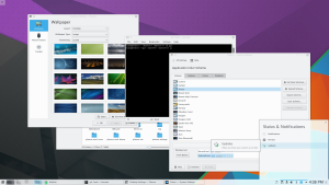
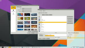
The Plasma theme system had a feature (since many years, actually) in which SVG elements done in a certain way can be recolored with colors coming from a theme file.
The Breeze Plasma theme (and now all the monochrome Breeze icons too) was all done in this way, in part to prepare what I’m, presenting today:
If the colors in the SVG can follow a color scheme defined in the theme, they can follow also a system wide color theme no?
For Plasma 5.6, (as a feature that was requested really a lot) the default Breeze theme, while by looking familiar, it will change color following the applications scheme.
However, if you prefer to maintain a clear distinction between the workspace and the applications (And I’m definitely among them), there are still available the themes “Breeze Light” and “Breeze Dark”, just as before (Oxygen and Air also received some nice visual updates).
Let’s look at some screenshot:
So far so normal, typical Breeze theme we had so far.


nell’ultima immagine che succede se clicchi sul tipo di layout (o walpaper type o positioning) in desktop settings->walpaper al colore del menu? segue il colore scuro di plasma? a me su tutte le distro che ho provato da plasma 5.0 all’ultima il colore è sempre bianco.
It would be also cool, if you could set the transparency for the panels and widgets in plasma theme with a setting, not in the theme itsefl.
Impressive. Can’t wait.
You rawwwk Marco! Love it!
Whilst I think that the theme part is a great idea, I think the icon part is very bad from an UX point of view. As I wrote in https://bugs.kde.org/show_bug.cgi?id=359387 it leads to a massive inconsistency, which is also quite well visible in your screenshots, e.g. in the first one with konsole (notice that the icon differ between the window decoration, the window list in the taskbar and, likely, other places such as application menus). This will get worse due to the fact that people use lots of applications that aren’t part of the KDE ecosystem and thus will stick out.
And I don’t see the benefit of it, if you take the last screenshot as an example, the icon of the wallpaper dialogue is nearly invisible in both the window decoration (which isn’t plasma) and the window list in the taskbar (which is plasma)
So while I clearly support the theme thing, I think the icon part needs to be reconsidered.
This is really nice!
I love the idea to have a single look and feel for everything.
This basically makes other color schemes usable without having to dig for a matching plasma theme.
Congratulations!
Finally! There was a popular KDE4 plasma theme that adopted the system color scheme (can’t remember its name). I was wondering why there was no plasma 5 theme that did the same. Including one as default seems definitely the way to go!
Are there tutorials for setting up assets to work this way in inkscape? IE so the resulting SVG file is themeable?
Are the empty spaces in the systray symptoms of bug https://bugs.kde.org/show_bug.cgi?id=352055 ?
This is really nice !
So you new color scheme means new plasma theme 🙂
Thank you for your hard work!
In the screenshots it looks like this feature causes some of the system tray icons to disappear… is that a bug? If so, is it being addressed?
the holes in the systray were an old unrelated bug, it should be fixed now
With this change, Can I have different color schemes for different applications?
For example: I love the dark theme but is unusable for some applications, I prefer to use kmail or firefox in light color.
Thank you. Now Breeze is a great replacement for one of my old favorites: Aya.
http://kde-look.org/content/show.php/Aya?content=76197
Super! 😀