Today the first feature update of Kirigami has been released.
We have a lot of bug fixes and some cool new features:
The Menu class features some changes and fixes which give greater control over the action triggered by submenus and leaf nodes in the menu tree. Submenus now know which entry is their parent, and allow the submenu’s view to be reset when the application needs it to.
The OverlaySheet now allows to embed ListView and GridView instances in it as well.
The Drawer width now is standardized so all applications look coherent from one another and the title now elides if it doesn’t fit. We also introduced the GlobalDrawer.bannerClicked signal to let applications react to banner interaction.
SwipeListItem has been polished to make sure its contents can fit to the space they have and we introduced the Separator component.
Desktop Kirigami applications support the “quit” shortcut (such as Ctrl+Q) now.
Plasma 5.8 will depend from Kirigami 1.1, so if you are planning to write a Kirigami-based application, it will work by default and nicely integrate in the Plasma 5.8 desktop.
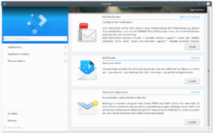
Plasma 5.8 also has a new big user for Kirigami 1.1, that is Discover: the application to search and install for new software, has a brand new user interface, based upon Kirigami.
This is problably the last feature release based upon QtQuickControls 1, QtQuickControls 2 version is on the way at an experimental stage. The port will have way simpler code (and smaller memory footprint) but this is an entry for another day 🙂


Very cool! It would be great to hear more about the status of the QtQuick Controls 2 port, looking forward to that post 🙂
Looks very nice. Just to confirm, the screenshot shows Discover on the desktop? Will it look different on the mobile version? Though, I guess the menu drew hides until you swipe on mobile, right?
Anyways, great job. It’s nice to see more feature full (and better looking in my opinion) QtQuick elements.
> Looks very nice. Just to confirm, the screenshot shows Discover on the desktop? Will it look different on the mobile version?
yep, that’s on the desktop, on mobile it looks different and the left sidebar it’s a swipe-in drawer
I have been working on a music player targeting both desktop and Android (this effort is in pause right now). The existing Android UI (probably broken right now) is a bit awkward for a music player since one has to change page to see player control and playlist.
One thing were I would like your advice is the best way with Kirigami to put a kind of top or bottom bar always there with player controls. What would you suggest ?
Best regards and congratulations on the 1.1 version.
By the way, using Kirigami to do mobile UI is a real pleasure.
Pingback: Links 2/10/2016: Wine 1.9.20, Raspberry Pi PIXEL | Techrights