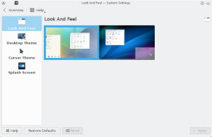
Plasma 5.1 will make way easier to fine-tune their workspace to their needs.While already very powerful, it was not always trivial, so now on one hand it will be possible choose between plasmoids that offer the same feature with a very simple UI.
On the other hand, ever wanted to set themes, look and feel of your desktop, but was discouraged by how many places you had to change themes to make the experience as you wanted? being icon theme, widget style, plasma theme, cursors etc…
Plasma 5.1 will support the concept of Look and Feel packages (or “mega themes” if you like) Basically an one stop place to set the look and feel of the whole desktop.

To start, there will be a “Breeze” and an “Oxygen” experience, and in the future, let’s hope yours too 😉
In the first release it will be very basic, but in the future it will grow more complete, allowing to more fine-tune individual components, downloading new “look and feels” from the internet etc.
Technically, Look And Feel themes are plasma packages, that contain two things: configuration files for defaults such as icons, colors, cursors etc
and QML files for certain parts of the workspace ui, such as the splashscreen, the lockscreen etc, allowing from very simple things (like a theme that just sets icon theme, widget style etc) to very comprehensive ones, that change completely the logout dialog, lockscreen etc.


KDE is insanely configurable. We could look and behave like Windows, Unity, Gnome shell and much more.
However, configuring KDE to look and behave like them needs a lot of time an knowledge.
Maybe we could provide ‘Unity’ and ‘Gnome Shell’ “Look and feek” packages that make the whole thing look like them?
I believe that Plasma supports javascript files to shape out the layout. Perhaps, these files or just a plasma-rc file could be added to the package to fulfill this request.
Also, will .color and .qtcurve (since QtCurve is now hosted on KDE infrastructure) files be allowed inside these packages? That would lead to a whole desktop theme minus the icons (which are usually a heavy package).
You mean like this?
http://sessellift.wordpress.com/2014/04/02/choose-your-own-experience-this-time-its-for-real/
😉
Nice! I do have one suggestion though.
Even if it is not possible to enforce it, how about recommending a common «preview setup», i.e. what applications or whatever should be opened. These should be defined to maximize the number of configurable features displayed while minimizing the number of open windows.
In your screenshot Breeze displayes the program starter, while Oxygen does not – and vice versa for the calendar. This makes it harder to make a quick comparison of themes. Although one can just try them out it wouldn’t hurt if it was possible to make a meaningful comparison between them at first glance too.
Awesome!
This rocks! You all rock!
Cheers! \o/
Any plans to improve (get rid of) Login Screen settings and possibly include them as not only for super-human but made for common people? The login screen settings have too many option that don’t make any sense for regular users. Some of those stuff should left out for either specialized tools or command line. Gnome also provides setting lock-screen wallpaper right from the wallpaper changer.
Great idea. I’d even push everything under this configuration panel;
– only have a “Look and feel” package.
– add a “create new..” or “custom..” where you can create a new package, where you can define: cursur theme, widget theme/colors, titlebars, and everything else.
There are way too much option panels now, and this would greatly simplify the UI, without removing the flexibility. It’s just flexibility redesigned in a nicer way.
Will there be any improvements to theme creation in plasma 5? I recently got back to linux and KDE after using windows 7 exclusively for a couple of years. I produced a few themes for plasma back in 4.1-4.4. And while on windows I created a couple of themes as well . And now that I’m back to kde I tried my hand at making another plasma theme <a href="http://i.imgur.com/qRQEgpw.png" title="(link)".
Before I say anything else, I understand that custom themes aren't the most important thing, and I get that you may not have a lot of resources and time to dedicate to it. That said, even compared to third party solutions for windows, plasma themes are really, really limited. It ends up just feeling like I'm just changing some colors around, with very limited control over margins and a one size fits all approach to most widgets.
This isn't really the place to make a list of things I'd like to see but off the top of my head being able to remove the hardcoded top margin on the panel without ugly hacks (like making that part transparent), being able to show at least the corner shadow on a maximized panel (would enable some cool stuff like rounded corners without using seperate widgets), and a bit more ambitious, to be able to have folders for specific plasmoids to override widget styles for it specifically (things like a single svg for all arrows everywhere means it HAS to be an arrow, can't have a "…" in the system tray, can't have task previews that looks connected to the panel without breaking everything else). Also, it seems completely impossible to have a dark panel and white widgets without getting unreadable text in one place or another. /rant
At least the defaults in KDE 5 looks great, keep it up :).
in these “mega themes” is there sound support? I mean something like “sound themes”?
Bye 🙂
This sounds fantastic! That is one thing that kept me away from KDE, but I may have to give it another look once this comes out.