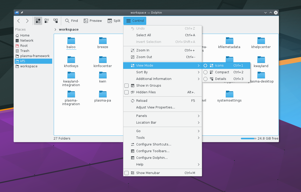
Today the first feature update of Kirigami has been released.
We have a lot of bug fixes and some cool new features:
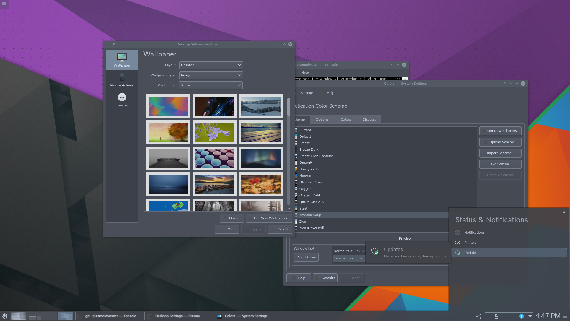
The Menu class features some changes and fixes which give greater control over the action triggered by submenus and leaf nodes in the menu tree. Submenus now know which entry is their parent, and allow the submenu’s view to be reset when the application needs it to.
The OverlaySheet now allows to embed ListView and GridView instances in it as well.
The Drawer width now is standardized so all applications look coherent from one another and the title now elides if it doesn’t fit. We also introduced the GlobalDrawer.bannerClicked signal to let applications react to banner interaction.
SwipeListItem has been polished to make sure its contents can fit to the space they have and we introduced the Separator component.
Desktop Kirigami applications support the “quit” shortcut (such as Ctrl+Q) now.
Plasma 5.8 will depend from Kirigami 1.1, so if you are planning to write a Kirigami-based application, it will work by default and nicely integrate in the Plasma 5.8 desktop.
Plasma 5.8 also has a new big user for Kirigami 1.1, that is Discover: the application to search and install for new software, has a brand new user interface, based upon Kirigami.
This is problably the last feature release based upon QtQuickControls 1, QtQuickControls 2 version is on the way at an experimental stage. The port will have way simpler code (and smaller memory footprint) but this is an entry for another day 🙂
Breeze icons are very simple SVG files, especially the ones used for actions that are mostly monochromatic are very simple, and that’s part of their appeal.
Since some time, Plasma themes that are SVG files as well have the capability of being colored with system themes.
So, why not doing this for every icon as well?
One problem with monochromatic icons is that they can lose contrast in particular situation: when the application uses another color scheme or in places such as in menu items uder the mouse, that get a blue background, giving a not too visible dark gray on dark blue.
That’s one of those “last mile” polishing issues that may be small, but have quite a big impact on the perceived quality of the finished product.
Starting with Plasma 5.7 Icons will behave the same way as Plasma themes: they can have an internal stylesheet which colors will be replaced at runtime with the colors from the system theme.
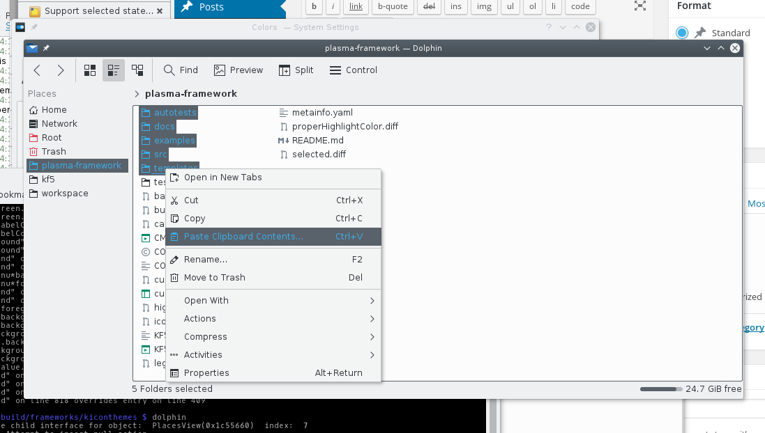
Here, Dolphin with the colors theme “Wonton Soup” and all the breeze icons following the text color of the theme:
Some applications, like Gwenview can use a completely custom color scheme, in the case of GwenView, it switches to a dark color scheme when fullscreen, regardless of the normal system color theme:
Icons that are in a “selected” state such as the menu item under the mouse or the current dolphin sidebar item change their color, just like the text does too:
Here with some custom colors for the highlight areas:
How to create a compatible icon?
First of all, Big kudos to Andreas for updating the whole breeze theme to the standard described below 😀
This is a quite minimal SVG file that supports colors from the system theme (Plasma Svg themes follow the same convention):
The colors defined in Text, Background, Highlight etc will be replaced with the corresponding colors from the system theme (look at the Systemsettings module to configure colors to see what colors they actually are)
This also defines a very minimal palette of “semantic” colors: you have the foreground and background colors for purely monochromatic shapes, and other colors for small accents that make the icon slightly more expressive than purely monochromatic such as Highlight, positive, negative (an “x” icon to close will be usually of “negative” color)
The other important part is the actual definition of the shape:
The rectangle has class=”ColorScheme-Text” that will make the stylesheet match to the class definition of ColorScheme-Text, that defines a color.
In order to actually apply that color, you can see the attribute style=”fill:currentColor”. It’s important no other colors are defined in the style attribute.
This post wanders quite off topic… but has a lot of pretty pictures indeed 😉
Sometimes I ask myself why I am a software developer, the answer in the end is that I always enjoyed creating things, whatever it is going from being sketched out totally in my imagination to finally seeing it in the flesh. Writing software, especially graphical software can be very satisfying exactly because of this mental process of seeing the thing you thought about slowly forming and starting to actually working, with the gap between the mental image and the real thing narrowing more and more (yeah, I’m one of those heavy visual thinkers that can think almost exclusively by images).
But sometimes nothing can replace the satisfaction to create an actual, beautiful object, and I also feel manual skills are something that we should cultivate much more, I feel more complete if every now and then I do something that a) I don’t know anything about when I start and b) it’s a difficult manual skill to craft.
That’s also why before drawing the svg for the Kirigami banner
I “had” to make some experiments of an actual kirigami…
But this post is not about that.
Almost a year ago, a friend of mine told me that he wanted to learn a bit to hack on some simple Arduino stuff, and you know what? I wanted too.
I have this stubborn quality that makes me to go quite overboard when I decide to do something (especially if is not for myself) and not to stop until is done, actually useful and pretty, so if we are doing some Arduino project, let’s do something that has an use and that will be pretty… and that’s how the project “Bagnur” started (means watering can in Piedmontese language).
Of course it needed a logo :p
The project is one that is seen again and again on the interwebs, so is just a remix of existing ideas rather than something truly innovative: the Arduino takes data from a soil moisture sensor (different humidity in the soil changes current conductivity), to figure out how much water the soil of a potted plant has.
When is dry enough it opens a solenoid based valve to pour enough water in, and the moisture sampling goes on and on, hopefully stopping you from killing those poor potted plants from thirst after forgetting watering them for days 😉
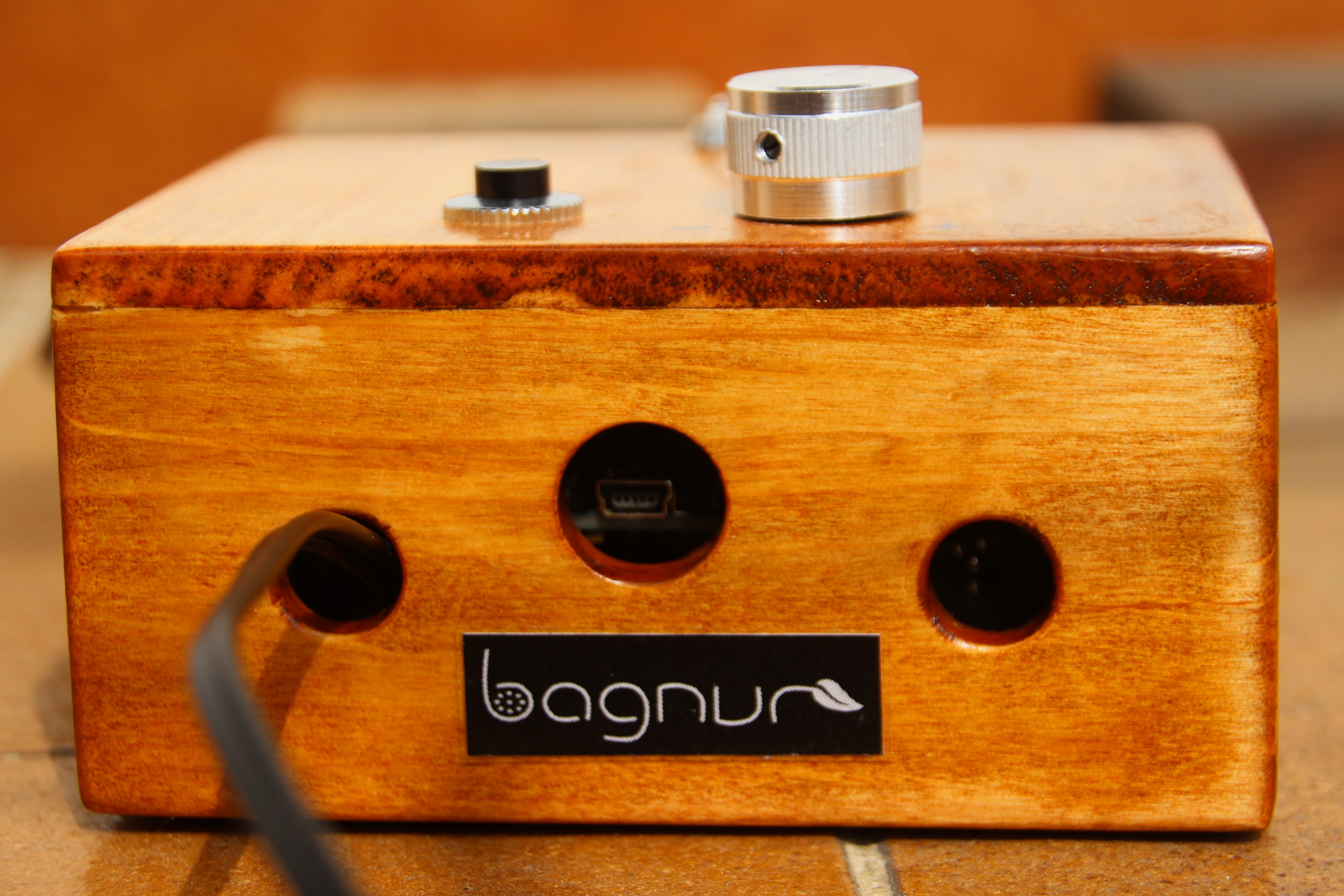
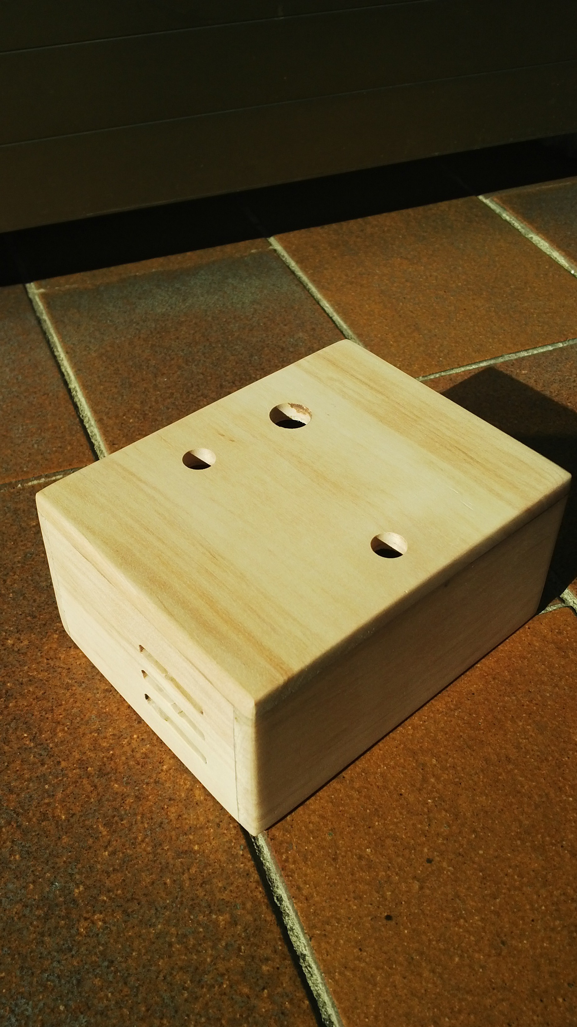
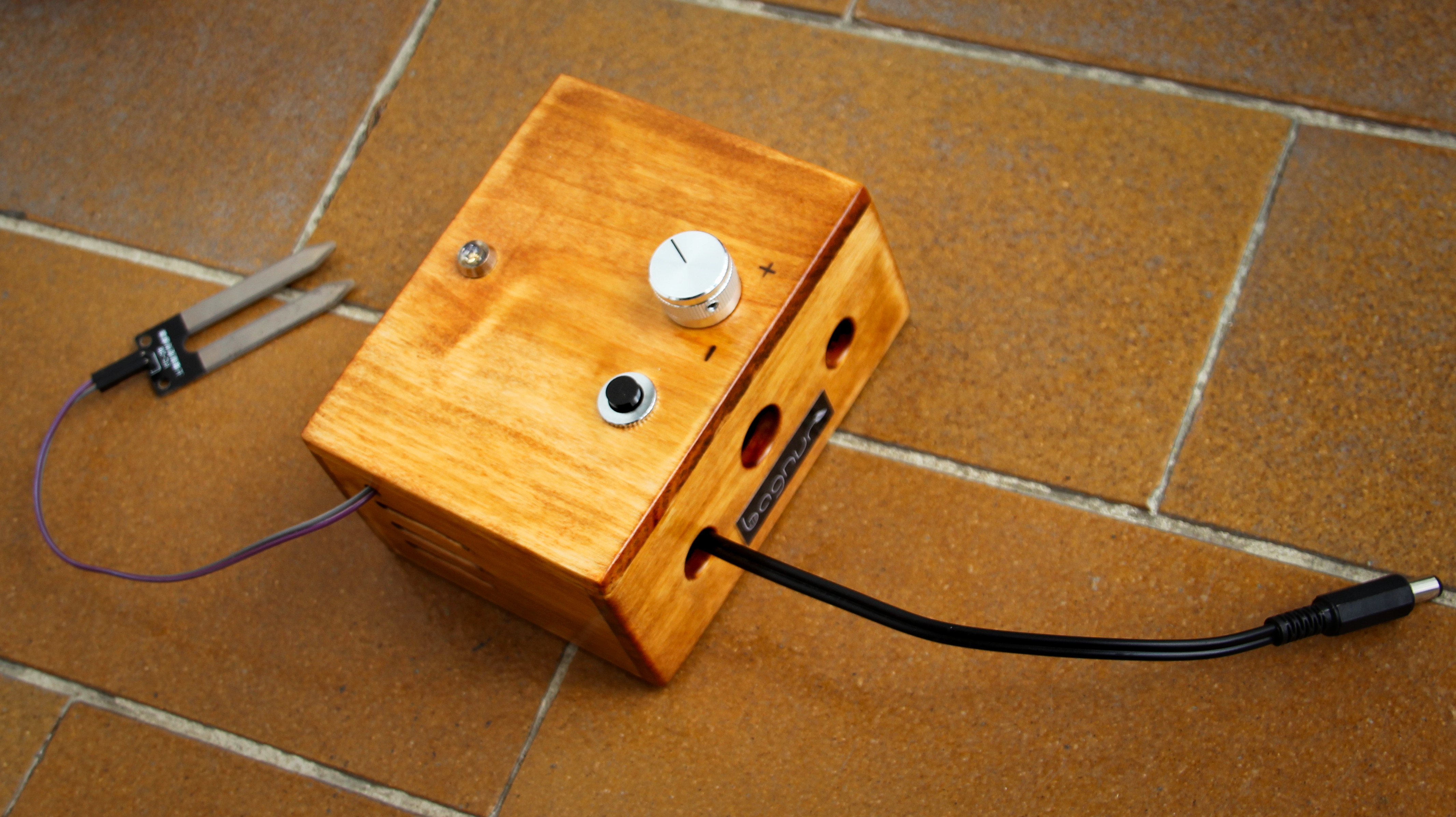
The final hand made steampunk-like package
The moisture sensor is based on the LM393 chip, the solenoid valve is similar to this one (hilariously overspec for this project, love this kind of overkill).
So we know the Arduino output pins have a too weak current to operate the valve, it will have to be powered separatedly: the Arduino will close its circuit with a transistor, I had just salvaged an E13007 NPN transistor that had useful charateristics (low base-emitter saturation voltage, resists quite heavy loads) from a broken ATX power supply.
This makes things a bit more interesting, luckily in the end a single power source was enough to power the Arduino and the valve in parallel, probably not particularly recomended, but cheap and compact (having 2 different power bricks for such a sillyness wouldn’t have been particularly fun for day to day use).
To make the project a bit more interesting, we have a potentiometer that will regulate how much water the plant needs, different plants, different needs and one of those pretty RGB LEDs, that will be the “output UI” of the thing.
The state of the led will be:
Fading from pure red (soil bone dry) to pure green (soil soaking wet) with all the values in between
Fading to blue when the valve is open, and the plant is being watered
The LED will stay usually at a very low power, the sensor will do a reading every 10 seconds or so, when this happens the LED will fade to full power with a nice animation
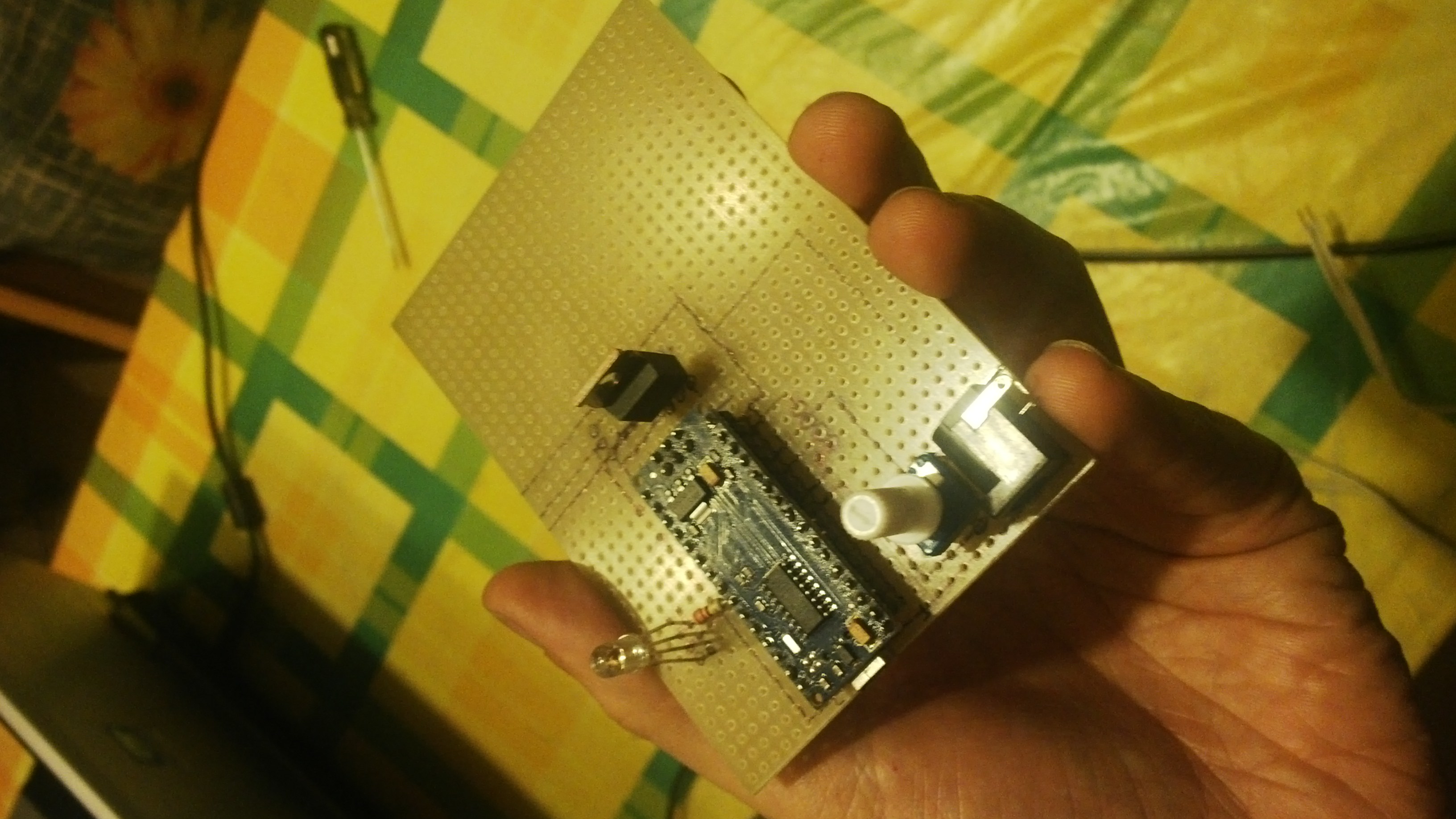
For the final thing, I decided to use an Arduino Nano compatible board, based as well on the ATMega 328 chip, since I don’t need many pins or performance, it just has to be as small, low power and cheap as possible.
In this Github repo there are both the source code of the program running in the arduino and a couple of schematics drawn with Fritzing, so it should be of easy replication and improvement… if someone really wants to 😉
The final board will be in an hand-made case made of wood that gives it a cool almost “steampunk” look: that was honestly for me the most fun part of the project of all, probably because was the farthest from what I usually do, the most low-tech, hand skill demanding part (and slightly dangerous… yep, it involves rotating blades :p).
Video of the thing in action
This videos shows some assembling steps and the thing in action, both opening the valve automatically based on the moisture sensor values and manually with the button on top.
Board
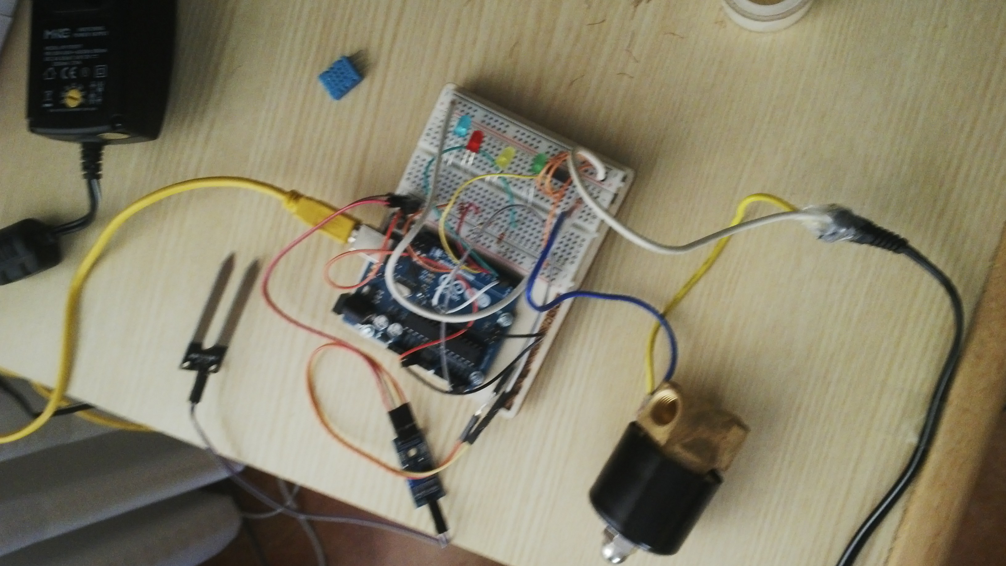
Let’s start from the usual prototyping with the classic Arduino Uno/breadboard combination (here still with different colored leds instead of the final single RGB one)
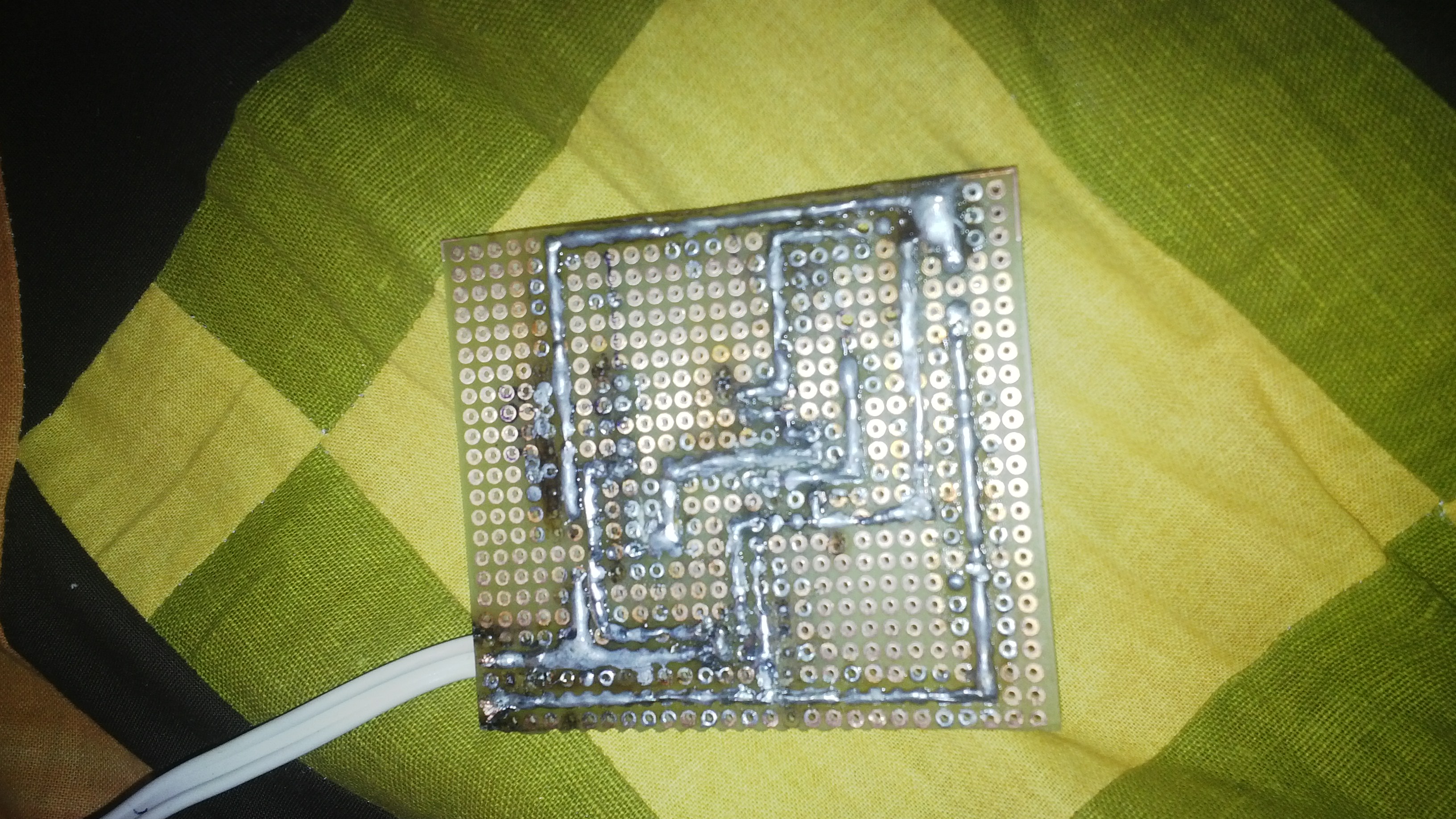
After the breadboard prototype is done, let’s start to lay out the components on a perfboard, to make it look more like a final prototype, usable day to day
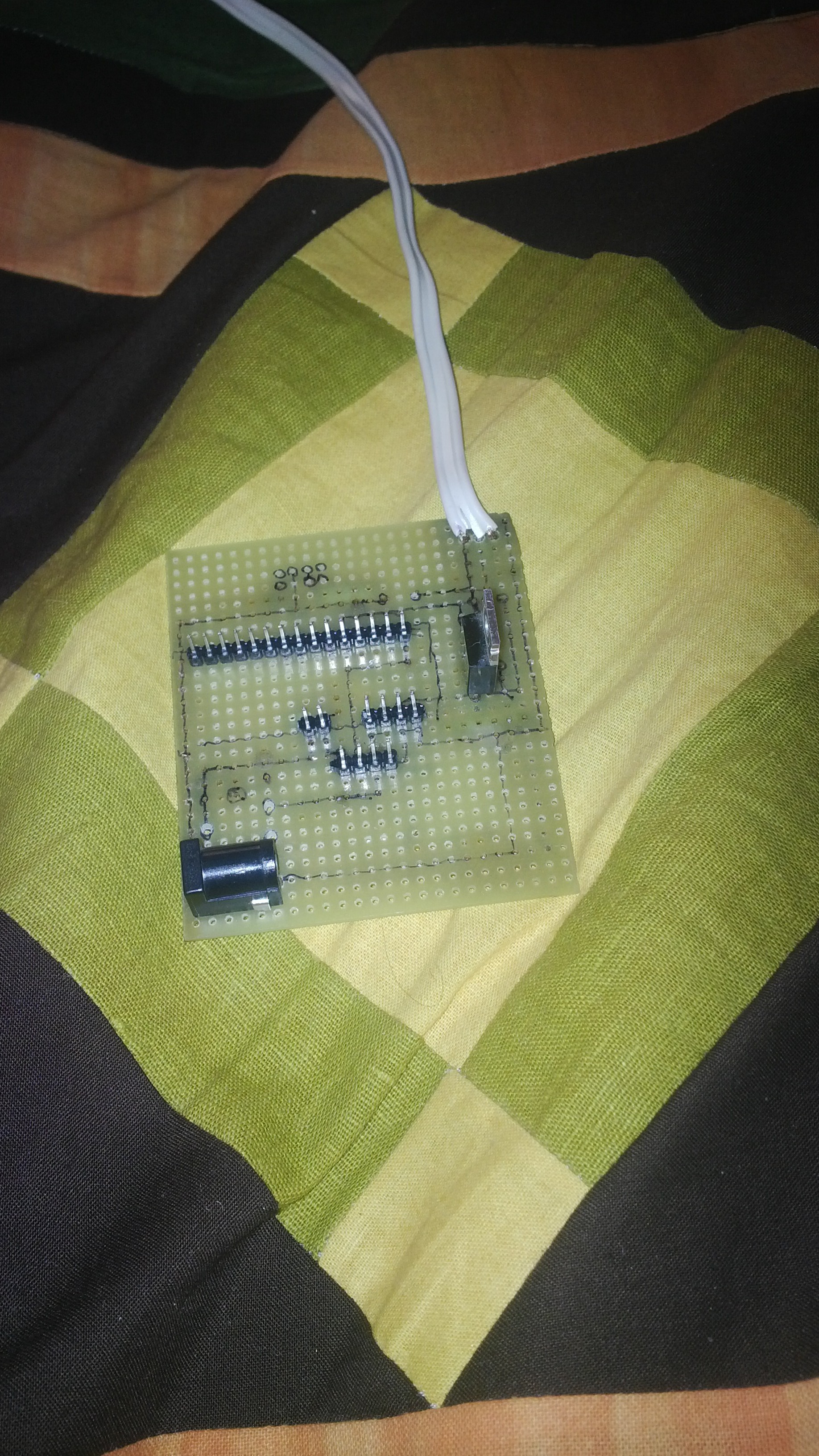
First components attached to the perfboard. The Arduino Nano will connect it as a daughter board.
Yep!, i definitely need to improve my soldering skills, but I swear, even if is kinda ugly, it works like a charm 😉
Still some components missing, already attached to the wooden base
Woodwork
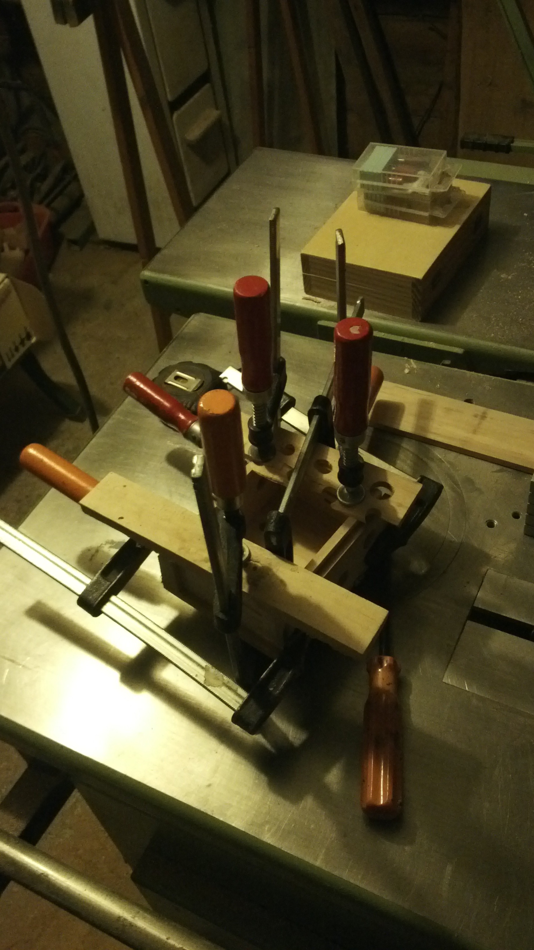
As I mentioned, for me the most interesting part was to build a wooden case from scratch, from a raw plank of wood, trying to master some of the classic woodwork tecniques.
The plank is made thinner and smoother via a thickness planer; after this step the setup of the machine changes becoming a surface planer for a more precise and smoother retouching. The process repeats until the wood reaches the desired thickness.
Did i mention, ROTATING BLADES?
All the sides of the box are done
After the box has been glued, it has to be tied very, very tightly as the glue dries
The joints are not very precise …yet
…But some aggressive sandpapering for sure helps, best if done with a Sander
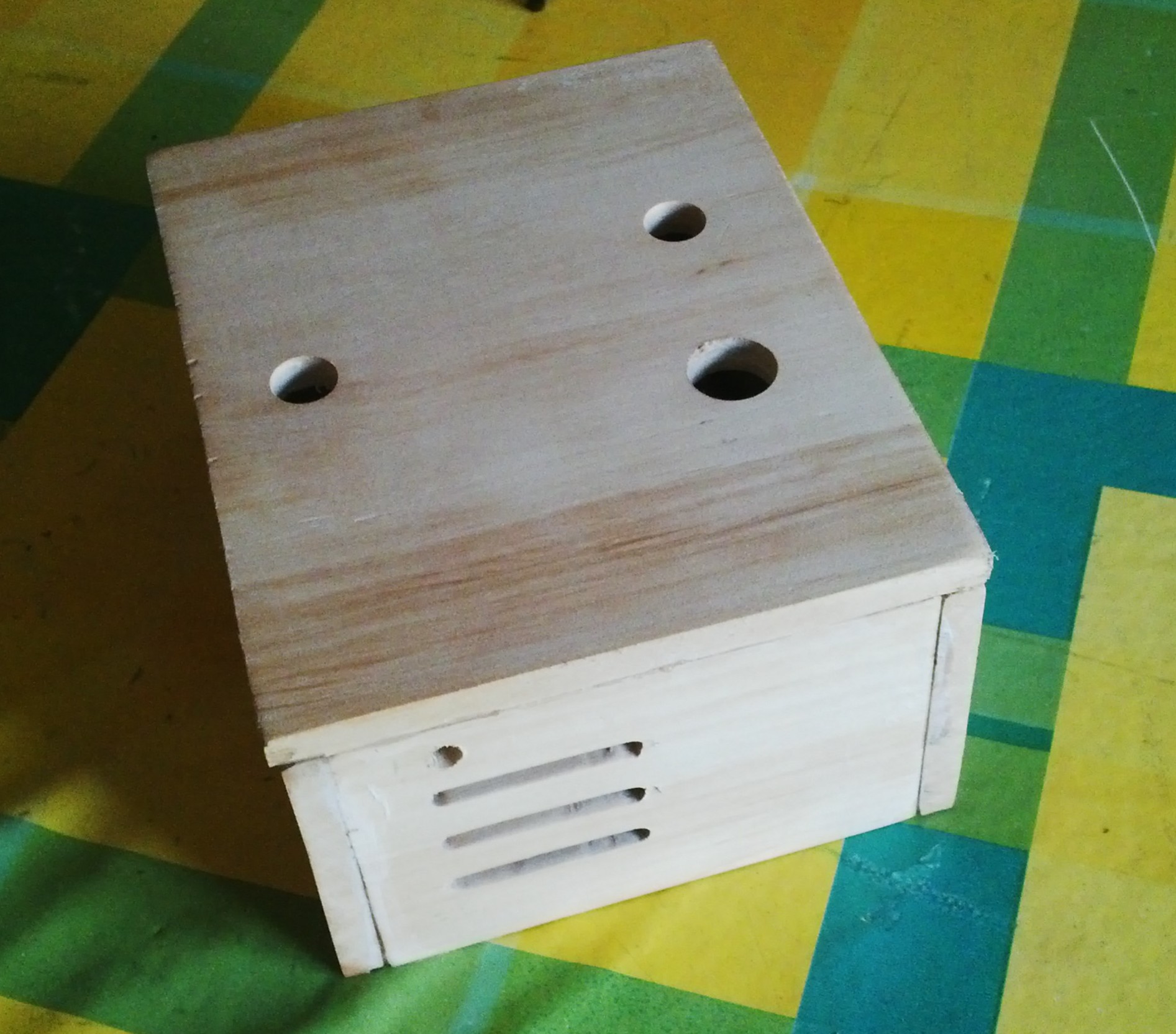
The lid of the box with a translucent, water proof paint, attached to the top are the moisture sensor, the RGB LED and a button to manually open the valve.
The complete device, ready to be closed. The wires on the left control the RGB LED, the blue and green wires in the middle control the button, the wires on the right control the moisture sensor.
The completed little, mean machine.
It has been an insanely fun project, and I am sure my technique can still improve in all areas (designing an electronics board, soldering, woodwork…). If I’ll keep trying to improve with new projects I don’t know yet, but the recomendation I can make is get out of the comfort zone of your day-to-day work and experiment: you have only to gain, if only for the act of doing things wrong, without which there is no learning.
Over the second week of March I’ve been at the sprint at CERN.
It has been an amazing experience seeing those very big toys, where the cutting edge research is done (noted with satisfaction the presence of Plasma desktops in the CMS control room)
On my side, some interesting little things happened:
All new systemtray finished and merged
During the sprint I’ve merged a thing i was working since a while: the system tray of Plasma was one of the most complicated plasmoids out there due to the very peculiar things it does.
Its code was really showing its age (it surviced at least 3 portings across different technologies) and even tough the old Xembed-based systray icon protocol was dropped, its architecture was still decidedly all
It has now been completely rewritten, its code is now way simpler, using less layers of proxymodels and went from ~2000 locs of C++ to ~300
While completely new, the users shouldn’t even notice any UI change, the only noticeable change should be less bugs and working better 😉
Kirigami
During the sprint, a new repository was born.
What was Plasma Mobile components is now residing in a separate git repository: https://quickgit.kde.org/?p=kirigami.git Kirigami (The names comes from a Japanese paper folding craft similar to Origami, but unlike Origami cutting the paper is allowed) is a set of QtQuick components at the moment targeted for mobile use (in the future desktop as well) targeting both Plasma Mobile and Android. It’s not a whole set of components, all the “Primitive” ones like buttons and textboxes are a job for QtQuickControls (soon QtQuickContrls2) but it’s a set of high level components to make as easy as possible making applications that look gorgeous on mobile devices that follow the Visual Design Group UI guidelines.
The target of those components is anybody that wants to do an application using QtQuick as its main UI, especially if targeting a mobile platform, without adding many dependencies. They work both in Plasma Mobile and Android.
It will eventually become a Tier-1 KDE Framework.
Subsurface
While I was refining the components, it turns out a piece of desktop software just has its first release of its Android port, it is already using a tech preview of the Kirigami components: it’s Subsurface a dive log software started some years ago by Linus Torvalds (in GTK+) and recently ported over Qt (here a talk by one of its main developers Dirk Hohndel about the porting process https://www.youtube.com/watch?v=ON0A1dsQOV0)
It’s awesome having already an early adopter (which has been a pleasure to work with) for the components and also means we are getting a ton of feedback on it.
An informational tooltip in Plasma is an item that shows extra informations for items such as task items, and is a single entity, moving along what you want to know more of, rather than magically appear out of nowhere (that’s the kind of “magic” the human brain doesn’t like).
A problem with Plasma tooltips was that they tried to animate themselves, that is usually not a good idea on X11, due to its old async architecture.
But KWin to the rescue! if we want a smooth animation of both the position and the size of the tooltip, the compositor is the place where to do it.
With its scripting user interface, it was even possible to implement it completely in JavaScript.
You can see it in this video taskbar tooltips animating and resizing/morphing in a similar way Windows 7 does.
Btw, the animations in he video looks way less smooth than are in reality, due how terrible screencasting is under X11, but for that:
The Plasma theme system had a feature (since many years, actually) in which SVG elements done in a certain way can be recolored with colors coming from a theme file.
The Breeze Plasma theme (and now all the monochrome Breeze icons too) was all done in this way, in part to prepare what I’m, presenting today:
If the colors in the SVG can follow a color scheme defined in the theme, they can follow also a system wide color theme no?
For Plasma 5.6, (as a feature that was requested really a lot) the default Breeze theme, while by looking familiar, it will change color following the applications scheme.
However, if you prefer to maintain a clear distinction between the workspace and the applications (And I’m definitely among them), there are still available the themes “Breeze Light” and “Breeze Dark”, just as before (Oxygen and Air also received some nice visual updates).
Let’s look at some screenshot:
So far so normal, typical Breeze theme we had so far.
Quoting from the announcement:
“KDE Neon is the intersection of these needs using a stable Ubuntu long-term release as its core, packaging the hottest software fresh from the KDE Community ovens. Compute knowing you have a solid foundation and enjoy the features you experience in the world’s most customisable desktop.”
This is pretty exciting for anyone who wants a stable core system with a setup of KDE Plasma software on to as recent as possible, setted-up and configured as good as possible, with hopefully less issues like “distro X has a slightly outdated version of kibrary Y which is know that makes app Z crash”.
Hell, I was so excited that during a sleepless night, I has been completely possessed by the Muse and I had to do this artwork based on a riff of its logo:
NEON written as a neon sign, how original :p It’s pretty tacky but it’s intended to be, here for your viewing pleasure at a typical wallpaper resolution.
One of the new useful tiny plasmoids that will be available in Plasma 5.5 is one called Activity Pager: you can find it in the kdeplasma-addons package of the release.
How does it look? well, not too exciting and very familiar, and that’s precisely the point:
since people use activities in very different ways, it’s written as an aid for people that use it in a particular way, when the use case partly overlaps with virtual desktops.
It’s built to look like a pager, behave like a pager (including the mini previews of windows) but instead of beng based on the virtual desktop, it’s based on the activity, so each little desktop preview will represent the activity and the windows in it (dragging previews from one activity to another works too).
Over the last few days I decided to help Martin a bit with the ongoing effort on Wayland, since there are still many parts of work missing in order to have a full Plasma Wayland session to just work, but it’s impressive how fast it’s getting there.
It was just a tiny part but is worth sharing it as it brings pretty pictures! (and shows how easy is to contribute).
The popups of the plasma shell need custom positioning code as normal applications can’t position themselves anymore for security reasons, plus KWin uses its effects framework to do a couple of things on plasma panels and popups:
Shadows: the shadows are rendered by KWin, they aren’t really a part of the window, as the shadow must not count anything in the position and resizing phase, but just a visual effect on it, it’s also more semantically correct.
Background effects: both the panel and the popups have a blurred background plus a contrast/saturation effect, to make it more readable and prettier.
After hooking a protocol to control such effects into wayland, here’s the result, almost undistinguishable (there is still a pretty visible graphical issue, points for finding it) from your current X11 Plasma 5.4 session:
So, what needed to be done?
KWayland protocols: each KWin effect that can now be controlled with X properties need its own wayland protocol extension in order to achieve the same thing, I wrote one for blur behind and background contrast (shadow was already there). The good news here is that Martin is working on a tool to auto generate the binding code from the XML specification of the protocol.
KWayland-integration repo: The effects that had KWndowSystem API to control them, need a Wayland implementation as well, this goes in the KWindowSystem wayland plugin contained in the kwayland-integration.git repo.
Modify the KWin effect: then the kwin effect needs to read the data that the client wrote on the surface with the new kwayland protocol and control the effect, in a way that is behaviorally identical to the X11 way, that came from reading X properties from the window
As an “user” of the infrastructure, I’m very impressed about the work that went in the Wayland port of KWin and from the KWayland framework: it really makes using a very challenging and “peculiar” plain C API very easy and elegant in a way familiar with our cozy C++/Qt world.
I can say that is a learning curve soft enough for everyone to jump in and help the big scary transition if they feel to.
In a while, together Plasma 5.3 will be released (independently) a new package: plasma-sdk, containing some very useful tools for development around plasma, some old KDE4 era ones will return, some are new.
plasmate: lightweight IDE for plasmoids (experimental port to KF5, work in progress)
plasmoidviewer: useful to test a single plasmoid, in different formfactors (like desktop, panel, and so on)
plasmaengineexplorer: test and debug tool for dataengines.
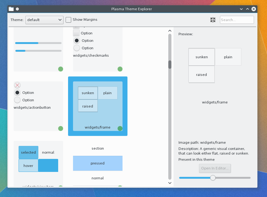
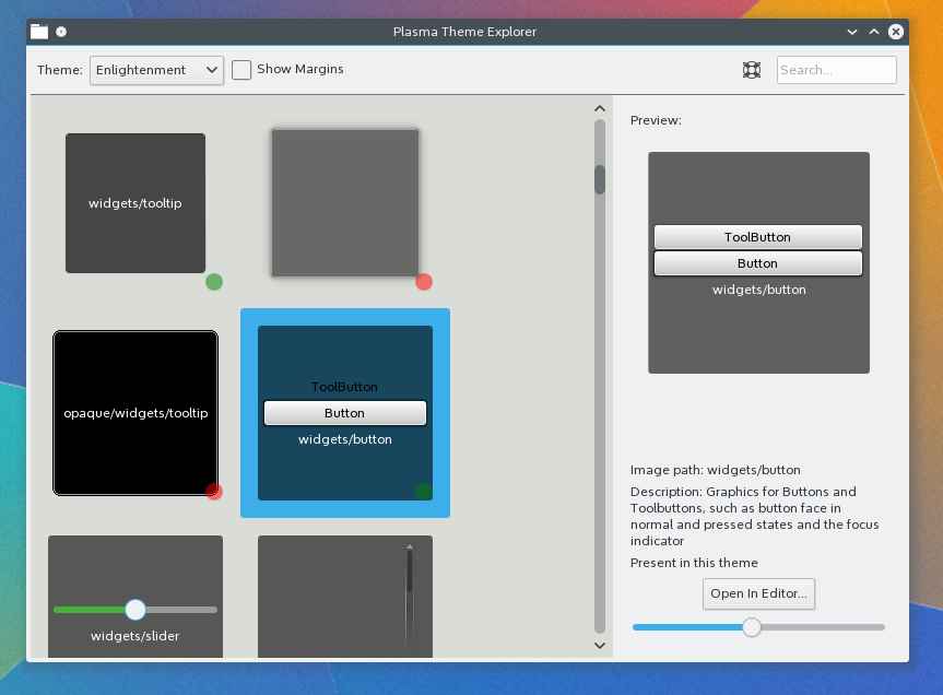
plasmathemeexplorer: tool used to explore Plasma themes, let’s talk about this one.
Plasma theme explorer is a new tool that is targeted at designers of Plasma themes.
It can open any installed theme and preview it as a grid of thumbnails of the actual elements rendered.
The thumbnails all have a green or a red dot in it. The ones with a green dot mean that the theme directly provides that element, red means the theme doesn’t have it, so it will fallback to the default theme (currently Breeze). So it makes it very easy and fast to assess the completeness of a theme and to decide what elements to do in order to make the theme more complete.
A sidebar on the right will show a bigger preview of the theme element, together a short description of what the element is for, and an edit button (enabled only for themes installed locally in the user home).
Clicking the edit button, will open the SVG of the theme in inkscape, and will run a little sanitizing script on the file after inkscape is closed.
If the theme doesn’t provide the particular element (and we have a red dot in the thumbnail) the corresponding file from Breeze will be copied in your theme folder, and that one will then be opened in inkscape, making the job of completing a theme easier and faster.


