


Ok, I lied: it’s about elegance, performance, simple and great API, better user experience, more cross-device compatibility, in the end about improvement on all fronts.
And a very important thing is to gove an user interface more beautiful, tidier, more elegant.
One example is what Sebas talked about yesterday.
That new calendar is kindof a blueprint of how the UI of the Plasma workspace is being reworked: no huge and breaking changes, but fixing small layout problems, paying attention to the visual balance of the elements, and way better typography.
One thing that was pointed out is that its contrast or readability it was still dependent on what kind of wallpaper or windows you have behind it.
That’s what we came up with:
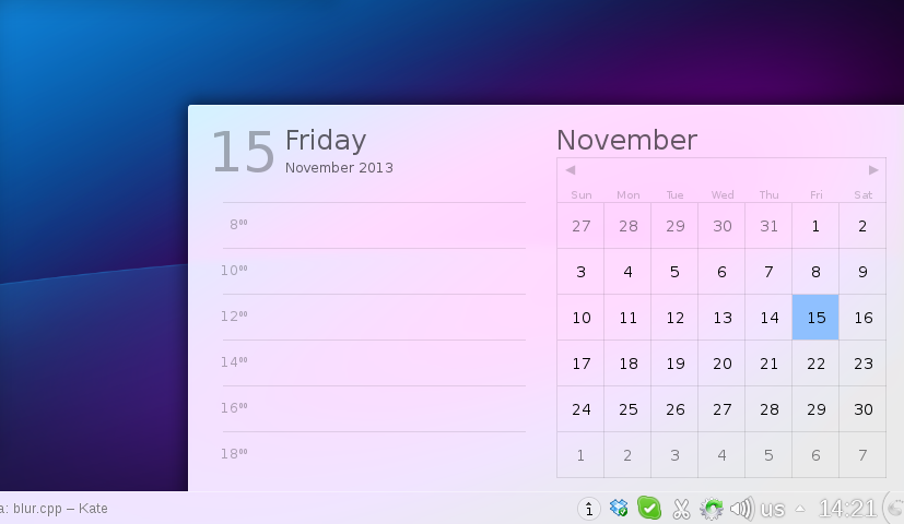
(Note, the panel is from Plasma1, the systemtray and clock area will look much better 😉
Here what it’s changed: contrary to what it seems, the window is *not* more opaque than the screenshots of yesterday, but it’s a modification of the blur effect in KWin.
What it does, it reproduces the effect of seeing something trough a frosted glass: what do you see is a combination of what’s behind the glass, the color of the glass, and the reflection of light reflected by the glass.
This last part is what has been added: it adds a bit of light to the color, but unlike a semi-transparent white window in front, it conserves all the information about colors.
So while being almost white, therefore very contrasted with the text, but still looking happy and colorful, instead of more dull and opaque if the theme was white, 95% opaque.
Very sexy indeed ! I can’t wait for Plasma 2 🙂
And I wish to thank all the Planet KDE contributors, it’s a pleasure to read all of you everyday
Hi,
This obviously looks very nice, but im wondering how will this new blur effect look with high contrast wallpaper or on the window with text and stuff.
Ugh… Emm… I’m not sure that happy to see it.
Looking forward to the graphic design of KDE5 Frameworks and Plasma2 overall. Hope you go in this line, minimalistic & elegant but usable and original. The hard work would be in Oxygen, but hope you reach that target.
Can we see the new Kwin blur effect with a diffrent background to compare the new color feature?
Present day could be blinkering in an elegant way, this way would be easier to identify it.
kool. I like fake 2D 🙂
can we highlight in some way active widget icon in system tray?
Try to center month-name like in http://ctrlv.in/259508
What about monochrome flat system tray icons of Produkt (/opensuse)? http://opendesktop.org/content/show.php?content=124213
elegance++
Looks beautiful! I wondered when the devs would address the readability issue. Really looking forward to the release!
This looks real good. Keep up the great work!
I like it when the text becomes more easily readable. I am becoming older and my eyes get weaker. 🙂
See also my comment about “virtual translucency” here http://vizzzion.org/blog/2013/11/responsible-evolution/comment-page-1/#comment-22609
It’s a lot better than what we currently have, thanks much for that!
A bit of constructive ctritics though:
* move the “Previous/Next month” arrows from the weekdays area, where it makes no sense, up to the month name area;
* make month name centered.
Looks great. It’ll be great if design like this is consistent everywhere in KDE.
Thank you! The readability of text has improved a lot. It is quite beautiful too 🙂
Could you help me understand why the top of “F” in “Friday” seems to be above the “15” to its left ? Also the bottom of 5 in 15 seems to dip below the 1. What is the root cause of these issues in the layout?
Really appreciate your work,
Bala.
#3opaque5me
Pingback: Plasma 2 新变化 | I, KDE
Looks awesome!
Still waiting for hooks to be added so that appointments can be added to Kontact from the widgets itself
It looks nice, but I wish KDE would give it a rest with the translucency, viewing things through frosted glass, etc. This translucency stuff does not look good, it’s never looked good, and at this point it is so over done it has almost become a parody of its self.
My other nit pick is with KDE’s hideous icons. I hope someone is working on those.
Pingback: Plasma 2: mejoras en el efecto de desenfoque | Ayuda Linux
There is still hope in my heart when I see this blogpost 🙂 Nice work
That screen might look elegant, but IMO is a usability disaster. Not that that happened recently though. 90% of the text in that image has ultra low contrast to the surrounding environment. I have a very hard time figuring the day and minutes on the calendar or even the time on the panel.
omg … that looks beautiful
1 question though … does it degrade nicely once desktop effects have been turned off?
(like not having black borders around it like the k menu does on 4.8)
Looks nice, but a bit too white. The screenshots at Sebas blog look better.