


These days at akademy i really couldn’t do that much in the code perhaps i’m lazy and i left the laptop turned off (and the brain too:) from quite some days.
By the way so far it’s really fantastic and insanely tiring, yaaawn (i don’t ride the bike THAT much usually) 🙂
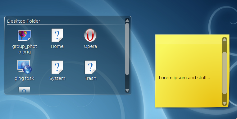
A little thing i managed to get done it’s a graphics change in plasma widgets and applets that have a scrollbar in it.
The Oxygen scrollbar was not really suited in plasma applets, both for its style and its colors, arrow button black on black with a flashing blue handle wasn’t really it in the plasma style… so now it’s svg themed too as other widgets.
it’s not really pretty as code but was really the least worst way, it uses a qstyle that must be explicitly set for each scrollbar, but it’s totally hidden from the api, since only widgets in kdelibs uses this thing, so just use widgets/
ScrollBar or TextView and all is done (hmm, i suppose i’ll have to provide also a set of treeview/listview and stuff so…).
Some months ago someone on the planet blogged about scrollbars in the folderview (I´m sorry but can´t remeber who) and there was a discussion in the comments about fading in/out the scrollbar when hovering over the plasma applet.
Is this anything you thought about?
Very nice! Now it just need the nuno’s magic and that’s perfect 🙂
Also, I stopped to comment just because I need to say you site layout is awesome! Long life to old-school 8bit artwork!
Would it be themable?
It is a step forward but I think that the arrows of the widgets of the 4.1 are more proper and that It could be bettar that the arrows don’t share the space of the scroll bar (sorry for my bad explanation)
personally, I feel that the oxygen scrollbars provide for further feel of an integrated kde desktop experience. I was happily surprised when I saw that the notes plasmoid now scrolled and the scrollbar was the same as I saw everywhere else. I’m sure this has been talked about in mailing lists and decisions have been made, but these are my 2 cents to make sure that the final design stays integrated with the look of the rest of kde. (for instance, imagine if someone changes their window style from oxygen to something else .. but the plasmoids still look a certain way..)
thanks!
As I say always :), I hope we’ll be able to use the same widget style and coloring for plasma and the rest of KDE.
I like the idea of the fading scrollbars tidbeck.
Having scrollbars is definitely a good step forward to maintain a mouse friendly environment – however also having the option to use arrow keys is also a good one.
fading: would be nice, at the moment i can’t think about ways of doing that.. hmm, eventfilters abuse? naah…
themeable: yes, it uses svg already for painting
8 bit: oh yeah dude, 8 bit rocks 😀
Personally I don’t like any scrollbars at my desktop. So the fading option would be a step forward. Mostly I like to get two arrows. A simple arrow down to scroll down and when you are going down a second arrow, up, will appear.
Advantages:
– only the color has to change to fit the theme
– uses less space
But as I said: This is allready a step forward so thank you very much 😀
I would prefer, if the plasmoid scrollbars were the same as in the rest of KDE. Fading would be good, but how do you see if there’s further content in a FolderView for example then (without hovering it)?
You could keep the arrows at all time but only fade the actual scrollbar.